ipad pro

#43 - iOS 15 and macOS Monterey, with Paul Shimmons

Paul Shimmons returns to the show to talk about the features in Apple’s new operating system updates, and how we plan to use them.

Patreon subscribers get a bootleg version of the recording, without the ads, and including bonus conversation about notation apps on iPad.

Subscribe to the Blog...

RSS | Email Newsletter

Subscribe to the Podcast in...

Apple Podcasts | Overcast | Castro | Spotify | RSS

Support Music Ed Tech Talk

Become a Patron!

Buy me a coffee

Show Notes:

Tuesday, 26 Oct 2021 14:10:49.jpeg

App of the Week

Paul - Ultimate Drill Book

Robby - Sofa

Music of the Week

Paul - Powerhouse - White Heart

Robby - Cory Henry - Best of Me

Where to Find Us:

Robby - Twitter | Blog | Book

Paul - Twitter | Website

Please don't forget to rate the show and share it with others!

Sibelius for iPad, with Joe Plazak (Principal Software Engineer and Designer)

This week on Music Ed Tech Talk I am joined by Joe Plazak, Principal Software Engineer and Designer of Sibelius, to talk all about their summer iPad release.

Listen below or in the podcast app of your choice! I look forward to writing more about Sibelius for iPad down the road.

Episode Description: Joe Plazak (Principal Software Engineer and Designer) joins the show to talk about Sibelius for Mobile and their new iPad app.

This episode is sponsored by Blink Session Music: Because Virtual Lessons Are More Than a Video Chat.

Backstage Access Patreon Subscribers can listen to extended discussion including Joe Plazak's Book of the Week and some of my reflections on writing Digital Organization Tips for Music Teachers.

Subscribe to the Blog... RSS | Email Newsletter

Subscribe to the Podcast in... Apple Podcasts | Overcast | Castro | Spotify | RSS

Support Music Ed Tech Talk

Become a Patron!

Buy me a coffeeBuy me a coffee

Thanks to my sponsors this month, Blink Session Music.

Show Notes:

App of the Week:
Robby - CleanShot Joe - Tips

Album of the Week:
Robby - Jack & Owane - Part One: Shredemption Joe - Pomplamoose - Impossible à prononcer

Tech Tip of the Week:
Robby - Make your own custom keyboard shortcuts Joe - Hold the spacebar on iPhone to get a cursor

Please don't forget to rate the show and share it with others!


Yesterday’s iPhone Event

I’ve already been getting texts from colleagues asking about yesterday’s iPhone event so I thought I would put some thoughts down here.

I get why this event has everyone’s curiosity levels at 100 every year. Everyone needs a phone. And they want to know which one will be their next. The truth is, iPhones are at a point where they are going to continue to slowly iterate year over year. Major changes are rare.

Every year Apple makes better iPhones than the previous year. In the case of this year, the most notable improvements are to the camera. If you have been holding on to your phone for 2-3 years, this will be a worthy upgrade.

There are four options: iPhone 13, iPhone 13 mini, iPhone 13 Pro, iPhone Pro Max.

Respectively, those could be explained as New Phone (Medium), New Phone (Small), Better New Phone (Medium), Better New Phone (Big).

I can’t tell you which phone to buy but chances are the New Phone is probably good enough for your needs, and what it will really come down to is size and how ready you are to upgrade. The camera is always better on the Pro models, and I have a toddler, so I am getting that model. While some years there is a better camera in the largest sized model, this is not the case this year, so iPhone Pro 13 (non-Max) it is for me. My wife will be getting a mini, which is a really lovely phone if you can stomach the low battery life.

The most attractive thing announced yesterday was probably the new iPad mini that has the new design of the iPad Pros (with flat edges and support for the second-generation Apple Pencil). If you have room for an iPad mini in your life, there is no question, you should get it. This device looks really slick. I am still riding out my iPad Pro 12.9 inch from 2018 and plan to do so for a while, though I am curious about going to the 11-inch pro model sometime down the road. I realize I might miss the larger size for sheet music reading, but I was doing it before there was ever a 12.9-inch size, and I really miss the feeling of holding the smaller size for things like reading and watching video content on the couch. The 12.9 has very much a laptop feeling in my experience. Owning a 12.9 and a mini is tempting but it seems cumbersome to charge and keep up with two iPadOS devices.

There is also a new Apple Watch and it looks like the most boring update ever unless you have a 2+-year-old Apple Watch in which case it will be a really strong update.

I also may consider the new MagSafe wallet attachment that has Find My app integration considering I just lost my wallet at school over as recently as this past weekend.

Sibelius comes to iPad

public.png

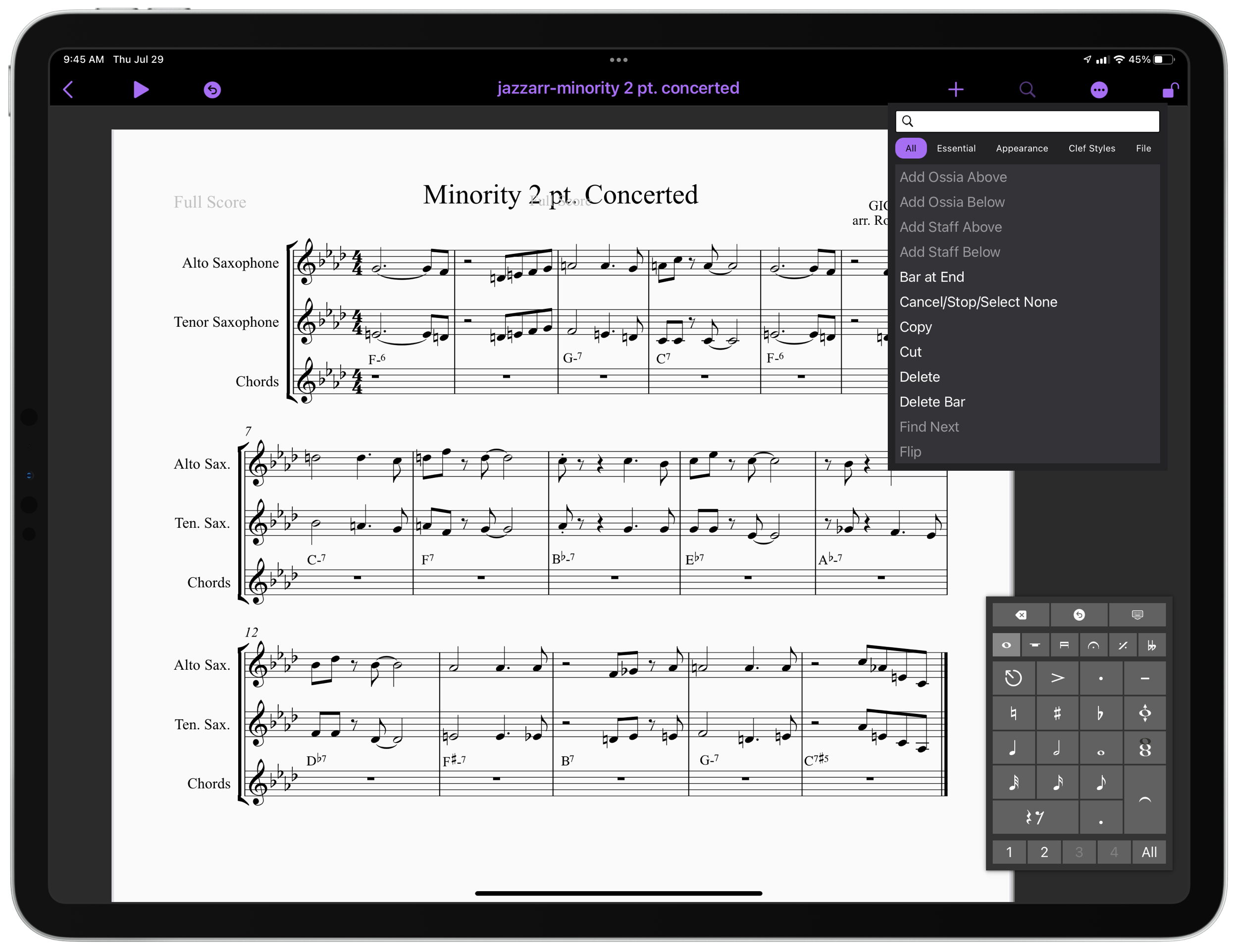
And just like that, Sibelius has their own iPad app. This comes after yesterday’s news that Dorico has released a desktop-class iPad app. If you want to learn more about that, click that link. I have some early first impressions, a video, and a podcast interview with Product Marketing Manager Daniel Spreadbury.

I don’t have much to say about Sibelius coming to iPad because I didn’t have any access to it before today, and because it hasn’t been my primary notation editor for years. But from 30 minutes of playing with it, it is pretty powerful and will certainly offer competition in this space, which is good! I want pro iPad apps to get better. The thing that is most impressive about it is how well adapted to the iPad it appears. It has multitasking, Files app integration, and some really intuitive touch/Apple Pencil touch gestures for note input that offer a new kind of ease and accuracy I wasn’t quite expecting.

You can watch a First Look video from Scoring Notes below and read their review here. You can download Sibelius for iPad here.

New iPad Air and iPhone

A number of teachers have asked me about the new iPad Air that Apple announced last month. It has been updated to look and function a lot more like the iPad Pro line and many are wondering if they need to go Pro or if the Air will satisfy their needs.

iPad Air and iPhone 12 (announced last week) reviews are out, and I have been reading through them this morning. Here are a few that stood out to me:

2020 iPad Air review: Almost Pro | Sixcolors.com

iPad Air Review: Forward-Looking | MacStories.net 

The iPhone 12 and iPhone 12 Pro | Daring Fireball

iPhone 12 and iPhone 12 Pro Review: The Best iPhones-but Note for the 5G

Based on everything I have learned so far, there has never been a better time to buy Apple's entry level products. The regular iPhone 12 and iPad Air are spectacular products, and I am guessing that a very large majority of users, even tech nerds, and professionals, are going to feel totally satisfied with them.

I have not tested pro apps like StaffPad, Ferrite, or LumaFusion on the iPad Air because I am still using the 2018 model iPad Pro. My educated guess is that you would not feel limited by the iPad Air, even if you use these apps. You would especially not feel limited using music apps like Tonal Energy and forScore.

When it comes to the iPhone, I am more compelled by the new Mini size and the Pro Max size (which comes with a much better camera system than the regular 12 Pro). Reviews for these are not out yet.

I will probably upgrade my phone, and it will probably be the Pro Max, just because I have a 9-month-old and want to take the best pictures possible of him. That said, I really miss the iPhone 5 days of the tiny phone and might consider a Mini in a future year if I read good things about it later this season.

I am going to keep my iPad Pro around for a bit, but if the Mac were ever to come equipped with a touch screen and Apple Pencil support, I would have to re-evaluate needing the larger-sized iPad Pro and whether or not I need an iPad altogether. I do miss the comfort of the smaller iPad size, particularly for reading, and my gut says that this iPad Air might satisfy my needs down the road.

Conclusion - You probably won't regret not going Pro on Apple's fall lineup of products, but the differences are definitely in the details so make sure you read up on them first.

Learn OmniFocus Workflow Guest: October 3, 2020

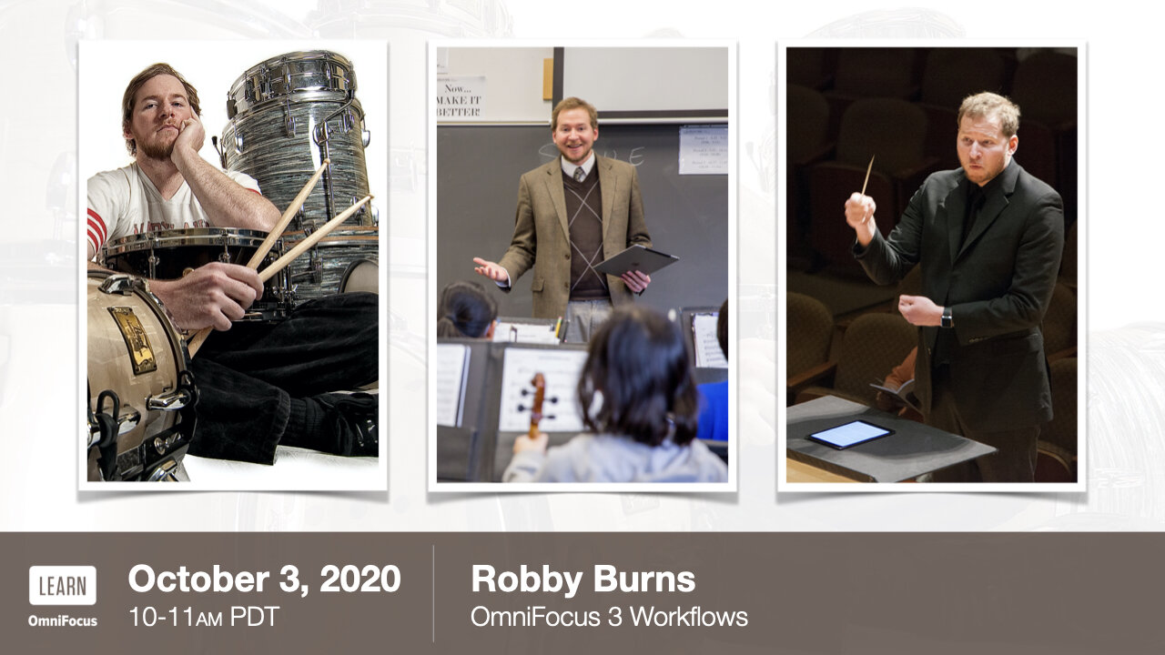
I am thrilled to announce that I will be joining Learn OmniFocus as a Workflow Guest on October 3rd, 2020.

Learn OmniFocus is a website dedicated to helping others live a fulfilling and productive life with OmniFocus, complementary productivity apps, and services.

You can learn a ton from their free resources, including basics like organizing tasks into projects and assigning tags to them. They also have information on advanced features like project templating and automation.

My session will be all about how I use OmniFocus and complementary productivity apps to keep my life as a teacher and musician together. Here is the session description:

Teacher, musician, and technologist, Robby Burns will be joining us from Ellicott City, Maryland to share how he uses OmniFocus and complementary productivity apps to keep his active life on track.

Robby has been using OmniFocus since 2010. He has a long history with Apple technologies and was originally drawn to OmniFocus’ deep integration with Apple’s operating systems. He especially appreciates that the Omni Group is quick to add support for new Apple technologies.

During the LIVE session, Robby will share details of his OmniFocus setup and workflows, including:

  • How and when he uses OmniFocus on his iPhone, iPad, and Mac.

  • Adjustments that he’s made to his use of OmniFocus and complementary productivity apps since switching from in-person to virtual teaching.

  • His strategy for using tags.

  • How he uses the Forecast perspective to keep his calendar lined up with his commitments.

  • How he uses defer dates to relieve the stress of seeing too many things at once.

  • Custom perspectives that help him hone in on his most important tasks, including his “Top 3” perspective that narrows his focus to only three items.

  • How he creates OmniFocus projects based on templates stored in Drafts.

Read more and register here. The session will have a live Q/A and members can interact and share ideas. I hope to see you there!

You can become a member of Learn OmniFocus here. They have educator and student discounts. It is worth checking out if you wish to be more productive!

A free recording of the video will be made available to everyone by October 10.

My Online Teaching Setup (High-Tech Edition)

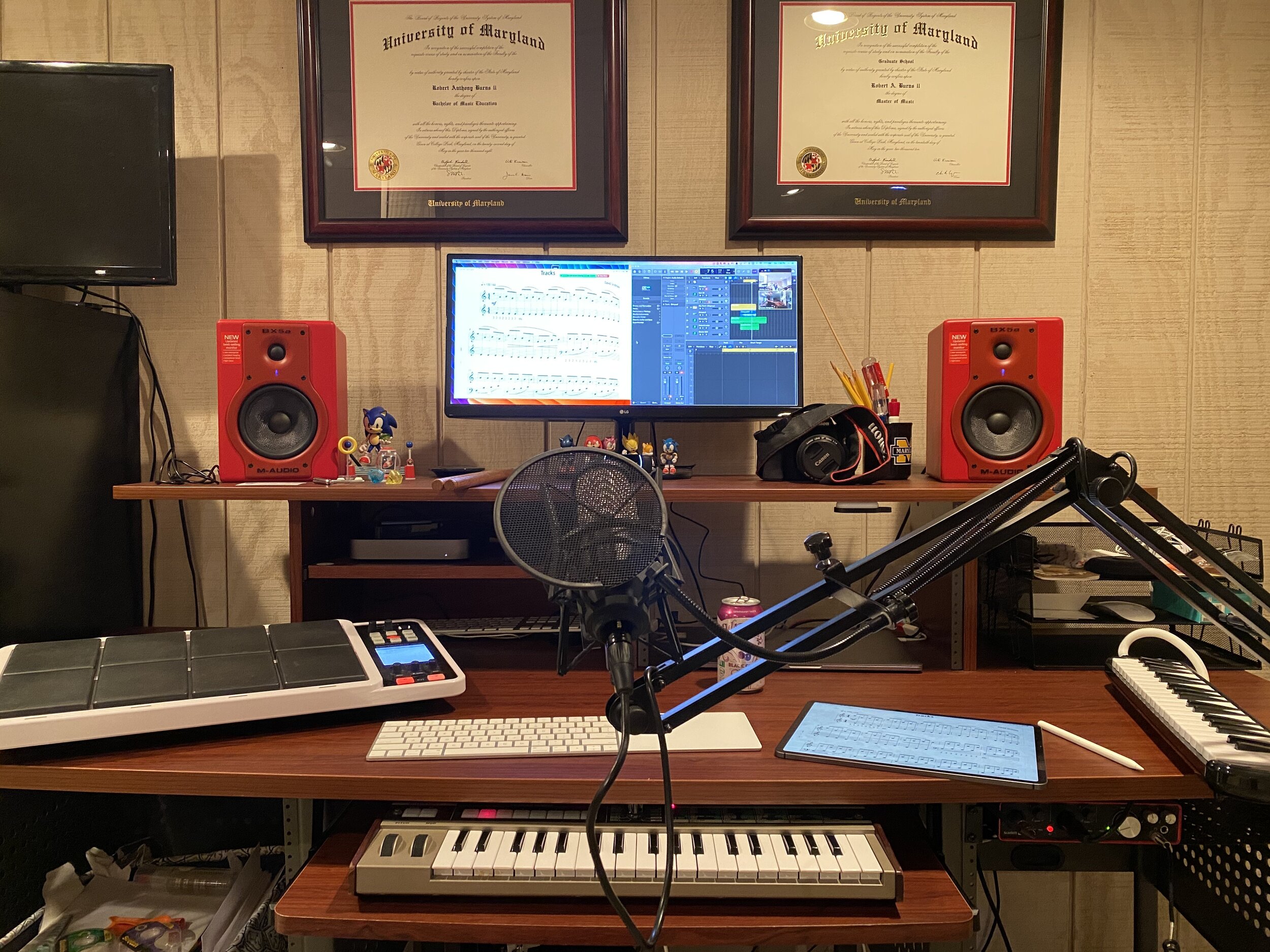
My studio computer and associated hardware.

My studio computer and associated hardware.

When school let out in March, I wrote My Very Straightforward and Very Successful Setup for Teaching Virtual Private Lessons. The impetus for this post, and its snarky title, was an overwhelming number of teachers I saw on Facebook fussing about what apps and hardware they should use to teach online when all you really need is a smartphone, FaceTime, and maybe a tripod.

I stand by that post. But there are also reasons to go high-tech. I have had a lot of time this summer to reflect on the coming fall teaching semester. I have been experimenting with software and hardware solutions that are going to make my classes way more engaging.

Zoom

I have been hesitant about Zoom. I still have reservations about their software. Yet, it is hard to resist how customizable their desktop version is. I will be using Google Meet for my public school classes in September, but for my private lessons, I have been taking advantage of Zoom’s detailed features and settings.

For example, it’s easier to manage audio ins and outs. Right from the chat window, I can change if my voice input is going through my Mac's internal microphone or my studio microphone, or if video is coming from my laptop webcam or my external Logitech webcam. This will also be useful for routing audio from apps into the call (we will get to that in a moment).

Zoom allows you to choose the audio/video input from right within the call.

Zoom allows you to choose the audio/video input from right within the call.

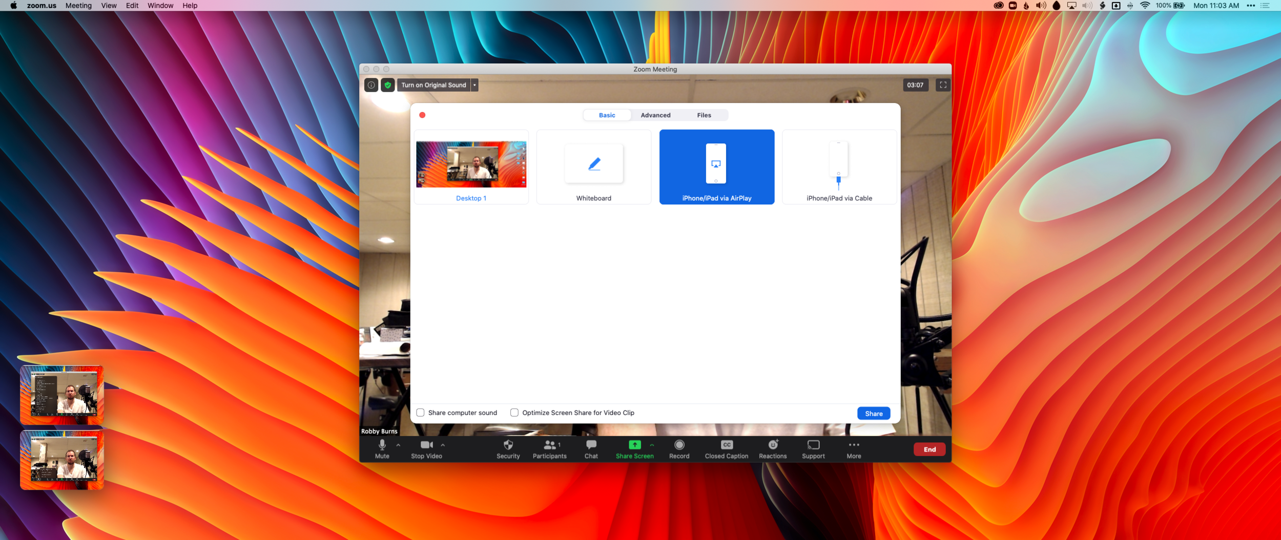
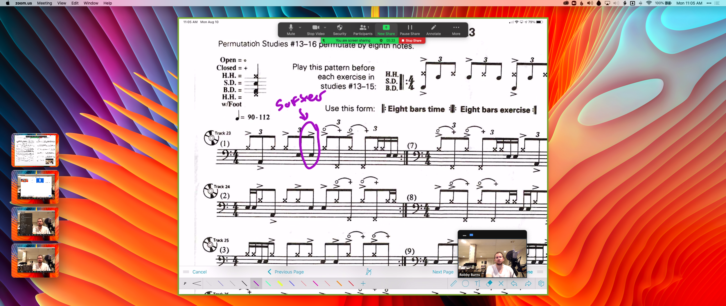
Zoom also allows you to AirPlay the screen of an iOS device to the student as a screen sharing option. This is the main reason I have been experimenting with Zoom. Providing musical feedback is challenging over an internet-connected video call. Speaking slowly helps to convey thoughts accurately, but it helps a lot more when I say “start at measure 32” and the student sees me circle the spot I want them to start in the music, right on their phone.

You can get really detailed by zooming in and out of scores and annotating as little as a single note. If you are wondering, I am doing all of this on a 12.9 inch iPad Pro with Apple Pencil, using the forScore app. A tight feedback loop of “student performance—>teacher feedback—>student adjustment” is so important to good teaching, and a lot of it is lost during online lessons. It helps to get some of it back through the clarity and engagement of annotated sheet music.

Selecting AirPlay as a screen sharing option.

Selecting AirPlay as a screen sharing option.

AirPlaying annotated sheet music to the Zoom call using the iPad Pro and forScore app.

AirPlaying annotated sheet music to the Zoom call using the iPad Pro and forScore app.

As much as I love this, I still think Zoom is pretty student hostile, particularly with the audio settings. Computers already try to normalize audio by taking extreme louds and compressing them. Given that my private lessons are on percussion instruments, this is very bad. Zoom is the worst at it of all the video apps I have used. To make it better, you have to turn on an option in the audio settings called “Use Original Audio” so that the host hears the student’s raw sound, not Zoom’s attempt to even it out. Some of my students report that they have to re-choose this option in the “Meeting Settings” of each new Zoom call.

If this experiment turns out to be worth it for the sheet music streaming, I will deal with it. But this is one of the reasons why I have been using simple apps like FaceTime up until this point.

My Zoom audio settings.

My Zoom audio settings.

My Zoom advanced audio settings.

My Zoom advanced audio settings.

Sending App Audio Directly to the Call

I have been experimenting with a few apps by Rogue Amoeba that give me more control over how audio is flowing throughout my hardware and software.

Last Spring, I would often play my public school students YouTube videos, concert band recordings from Apple Music, and warm-up play-alongs that were embedded in Keynote slides. I was achieving this by having the sound of these sources come out of my computer speakers and right back into the microphone of my laptop. It actually works. But not for everyone. And not well.

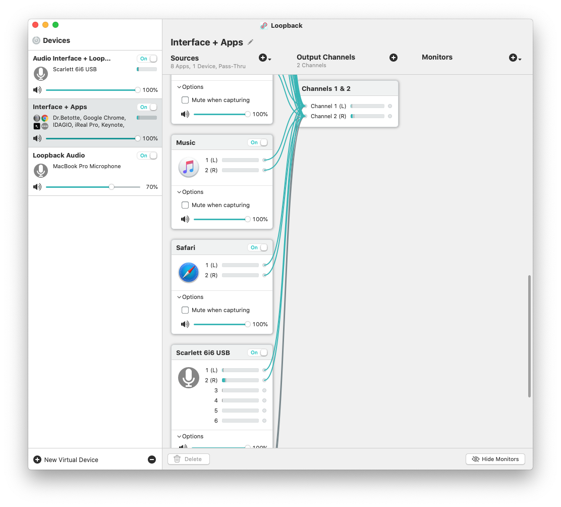
Loopback is an app by Rogue Amoeba that allows you to combine the audio input and output of your various microphones, speakers, and apps, into new single audio devices that can be recognized by the system. I wrote about it here. My current set up includes a new audio device I created with Loopback which combines my audio interface and a bunch of frequently used audio apps into one. The resulting device is called Interface+Apps. If I select it as the input in my computer’s sound settings, then my students hear those apps and any microphone plugged into my audio interface directly. The audio quality of my apps is therefore more pure and direct, and there is no risk of getting an echo or feedback effect from my microphone picking up my computer speaker’s sound.

A Loopback device I created which combines the audio output of many apps with my audio interface into a new, compound device called “Interface+Apps.”

A Loopback device I created which combines the audio output of many apps with my audio interface into a new, compound device called “Interface+Apps.”

I can select this compound device from my Mac’s Sound settings.

I can select this compound device from my Mac’s Sound settings.

Now I can do the following with a much higher level of quality...

  • Run a play-along band track and have a private student drum along
  • Play examples of professional bands for my band class on YouTube
  • Run Keynote slides that contain beats, tuning drones, and other play-along/reference tracks
  • and...

Logic Pro X

Logic Pro X is one of my apps routing through to the call via Loopback. I have a MIDI keyboard plugged into my audio interface and a Roland Octopad electronic drum pad that is plugged in as an audio source (though it can be used as a MIDI source too).

The sounds on the Roland Octopad are pretty authentic. I have hi-hat and bass drum foot pedal triggers so I can play it naturally. So in Logic, I start with an audio track that is monitoring the Octopad, and a software instrument track that is set to a piano (or marimba or xylophone, whatever is relevant). This way, I can model drum set or mallet parts for students quickly without leaving my desk. The audio I produce in Logic is routed through Loopback directly into the call. My students say the drum set, in particular, sounds way better in some instances than the quality of real instruments over internet-connected calls. Isn’t that something...

Multiple Camera Angles

Obviously, there is a reason I have previously recommended a set up as simple as a smartphone and a tripod stand. Smartphones are very portable and convenient. And simple smartphone apps like FaceTime and Google Duo make a lot of good default choices about how to handle audio without the fiddly settings some of the more established “voice conference” platforms are known for.

Furthermore, I can’t pick up my desk and move it to my timpani or marimba if I need to model something. So I have begun experimenting with multiple camera angles. I bought a webcam back in March (it finally just shipped). I can use this as a secondary camera to my laptop’s camera (Command+Shift+N in Zoom to change cameras).

Alternatively, I can share my iPhone screen via AirPlay and turn on the camera app. Now I can get up from my desk and go wherever I need to. The student sees me wherever I go. This option is sometimes laggy.

Alternatively, I can log in to the call separately on the iPhone and Mac. This way, there are two instances of me, and if I need to, I can mute the studio desk microphone, and use the phone microphone so that students can hear me wherever I go. I like this option the best because it has the added benefit of showing me what meeting participants see in Zoom.

Logging in to the Zoom call on the Mac and iPhone gives me two different camera angles.

Logging in to the Zoom call on the Mac and iPhone gives me two different camera angles.

SoundSource

This process works well once it is set up. But it does take some fiddling around with audio ins and outs to get it right. SoundSource is another app by Rogue Amoeba that takes some of the fiddly-ness out of the equation. It replaces the sound options in your Mac’s menubar, offering your more control and more ease at the same time.

This app is seriously great.

This app is seriously great.

This app saved me from digging into the audio settings of my computer numerous times. In addition to putting audio device selection at a more surface level, it also lets you control the individual volume level of each app, apply audio effects to your apps, and more. One thing I do with it regularly is turn down the volume of just the Zoom app when my students play xylophone.

Rogue Amoeba's apps will cost you, but they are worth it for those who want more audio control on the Mac. Make sure you take advantage of their educator discount.

EDIT: My teaching set up now includes the use of OBS and an Elago Stream Deck. Read more here.

Conclusion

I went a little overboard here. If this is overwhelming to you, don't get the idea that you need to do it all. Anyone of these tweaks will advance your setup and teaching.

This post is not specific about the hardware I use. If you care about the brands and models of my gear, check out My Favorite Technology to read more about the specific audio equipment in my setup.

First Impressions of StaffPad for iPadOS

D267D672-6E06-48AD-A014-FA4FA819A63A.png

Introduction

I remember seeing the introduction of StaffPad for Windows Surface tablets back in 2015. Applications that convert handwriting to music notation were not widespread yet and I was absolutely shocked by the demo videos.

My amazement was immediately followed by frustration when I leaned this was a Windows only product. It was a tough pill to swallow, but I understood. The iPad was (and is) widely held as a superior tablet for consumer and professional use, but iOS did not have proper stylus support at the time. There were only third party options, and none of them leveraged the operating system for the level of accuracy that the Apple Pencil now provides.

When the iPad Pro launched months later, I thought "surely StaffPad will now be possible." Turns out I was right. Though it has taken many years, the StaffPad team has been hard at work, and the product is now available for iOS.

I have been beta testing StaffPad for the past month. I consider myself to be testing it largely from the perspective of a music educator, specifically a middle school band director, which means that I am doing things like...

  • Reconstructing missing flute parts from my music library using the original score

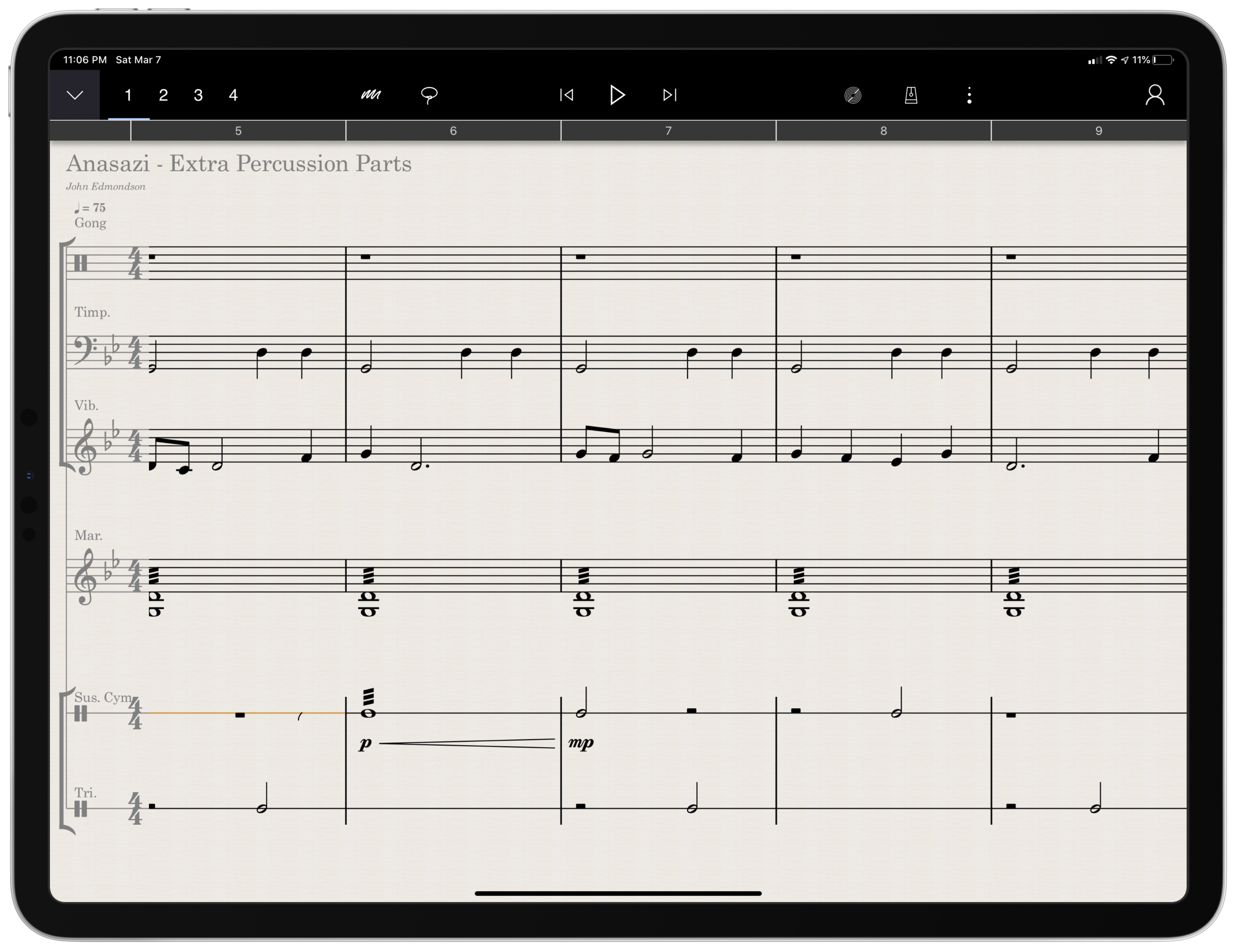
  • Arranging extra percussion parts for works that are sparse in percussion writing

  • Writing short folk melodies to use in our sectional curriculum

...pretty basic stuff. If you want a very balanced and comprehensive review of all the StaffPad features, not just the ones I depended on, I strongly recommend you check out the Scoring Notes review by David MacDonald.


TL;DR: If you want to skip this review, I'll get to the point:

StaffPad is an exceptional tool for music educators. It is elegantly designed, astoundingly intuitive, and makes exactly the right trade-off for what a teacher would and would not need in a pro-level score editor. It is a best-of-class example of what a professional 'iPad-first' app should look like. It legitimizes the platform by being a tool that executes tasks that no other computing device can.

While I believe StaffPad near-perfectly conceived, it's hand writing recognition is a headache to use at times, and it needs to improve a lot in this area for me to consider it rock-solid-dependable. Fortunately, I got better at it as I wrote this review.

Ok, let's get to it.

UPDATE: I spoke at length about my experiences using StaffPad on my pocast. Listen and subscribe below.


Design and Features

The design of StaffPad is one of the most impressive I have ever seen. It is undeniably professional, but maintains the elegance and simplicity you would expect if you are familiar with Apple’s native iOS apps. It manages not to be overbearing with buttons and knobs, yet none of the tools seem too far away or too many menus deep.

Let's look at the home page.

00E3D8A8-8961-424F-9A1D-C02F96F54A0A.png

Everything is beautifully laid out in a way where my eyes naturally gravitate towards the information relevant to me. There isn’t any information on this screen that doesn’t need to be.

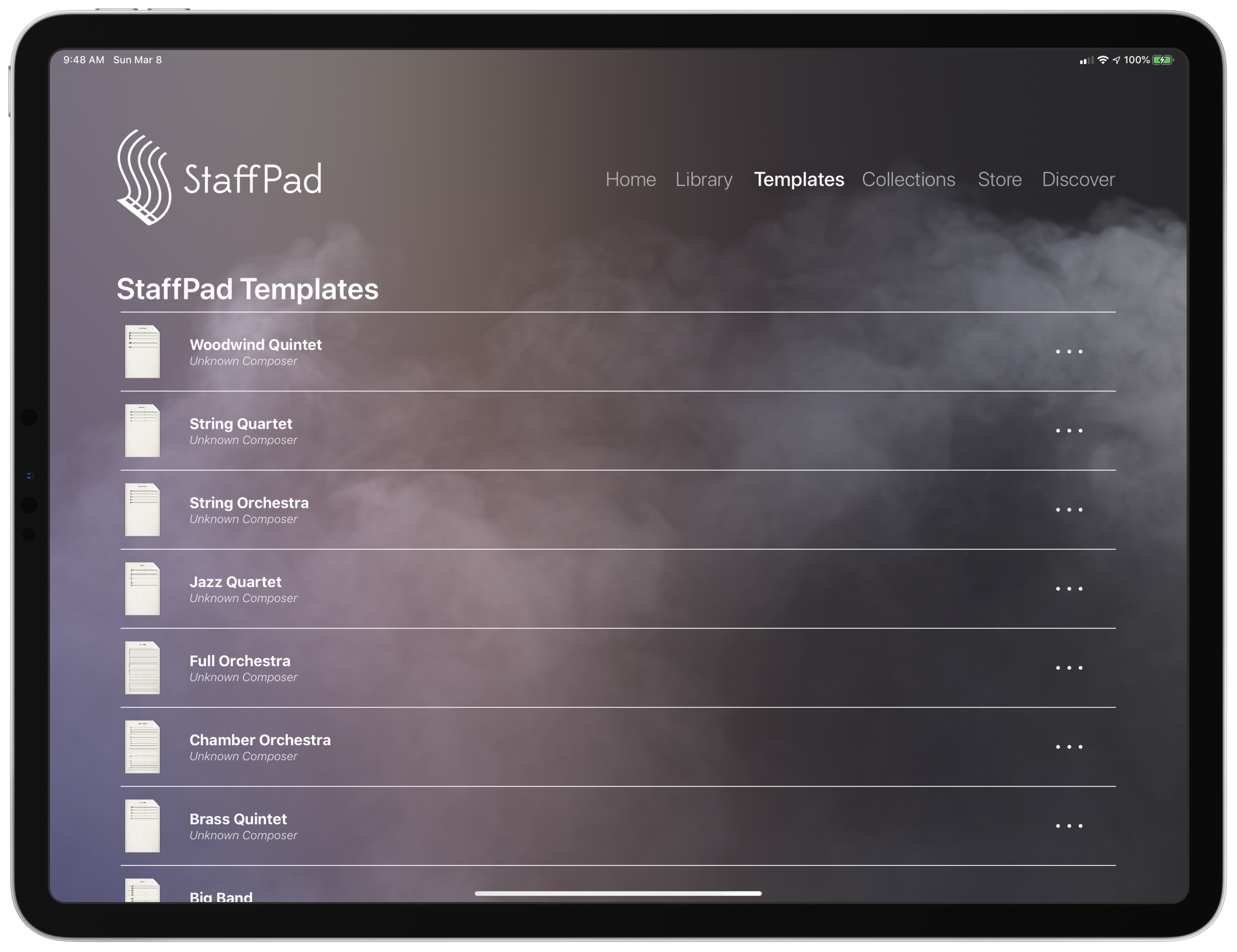
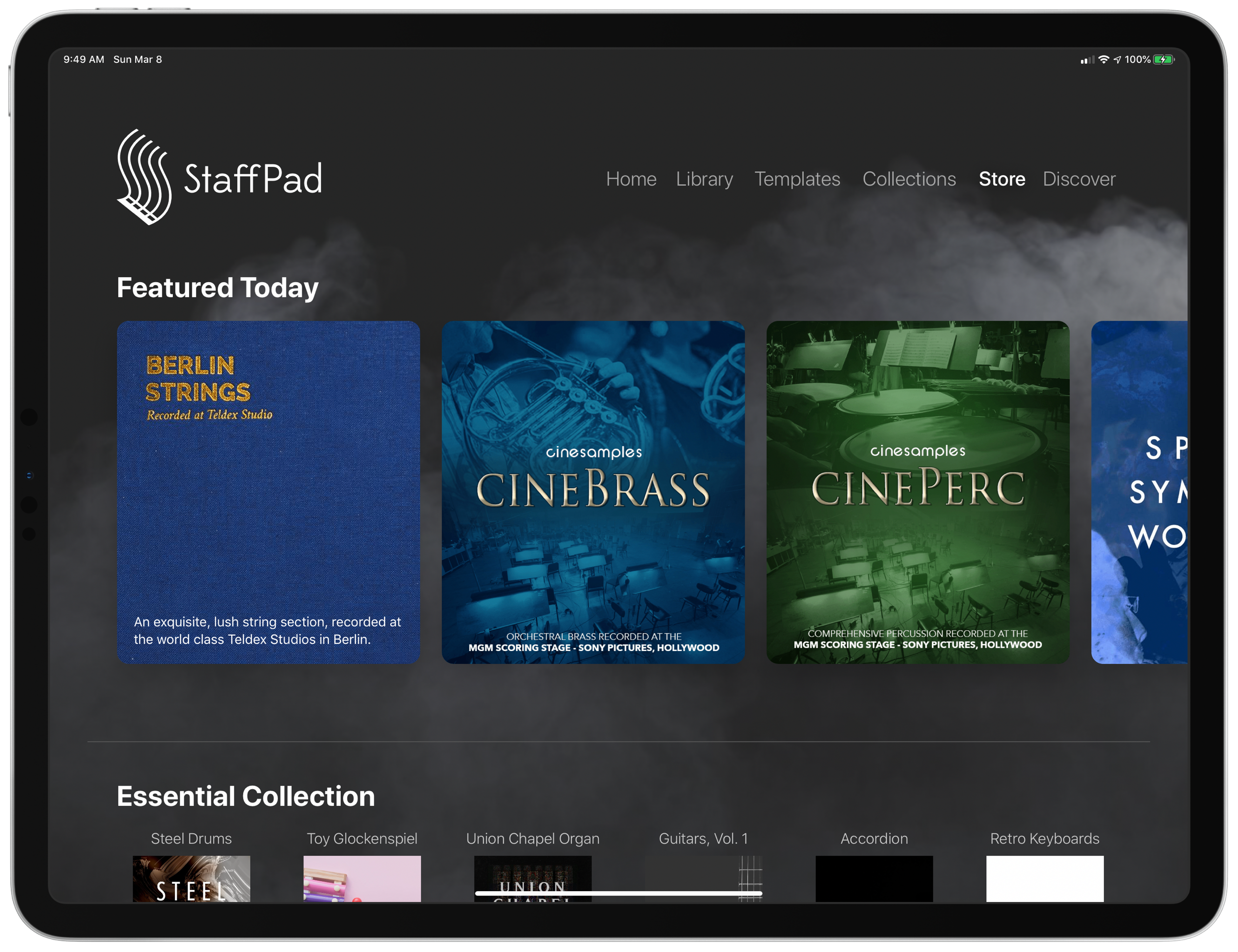
Home shows just recent documents, Library shows all of your stuff, templates shows the customary templates you would expect from a score editor, and Collections shows some pre-made StaffPad scores designed to show off the sound library. I appreciate how the Templates page is not bogged down with dozens of rare options like Mariachi Band.

5E51B601-73A3-488C-9555-5ACFFB719C57.png

The Store button takes you to a screen where you can buy sound libraries and other extensions. More on that later. Discover takes you to some helpful introduction videos.

I am going to get into note input in a bit. Before that, I want to pontificate the nature of writing notes with a pencil  on a touch surface.

At launch, the iPad made a promise to simplify computing for every person, allowing you to touch directly what you want to do on the screen and removing the abstraction of pointing and clicking, the preferred interface of personal computers for decades.

John Gruber, amongst other Apple commentators, have recently had a lot to say about the original promise of the iPad; about how it has maybe lost its way as it has tried to become more like the Mac, introducing inscrutable multitasking gestures and imitating professional PC software rather than leveraging the strengths of a touch interface. There is a great conversation about it on his podcast, which makes special reference to how revolutionary the original GarageBand app was for iPad.

I mention all of that here because I think StaffPad perfectly fulfills that original iPad promise. Writing notes directly on the screen really is the way to write music, as it removes all abstractions and lets you just touch where you want things to go. It also exists in a category of rare, niche, and professional iPad apps that a) cost real money, and b) could not really exist on a Mac. I already wrote about this a little bit here.

So what features exactly does StaffPad have? If you want an exhaustive list, check out StaffPad's help page. It is very detailed and straightforward.

Though StaffPad’s website has a great introduction video, the help page lists everything StaffPad can do in a concise manner.

Though StaffPad’s website has a great introduction video, the help page lists everything StaffPad can do in a concise manner.

If you need specialty engraving features and every editing feature money can buy, you need Dorico or Sibelius (but choose Dorico). If you need a sketch app for music notation, that can make 90% of your score needs come true from the comfort of your couch, StaffPad has you covered.

There are trade-offs. But for my basic purposes, they are just the right trade-offs. For a handwritten sketch app, StaffPad strikes exactly the right balance of what it does and what it doesn't do, especially considering the quality of the resulting scores. There aren't a lot of ways to customize your score's layout, but StaffPad makes really good default choices about how to stylize the final product.

I appreciate that everything StaffPad does is very discoverable and not buried too many layers deep. Most things, you can just write directly on the screen with the pencil (though I had a lot of trouble with articulation, and especially with dynamics). StaffPad attempts to solve the problem of organizing features by using what I call a "double tool bar." I am sure they have a technical name for it. Basically, the tool bar shows one set of tools, and when you tap the upward or downward facing arrow on the upper left corner of the screen, it shows another set of tools.

If I knew the logic behind how StaffPad has organized these tools, I would probably be able to find them better, but because the options are selectable from two sides of the same toolbar, I often get confused which "side" of it I need to be on to get what I want. At least changing it over is only a tap away. 

One side of the tool bar has buttons which contains the following...

09DBBA1C-4EE3-44E8-86D3-0927C3BCCD64.jpeg

Play, pause, forward, backward buttons.

Button to trigger Reader mode.

Button to toggle a metronome.

Options to change the voice (of which there are four).

Button to toggle an annotation mode. This mode allows you to scribble freely on your score and highlight certain sections. This mode is necessary because regular strokes draw notes on the staff by default. I can’t think of any standard notation editor that allows freeform annotations with a stylus since most of them are not designed for a tablet.

A loop tool. This tool is great but buggy. It does what you would expect. It allows you to circle a section of music and then copy, paste, or duplicate it. This is a nice way to solve the problem of there being no keyboard shortcuts for selection, copy, and paste, in the app. Sometimes StaffPad crashes when I use it.

The famous three-dots button. (which in most apps means "more") This button takes you to most of the notations that you cannot write on the staff directly with the Apple Pencil - trills, fermatas, rehearsal markings, etc. This button is so frequently accessed that I kind of wish it showed up on both sides of the tool bar. Furthermore, it would be great to be able to edit the order the options appear, rather than scrolling to the right every time I need a rehearsal marking.

Fenby. - a digital assistant that you can talk to. Fenby is wicked cool. Similar to digital assistants like Siri, however, it works really well only when it works. I got used to telling it to "add strings" or "transpose" the score, but there are other commands listed on the StaffPad website that I could not get to work.

The other side of the tool bar includes buttons for...

9464F57E-2EB6-41C5-AAA5-8EC4DA8C8363.jpeg

Undo and redo buttons. Which, again, are so commonly needed that I wish they showed up on both sides of the tool bar. You can use the new text gestures introduced with iOS 13 to three finger pinch (copy), three finger spread (paste), three finger swipe left (undo) and three finger swipe right (redo). Once you get the hang of these, you really start to fly.

Also, a bonus note (and my favorite take away from Paul Shimmons' StaffPad review): copying a selection of music in StaffPad, and pasting it into another app results in a beautifully formatted score excerpt. It’s nice touches like this that make StaffPad a delight to work with.

Copy and paste using the new three finger gestures in iOS 13 is very natural. 

Button add/remove instruments. This screen is super elegant and I love it.

Automation layer. You can actually draw your automations right onto each stave with the pencil. It is too bad this is a feature I will not use that much, because the implementation is really slick. I hope that all iOS DAWS consider adding Apple Pencil support for automation layers.

Button to toggle transposing vs. non transposing score.

Playback buttons. Again, these are on both sides of the toolbar but I use them far less often than some of the other options.

Button to access version history.

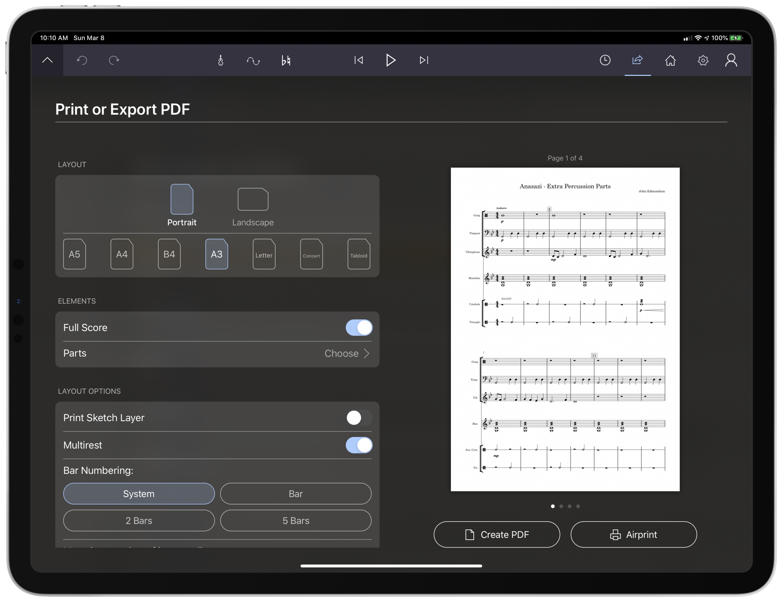
Share button. The share menu is ridiculously elegant and straightforward. It has all of the export options you would want, and appears very clean. My only complaint is that it does not work the way standard iOS share buttons work where once you share something, the share menu is no longer active. In StaffPad, it is more of a "mode" that you enter in to. I don't prefer this, but it is also not the end of the world. 

39DCD105-6951-40F9-8971-9A31DE56E1CA.png

Home button to go to the main screen.

Settings button. This screen is really straightforward and easy on the eyes. This is the one case where I do wish StaffPad would add more options. The screen is designed nicely enough that I would not mind scrolling downward for more options.

For example, I would like to be able to customize the tool bar or choose for the Apple Pencil's double tap gesture to do something other than initiate a lasso select.

Fenby. I do not think this feature is useful enough to put on both tool bars.

Note input

Ok so here’s where the rubber meets the road. StaffPad only accepts note input through the Apple Pencil. I have written about this elsewhere. I would love for StaffPad, like Notion, to have a Mac counterpart. But it’s not designed that way. Because Windows operates on a tablet, Surface users of StaffPad do not need to distinguish between tablet and PC operating systems. StaffPad runs on Windows, period. macOS is a different operating system than iPadOS, so there is no way I can run StaffPad on my Mac.

Interestingly, the main PC score apps, Dorico, Sibelius, and Finale, have made no attempts at an iPad app. I find that we are in this weird fragmented stage with Apple software where nearly any productivity app (I am thinking iWork, the Omni apps, even now Photoshop) can run on any Apple platform and even sync your work between devices, meanwhile niche pro apps still tend to exist on only one platform (Pro Tools/Ableton on the Mac and forScore/StaffPad for the iPad for example). These niche pro apps take unique advantage of platform conventions (the ability to work with complex audio streams in the case of DAWS on the Mac, and the Apple Pencil in the case of iPad).

Maybe its for the best. But I can’t help but feel like StaffPad would be superior if I could snap my iPad into the Smart Keyboard Folio and enter notes from there, or boot up a Mac version and enter notes with a MIDI keyboard..

Because I can’t do that, it is imperative that StaffPad’s handwriting recognition is air tight.

Simply put: it doesn’t register for me all the time. While I am getting better at it after a month of practice, it has a way to go. Sometimes I write really messy and get surprisingly great results on first pass. Other times, I write as slowly and neatly as I can and StaffPad doesn’t convert the notation.

Fortunately, StaffPad’s rules for notation conversion are very thoughtfully considered. Unlike Notion, notes do not convert until I tap somewhere outside the current measure I am composing. This means I can stop and think as long as I want before moving on. StaffPad also leaves anything that it doesn’t recognize in my own handwriting while converting the rest. This means I do not have to worry about an ambiguous pencil stroke being converted into StaffPad’s best guess, and I can go back and fix it later. Speaking of fixing things later, there isn’t a need to be too careful, because notes that end up a line or a space to high or low can be held with the pencil tip and dragged wherever you want on the staff.

This video shows off the design, features, and note input of StaffPad in action. 

StaffPad’s design ingenuity continues to shines in the details. You are allowed to write whatever you want in a bar, regardless of if it fits in the time signature or not. StaffPad also allows you to drag the bar line to the right with the pencil if you run out of room. These considerations work well for my brain, because there is less cognitive overhead. I feel like I am writing with a pencil and paper, not a computer.

Still, there are times that I  have to try numerous attempts before achieving success. The StaffPad support team recommended that I do notes in one pass, articulations in another, and dynamics in yet another, until I gain confidence with the system. They also recommended that I try to write the notes at approximately the size they will appear once converted. This advise helped but I am still making more mistakes than I would like.

My wife is a professional artist. She uses the iPad Pro to do illustrations and design mock ups. In other words, she has way better control of a pencil than I do. I asked her to spend some time writing various different musical symbols, at varying speeds and sizes. She, too, was perplexed at which of her pencil strokes worked and which ones didn’t.

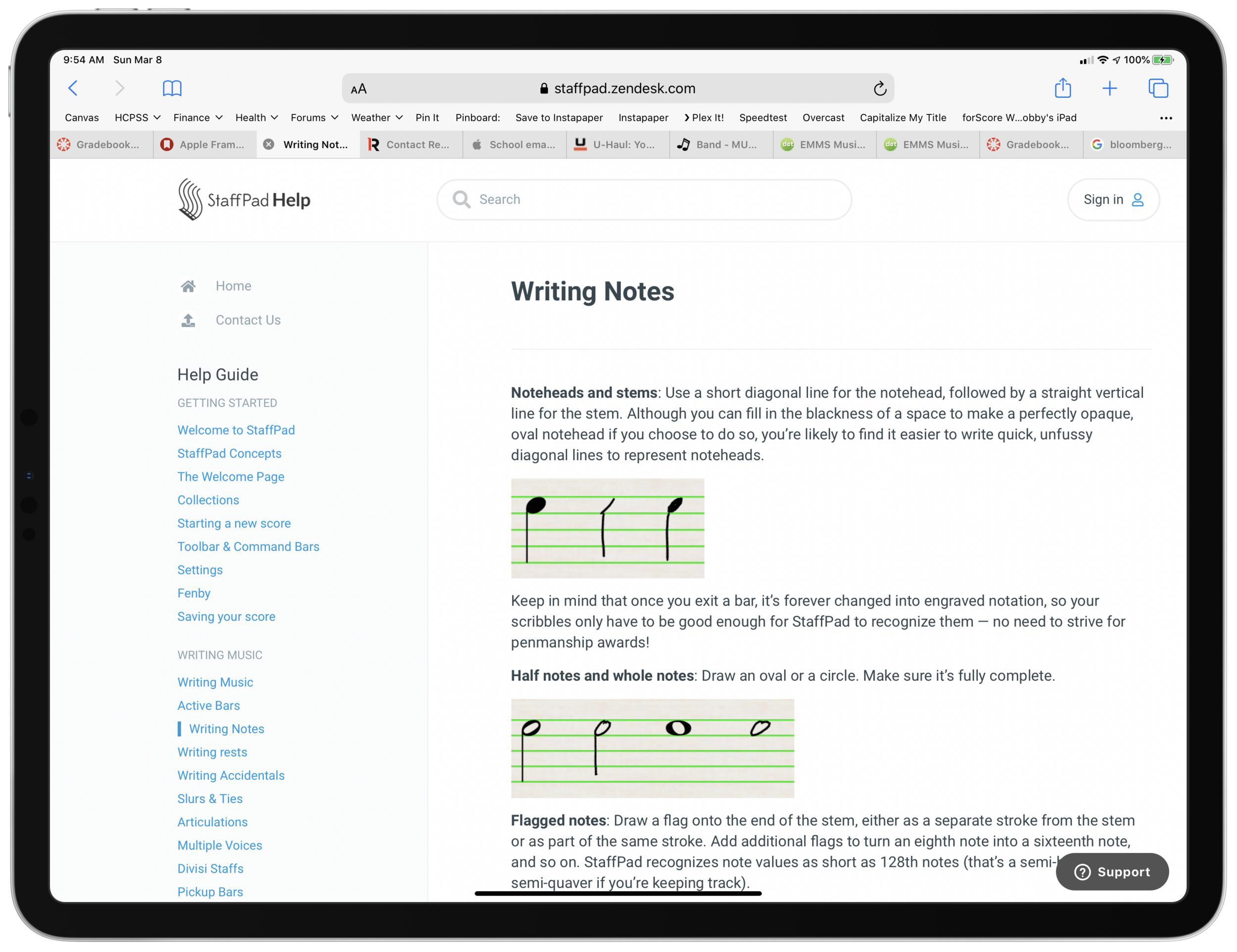
StaffPad’s help documentation (again, excellent) makes it look really easy. The examples of handwriting are really loose. As a percussionist who detests how other score programs handle drum set notation, I would love to be able to write drum parts as easily as the support documentation illustrates. No matter how hard I try to imitate it, I am getting inconsistent results enough so that I am reluctant to try these features again in the future.

While I am reflecting on note input, I need to acknowledge that StaffPad has, by far, the best implementation of erasing that I have ever seen for the Apple Pencil. There is no double-tap, or need to tap a button on screen to turn on the eraser. You simple press harder! It takes a little getting used to, and it is easy to press too hard when attempting to compose and erasing by mistake. But overall, I wish all apps would adopt this style. It is truly a dream.

Most of my testing for StaffPad included preparing for my recent band concerts. My Concert Band has 10 percussionists and some of my music had only three or four parts. I also have some flutes in my Jazz Band this year, and planned some repertoire that does not have original flute parts. Arranging these additional parts took place while I was on leave for the birth of my first child and was awaiting a return to school, where I would have only two weeks to prepare this concert before the performance date.

Headaches aside, the lightness and simplicity of StaffPad’s design, mixed with its direct note input, made this an indispensable tool for me in the past month. Projects that would have had more overhead using a heftier score editor like Dorico were a breeze using StaffPad and iOS. The iPad’s portability made it easy to sneak little additions to my work into busy days of carrying, holding, and feeding a newborn in one arm while sitting on the couch in my living room rather than at a desk.

Between pencil input and the tool bars mentioned above, there are a handful of features that are hidden beneath contextual menus that are achieved by long pressing on various places in the score. Long pressing in a measure allowed you to change the time or key signature. Long pressing on bar lines allows you to change their style or add measures to the music, add lyrics, text, or chords. These menus are very tastefully done, and as I have already mentioned, they have just enough features that they are confusing to dig through, but just enough that I was never wondering where something was. The lyrics and chords options are not as in depth as other score applications, but they were just right for my needs.

iOS-ness

There are features available to third party apps that I believe should be in every app. I was disappointed that StaffPad did not follow a few of these conventions.

Specifically, I wish StaffPad supported Split View. iPad apps can now share half the screen with another app. StaffPad only works in full screen.

This was frustrating for me, particularly in my arranging project mentioned earlier. I wanted to be able to open forScore on one half of the screen for a reference of the full score, and then compose in StaffPad on the other half of the screen. StaffPad customer support informs me that they experienced weird multi-touch results when StaffPad was on half of the screen and that it doesn’t work. But I would still like to see it happen.

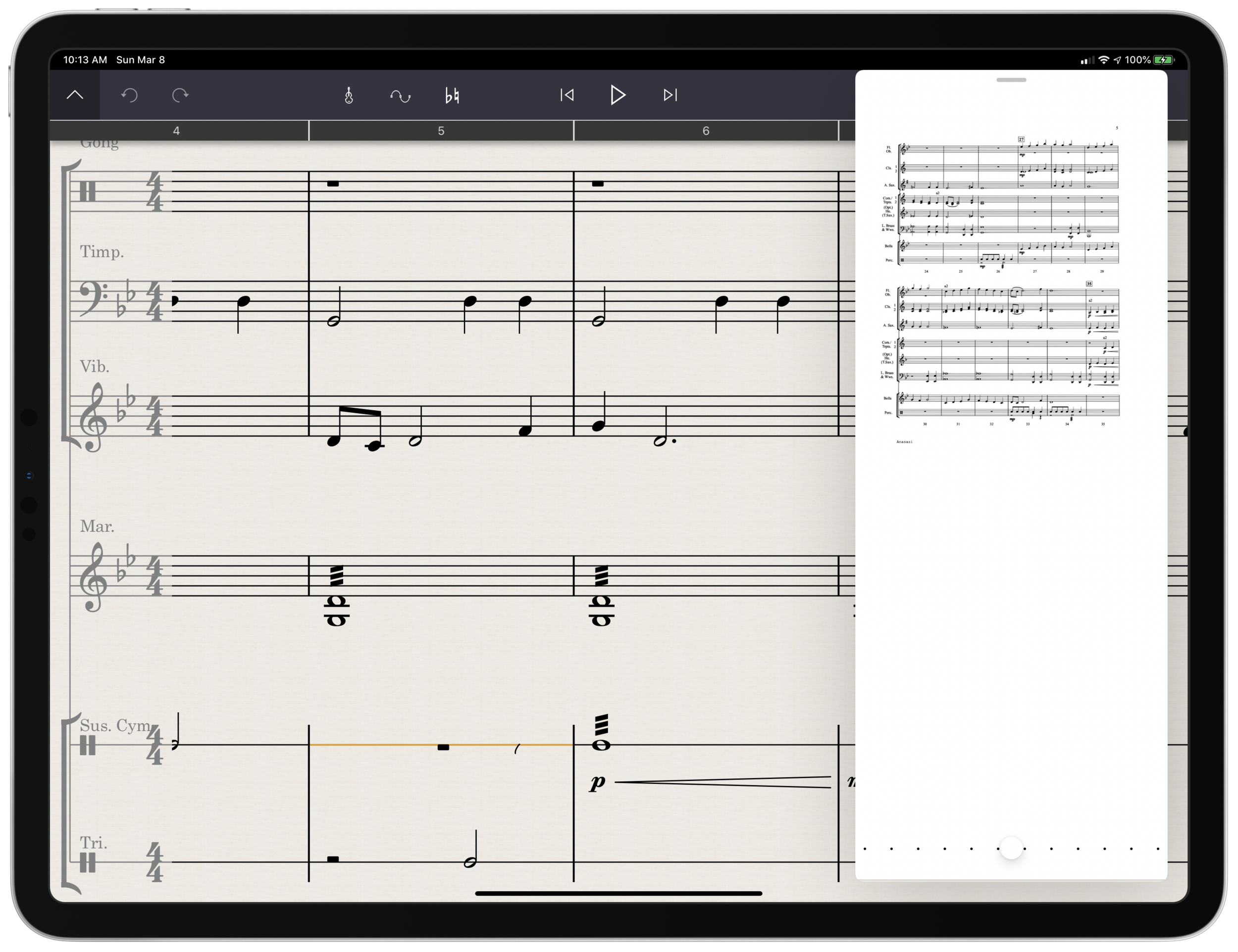
You can use other apps in slide over view, which is where you drag an iPhone-sized version of an app over top a full screen app for quick reference. You can see if the screenshot below that this is really too small to be tenable for score reference.

Referencing a score is awkward because StaffPad doesn’t support the iPad’s splitview feature.

Referencing a score is awkward because StaffPad doesn’t support the iPad’s splitview feature.

Playback 

Spitfire and cinesamples audio libraries, amongst others, are available as inn-app purchases. They sound fantastic! Given how seamlessly they work with StaffPad, it is astounding how easy it is to get good sounding playback. If only using advanced audio plugins with score apps was this easy on macOS and Windows.

That said, I am extremely hesitant about buying these plugins. These samples, once purchased, only work with StaffPad on iOS and cannot be used with any other program like they can be if you purchase the PC versions of these plugins directly from the companies that engineer them.

iVBORw0KGgoAAAANSUhEUgAAC50AAAjwCAYAAAAKgq9xAAAACXBIWXMAAAsTAAALEwEAmpwYAAAM-2.png

Conclusion

StaffPad is a unique composing application that leverages everything unique about the iPad to provide what I anticipate will be an indispensable tool for my work as a music educator. While the handwriting recognition doesn’t always work as I expect, it gets better with each update and also as I practice it.

StaffPad is elegantly designed and makes trade-offs that position it as perhaps the most natural score editor I have ever worked with. I am so glad that this app exists both as a tool for my professional work, and as a statement about what the iPad can be. I would recommend it to anyone who is looking for a score app that balances power and ease as long as they acknowledge that there is a learning curve and a price.

Want other opinions? Check out these reviews:

Scoring Notes: StaffPad wows with long-awaited iPad release and new free StaffPad Reader

Technology in Music Ed | Chris Russell: Working with StaffPad

iPadmusiced | Paul Shimmons: A Revolution and Turning of the Tide - Music Creation is Changing for the Better With StaffPad for iOS!

Favorites of 2018 - Things

These posts will never happen if I don’t make it fuss free. So here is it! With little introduction or fanfare, the ‘stuff’ that made up my year. My favorite albums, live shows, apps, and ‘things’ of 2018.

The final installment features the most tangible and miscellaneous. My favorite things! The stuff that didn’t fit into any other category but that brought me joy this year.

Things

Prepd Lunch Box

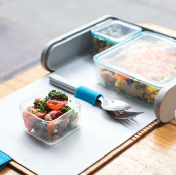
This modular lunchbox helps me to better plan my lunches throughout the week. After mass prepping on Sunday night, I slam all of my meals into a weeks worth of these containers and then easily swap them out at the end of each day. This lunchbox is slim enough to fit in my backpack. There is a companion app that has recipes for meals that easily fit into the containers.

Series 4 Apple Watch

Of all the Apple products I own, this is the one that I take the most delight in. My Series 4 watch has this new watch face that allows me to slam a ton of information onto it at a glance. My current version of it I call the 'status circle' watch face. It keeps track of my progress on activity, sleep, water intake, and tasks, while also helping me stay on top of alarms, timers, and calendar events.

Rx Bars

If you are what you eat, I am a coconut chocolate Rx Bar. These energy bars are delicious, and most importantly, they are substantial. I can sub one of these out for breakfast or have it as a late afternoon snack. It carries me through. And there are tons of delicious flavors, all made with a minimal list of natural ingredients.

Rx Bars come in diverse flavors.

Rx Bars come in diverse flavors.

The Prepd lunchbox.

The Prepd lunchbox.

Hidrate Spark Smart Water Bottle

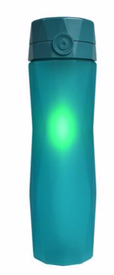
This water bottle reminds me when to drink. It automatically senses how much I drink and displays my progress on my Apple Watch. It even remembers the last location it was connected to my phone in the event that I loose it (like yesterday...) This water bottle is a big motivation for me to drink more water. I love it.

My Apple Watch Series 4, with my ‘status circle.’ watch face. When I am not taking screenshots at 2 am, the blue status ring on bottom represents the water I drink in the Hidrate Spark water bottle.

My Apple Watch Series 4, with my ‘status circle.’ watch face. When I am not taking screenshots at 2 am, the blue status ring on bottom represents the water I drink in the Hidrate Spark water bottle.

You read that last caption right! This water bottle automatically logs my water intake. And much much more.

You read that last caption right! This water bottle automatically logs my water intake. And much much more.

Ableton Live Hoodie

My wife got me this last Christmas and I love it. Everyone loves it. I feel a little bit phony wearing it because Ableton is not an app I use much anymore. But it carries with it the general spirit of an audio editor. And some bright colors! I am down with that.

Screen Shot 2019-01-01 at 1.28.05 PM.png

Nintendo Switch

Over a year into owning this thing and I am still amazed that I can play the latest Mario game the same way on an airplane that I can on my living room TV. Our latest craze is Overcooked 2. It’s the most addictive local multiplayer I have experienced in a long time.

Thrive Market

Thrive sells health food items in larger than normal quantities at discounted prices. As I continue to experiment with adjustments to my diet, this service is becoming my go to for essentials like nuts, cooking oils, fresh water fish, and more!

Territory

For busy teaching weeks (like a week where my music team puts on four concerts), it is hard to manage meal prep. For those weeks I turn to Territory. Territory makes healthy, delicious, meals that are pre-made and shipped straight to my front door. The amount of diet customization you can do with this service keeps me coming back for more. 

2018 iPad Pro

I also upgraded my iPad Pro this year and gave my old one to my wife. What is there to say? I really like this iPad. It makes the Apple Pencil feel like magic. I am still frustrated by the keyboard case, and iOS is still not an OS I can get all of my work done on. But somehow, the hardware improvements to this device (larger display, FaceID, inductive charging Apple Pencil) makes it a real delight to use.

It does not fundamentally change the way the iPad works. But it also does.

It does not fundamentally change the way the iPad works. But it also does.