Ableton introduced the Push 3 last month and it looks amazing. The MPE-enabled touch sensitivity features are huge improvements to what was already a very playable and expressive piece of hardware. I appreciate that Ableton is making this a standalone production device by building an audio interface into it. So many products in the “colorful grid of squares” category already are, and it makes sense that a device as powerful and loved as the Push goes in this direction.
Microtuner by Ableton
Ableton released a Microtuner recently. I have had a lot of fun playing around with it using these Scala files.
Microtuner by Ableton is a MIDI device that lets you import, edit, and generate microtonal scales. Load scale files, create custom scales, and morph between tunings in real time – all with polyphony, MPE, and Lead/Follow modes to sync your scales across instruments.
One of these days, I'd like to make more Scale Exercise Play-Along Tracks, and this tool very well might help me get the process done quicker.
Be sure to check out the demo songs in Ableton's blog post. Very cool.
#48 - Holiday Special 2021, featuring Will Kuhn, Craig McClellan, David MacDonald, and Jon Tippens
Friends of the show join to answer burning questions about music, education, and technology in 2021 (and beyond).
Patreon subscribers get some extra discussion about Dune and Foundation.
Subscribe to the Blog…
Subscribe to the Podcast in…
Apple Podcasts | Overcast | Castro | Spotify | RSS
Support Music Ed Tech Talk
Show Notes:
- David MacDonald, composer
- Scoring Notes - Will Kuhn
- Will Book 1 - Electronic Music School
- Will Book 2 - Interactive Composition
- The Class Nerd Podcast
- Jon's new song - Another Night
- Obsidian - a second brain for you, forever.
- Craft - Taking notes to the next level
- Craft episode of Music Ed Tech Talk --> #47 - Craft for Music Educators, with Dr. David MacDonald
- OBS Studio (Open Broadcaster Software)
- OBS Cam app
- How to set up and use a Focus on iPhone and iPad
- DJI Pocket 2 camera
- Slack - a new way to communicate with your team.
- Todoist
- Trello
- Muse meditation headband
- Kirk Franklin
- Robby's book - Digital Organization Tips for Music Teachers
- Hazel - Hazel watches whatever folders you tell it to, automatically organizing your files according to the rules you create.
- How to Organize Your Mac's Desktop with Stacks in macOS Mojave
- Add your Desktop and Documents files to iCloud Drive
- File Not Found, a generation that grew up with Google is forcing professors to rethink their lesson plans | The Verge
- I Gave My Mom a Crypto Wallet: A Simple Guide to NFTs, Blockchain and More | The Wall Street Journal
- Dyson cordless vacuum
- Pen Chalet
- iRobot Brava
- How Machines Learn - CPG Grey
- The Most Human Human: What Talking with Computers Teaches Us About What It Means to Be Alive
- Google is trying to make its image processing more inclusive
- iPad Mini
- Shure SM7B Cardioid Dynamic Vocal Microphone
- Elago Ring Light
- Ableton Push 2
- APC 40
- Instapaper - Save Anything. Read Anywhere.
- AirPods Max
- Tom Bihn Bags
- Tom Bihn Synik 30
- Tom Bihn Road Buddy Duffel 36
- Tom Bihn Parental Unit - Robby's bag for baby stuff
- Peloton Digital
- Headspace for Educators
- Will's car - Fiat Dino Spider (1967)
- Soda Stream Fizzy One Touch
- Matter - smart home alliance
- Teenage Engineering
- Playdate
- Apple VR AR Rumors - Bloomberg
- Soothe2 vocal processer
- Band in a Box
- iReal Pro
- Robby's play along tracks
- Pianoteq 7
- Loopback - cable-free audio routing for Mac
- OP1
- OPZ
- The Dirty Loops and Cory Wong - TURBO
- The Wheels on the Bus - Cocomelon
- Julius Eastman: Stay On It
- Sound Painting
- Animal Collective - My Girls
- One of a Kind | Vivo
- POWRIG 6" Elastic Cable Ties Bungee Cords Adjustable Cable Management Reusable - Red (10-pack)
- DEVONthink - Get Organized -- Unleash Your Creativity
- OmniFocus - Accomplish more every day
- The Verge - EMAILS shirt
- Loki
- Foundation
- Only Murders in the Building
- Doom Patrol
- Chillin Island
- The Expanse
- Animal Crossing
- The Breath of the Wild
- Overcooked 2
- Star Wars Squadrons
- Dark Souls
- Fortnight
- League of Legends
- Google Stadia
- The Plot Thickens by Turner Classic Movies
- Hit Parade
- Sound Expertise
- William Robin | musicologist
- Robot or Not
- Do By Friday
- Election Profit Makers
The 4-Hour Chef - The best steak recipe I have is in this book
Recent episodes of Music Ed Tech Talk that the guests have been on:
Album of the Year - Nate Smith: Kinfolk 2 | Stevie Wonder: Talking Book | Magdalena Bay: Murcurial World | John Mayer: Sob Rock | Cory Wong and Dirty Loops: Turbo
App of the Year - Obsidian | Fin Timer | OP-Z App | Pixelmator Photo | Molskine Actions
Tech Tip of the Year - Focus Modes (some discussion about how I am using these on episode 44 of this show) | camelcamelcamel.com | Use OBS for everything | Feedbin | Press and hold the spacebar on iOS to move your cursor around
Please don’t forget to rate the show and share it with others!
First Impressions of StaffPad for iPadOS
Introduction
I remember seeing the introduction of StaffPad for Windows Surface tablets back in 2015. Applications that convert handwriting to music notation were not widespread yet and I was absolutely shocked by the demo videos.
My amazement was immediately followed by frustration when I leaned this was a Windows only product. It was a tough pill to swallow, but I understood. The iPad was (and is) widely held as a superior tablet for consumer and professional use, but iOS did not have proper stylus support at the time. There were only third party options, and none of them leveraged the operating system for the level of accuracy that the Apple Pencil now provides.
When the iPad Pro launched months later, I thought "surely StaffPad will now be possible." Turns out I was right. Though it has taken many years, the StaffPad team has been hard at work, and the product is now available for iOS.
I have been beta testing StaffPad for the past month. I consider myself to be testing it largely from the perspective of a music educator, specifically a middle school band director, which means that I am doing things like...
Reconstructing missing flute parts from my music library using the original score
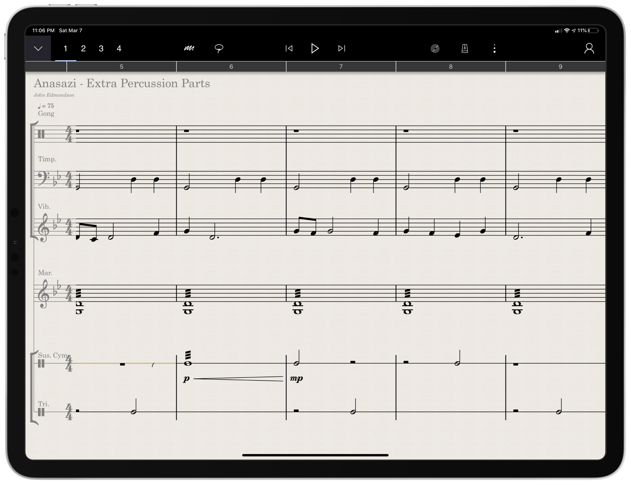
Arranging extra percussion parts for works that are sparse in percussion writing
Writing short folk melodies to use in our sectional curriculum
...pretty basic stuff. If you want a very balanced and comprehensive review of all the StaffPad features, not just the ones I depended on, I strongly recommend you check out the Scoring Notes review by David MacDonald.
TL;DR: If you want to skip this review, I'll get to the point:
StaffPad is an exceptional tool for music educators. It is elegantly designed, astoundingly intuitive, and makes exactly the right trade-off for what a teacher would and would not need in a pro-level score editor. It is a best-of-class example of what a professional 'iPad-first' app should look like. It legitimizes the platform by being a tool that executes tasks that no other computing device can.
While I believe StaffPad near-perfectly conceived, it's hand writing recognition is a headache to use at times, and it needs to improve a lot in this area for me to consider it rock-solid-dependable. Fortunately, I got better at it as I wrote this review.
Ok, let's get to it.
UPDATE: I spoke at length about my experiences using StaffPad on my pocast. Listen and subscribe below.
Design and Features
The design of StaffPad is one of the most impressive I have ever seen. It is undeniably professional, but maintains the elegance and simplicity you would expect if you are familiar with Apple’s native iOS apps. It manages not to be overbearing with buttons and knobs, yet none of the tools seem too far away or too many menus deep.
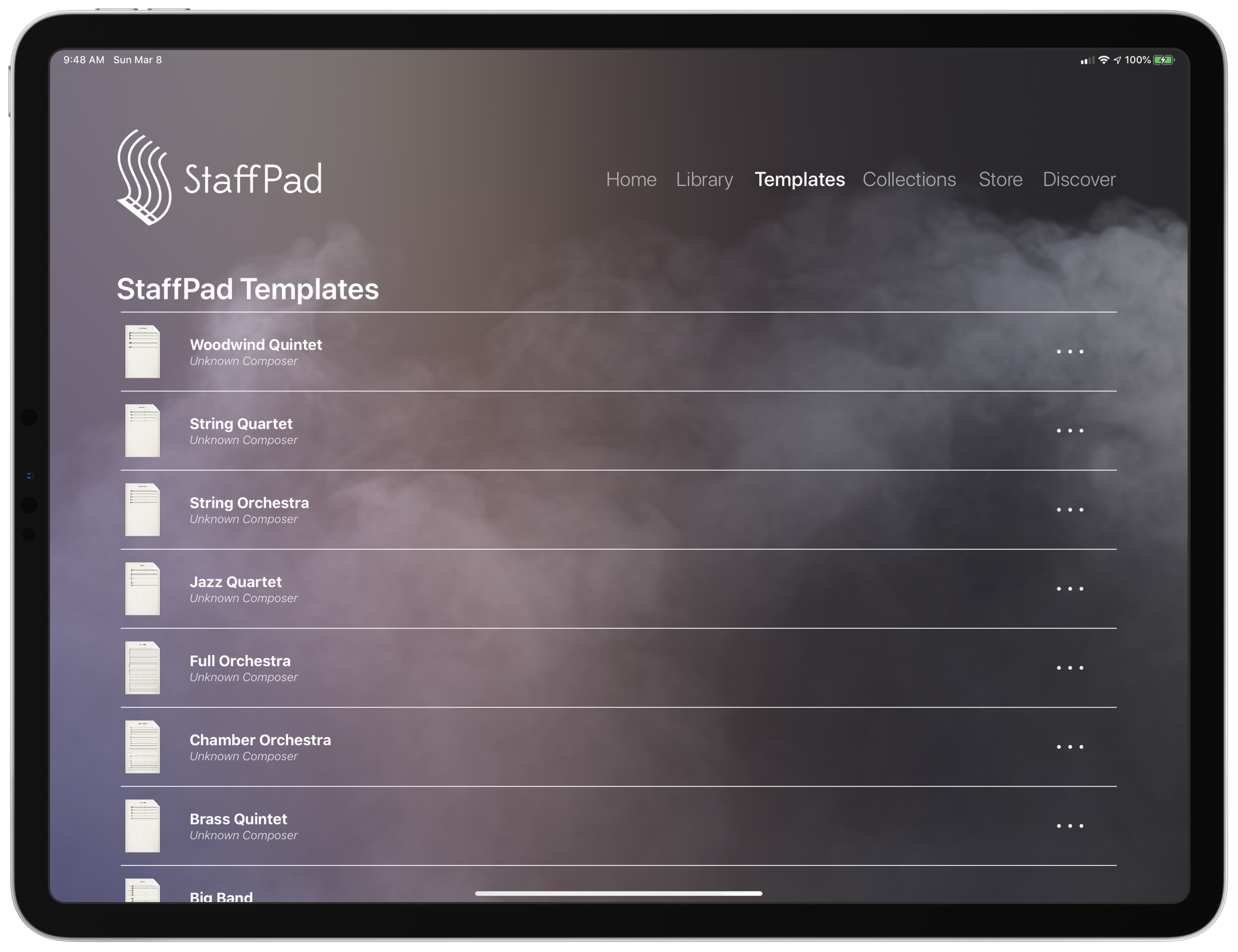
Let's look at the home page.
Everything is beautifully laid out in a way where my eyes naturally gravitate towards the information relevant to me. There isn’t any information on this screen that doesn’t need to be.
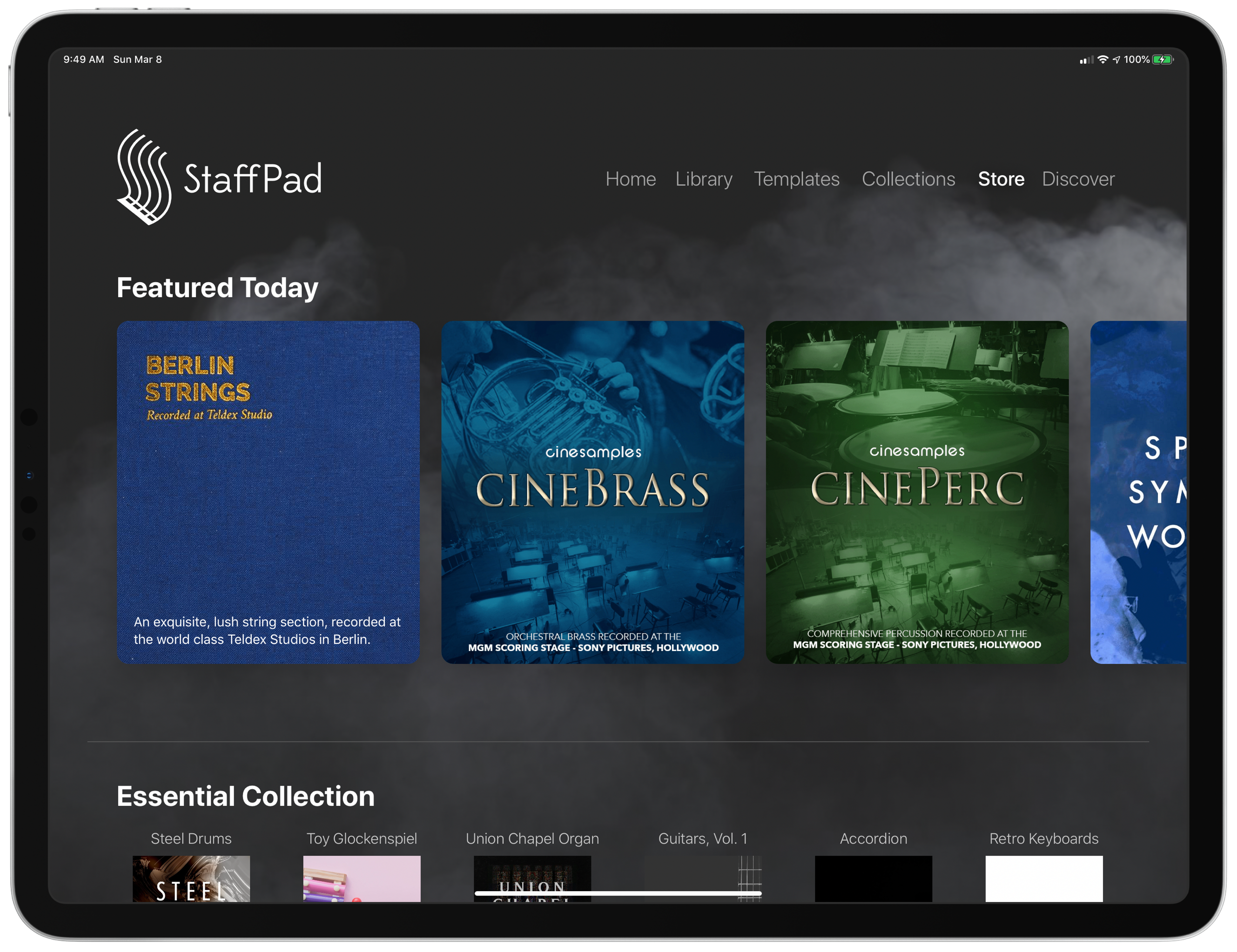
Home shows just recent documents, Library shows all of your stuff, templates shows the customary templates you would expect from a score editor, and Collections shows some pre-made StaffPad scores designed to show off the sound library. I appreciate how the Templates page is not bogged down with dozens of rare options like Mariachi Band.
The Store button takes you to a screen where you can buy sound libraries and other extensions. More on that later. Discover takes you to some helpful introduction videos.
I am going to get into note input in a bit. Before that, I want to pontificate the nature of writing notes with a pencil on a touch surface.
At launch, the iPad made a promise to simplify computing for every person, allowing you to touch directly what you want to do on the screen and removing the abstraction of pointing and clicking, the preferred interface of personal computers for decades.
John Gruber, amongst other Apple commentators, have recently had a lot to say about the original promise of the iPad; about how it has maybe lost its way as it has tried to become more like the Mac, introducing inscrutable multitasking gestures and imitating professional PC software rather than leveraging the strengths of a touch interface. There is a great conversation about it on his podcast, which makes special reference to how revolutionary the original GarageBand app was for iPad.
I mention all of that here because I think StaffPad perfectly fulfills that original iPad promise. Writing notes directly on the screen really is the way to write music, as it removes all abstractions and lets you just touch where you want things to go. It also exists in a category of rare, niche, and professional iPad apps that a) cost real money, and b) could not really exist on a Mac. I already wrote about this a little bit here.
So what features exactly does StaffPad have? If you want an exhaustive list, check out StaffPad's help page. It is very detailed and straightforward.
Though StaffPad’s website has a great introduction video, the help page lists everything StaffPad can do in a concise manner.
If you need specialty engraving features and every editing feature money can buy, you need Dorico or Sibelius (but choose Dorico). If you need a sketch app for music notation, that can make 90% of your score needs come true from the comfort of your couch, StaffPad has you covered.
There are trade-offs. But for my basic purposes, they are just the right trade-offs. For a handwritten sketch app, StaffPad strikes exactly the right balance of what it does and what it doesn't do, especially considering the quality of the resulting scores. There aren't a lot of ways to customize your score's layout, but StaffPad makes really good default choices about how to stylize the final product.
I appreciate that everything StaffPad does is very discoverable and not buried too many layers deep. Most things, you can just write directly on the screen with the pencil (though I had a lot of trouble with articulation, and especially with dynamics). StaffPad attempts to solve the problem of organizing features by using what I call a "double tool bar." I am sure they have a technical name for it. Basically, the tool bar shows one set of tools, and when you tap the upward or downward facing arrow on the upper left corner of the screen, it shows another set of tools.
If I knew the logic behind how StaffPad has organized these tools, I would probably be able to find them better, but because the options are selectable from two sides of the same toolbar, I often get confused which "side" of it I need to be on to get what I want. At least changing it over is only a tap away.
One side of the tool bar has buttons which contains the following...
Play, pause, forward, backward buttons.
Button to trigger Reader mode.
Button to toggle a metronome.
Options to change the voice (of which there are four).
Button to toggle an annotation mode. This mode allows you to scribble freely on your score and highlight certain sections. This mode is necessary because regular strokes draw notes on the staff by default. I can’t think of any standard notation editor that allows freeform annotations with a stylus since most of them are not designed for a tablet.
A loop tool. This tool is great but buggy. It does what you would expect. It allows you to circle a section of music and then copy, paste, or duplicate it. This is a nice way to solve the problem of there being no keyboard shortcuts for selection, copy, and paste, in the app. Sometimes StaffPad crashes when I use it.
The famous three-dots button. (which in most apps means "more") This button takes you to most of the notations that you cannot write on the staff directly with the Apple Pencil - trills, fermatas, rehearsal markings, etc. This button is so frequently accessed that I kind of wish it showed up on both sides of the tool bar. Furthermore, it would be great to be able to edit the order the options appear, rather than scrolling to the right every time I need a rehearsal marking.
Fenby. - a digital assistant that you can talk to. Fenby is wicked cool. Similar to digital assistants like Siri, however, it works really well only when it works. I got used to telling it to "add strings" or "transpose" the score, but there are other commands listed on the StaffPad website that I could not get to work.
The other side of the tool bar includes buttons for...
Undo and redo buttons. Which, again, are so commonly needed that I wish they showed up on both sides of the tool bar. You can use the new text gestures introduced with iOS 13 to three finger pinch (copy), three finger spread (paste), three finger swipe left (undo) and three finger swipe right (redo). Once you get the hang of these, you really start to fly.
Also, a bonus note (and my favorite take away from Paul Shimmons' StaffPad review): copying a selection of music in StaffPad, and pasting it into another app results in a beautifully formatted score excerpt. It’s nice touches like this that make StaffPad a delight to work with.
Copy and paste using the new three finger gestures in iOS 13 is very natural.
Button add/remove instruments. This screen is super elegant and I love it.
Automation layer. You can actually draw your automations right onto each stave with the pencil. It is too bad this is a feature I will not use that much, because the implementation is really slick. I hope that all iOS DAWS consider adding Apple Pencil support for automation layers.
Button to toggle transposing vs. non transposing score.
Playback buttons. Again, these are on both sides of the toolbar but I use them far less often than some of the other options.
Button to access version history.
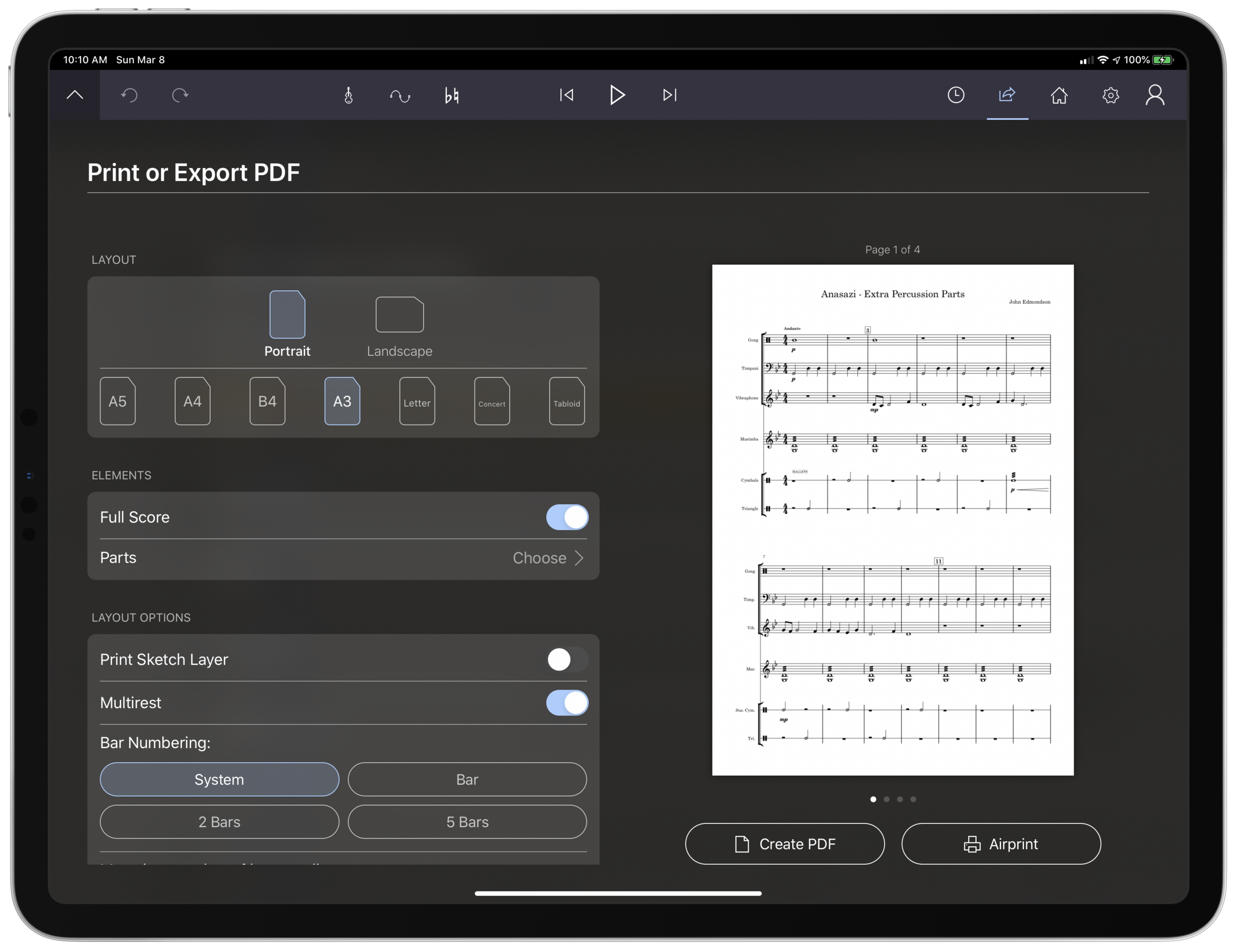
Share button. The share menu is ridiculously elegant and straightforward. It has all of the export options you would want, and appears very clean. My only complaint is that it does not work the way standard iOS share buttons work where once you share something, the share menu is no longer active. In StaffPad, it is more of a "mode" that you enter in to. I don't prefer this, but it is also not the end of the world.
Home button to go to the main screen.
Settings button. This screen is really straightforward and easy on the eyes. This is the one case where I do wish StaffPad would add more options. The screen is designed nicely enough that I would not mind scrolling downward for more options.
For example, I would like to be able to customize the tool bar or choose for the Apple Pencil's double tap gesture to do something other than initiate a lasso select.
Fenby. I do not think this feature is useful enough to put on both tool bars.
Note input
Ok so here’s where the rubber meets the road. StaffPad only accepts note input through the Apple Pencil. I have written about this elsewhere. I would love for StaffPad, like Notion, to have a Mac counterpart. But it’s not designed that way. Because Windows operates on a tablet, Surface users of StaffPad do not need to distinguish between tablet and PC operating systems. StaffPad runs on Windows, period. macOS is a different operating system than iPadOS, so there is no way I can run StaffPad on my Mac.
Interestingly, the main PC score apps, Dorico, Sibelius, and Finale, have made no attempts at an iPad app. I find that we are in this weird fragmented stage with Apple software where nearly any productivity app (I am thinking iWork, the Omni apps, even now Photoshop) can run on any Apple platform and even sync your work between devices, meanwhile niche pro apps still tend to exist on only one platform (Pro Tools/Ableton on the Mac and forScore/StaffPad for the iPad for example). These niche pro apps take unique advantage of platform conventions (the ability to work with complex audio streams in the case of DAWS on the Mac, and the Apple Pencil in the case of iPad).
Maybe its for the best. But I can’t help but feel like StaffPad would be superior if I could snap my iPad into the Smart Keyboard Folio and enter notes from there, or boot up a Mac version and enter notes with a MIDI keyboard..
Because I can’t do that, it is imperative that StaffPad’s handwriting recognition is air tight.
Simply put: it doesn’t register for me all the time. While I am getting better at it after a month of practice, it has a way to go. Sometimes I write really messy and get surprisingly great results on first pass. Other times, I write as slowly and neatly as I can and StaffPad doesn’t convert the notation.
Fortunately, StaffPad’s rules for notation conversion are very thoughtfully considered. Unlike Notion, notes do not convert until I tap somewhere outside the current measure I am composing. This means I can stop and think as long as I want before moving on. StaffPad also leaves anything that it doesn’t recognize in my own handwriting while converting the rest. This means I do not have to worry about an ambiguous pencil stroke being converted into StaffPad’s best guess, and I can go back and fix it later. Speaking of fixing things later, there isn’t a need to be too careful, because notes that end up a line or a space to high or low can be held with the pencil tip and dragged wherever you want on the staff.
This video shows off the design, features, and note input of StaffPad in action.
StaffPad’s design ingenuity continues to shines in the details. You are allowed to write whatever you want in a bar, regardless of if it fits in the time signature or not. StaffPad also allows you to drag the bar line to the right with the pencil if you run out of room. These considerations work well for my brain, because there is less cognitive overhead. I feel like I am writing with a pencil and paper, not a computer.
Still, there are times that I have to try numerous attempts before achieving success. The StaffPad support team recommended that I do notes in one pass, articulations in another, and dynamics in yet another, until I gain confidence with the system. They also recommended that I try to write the notes at approximately the size they will appear once converted. This advise helped but I am still making more mistakes than I would like.
My wife is a professional artist. She uses the iPad Pro to do illustrations and design mock ups. In other words, she has way better control of a pencil than I do. I asked her to spend some time writing various different musical symbols, at varying speeds and sizes. She, too, was perplexed at which of her pencil strokes worked and which ones didn’t.
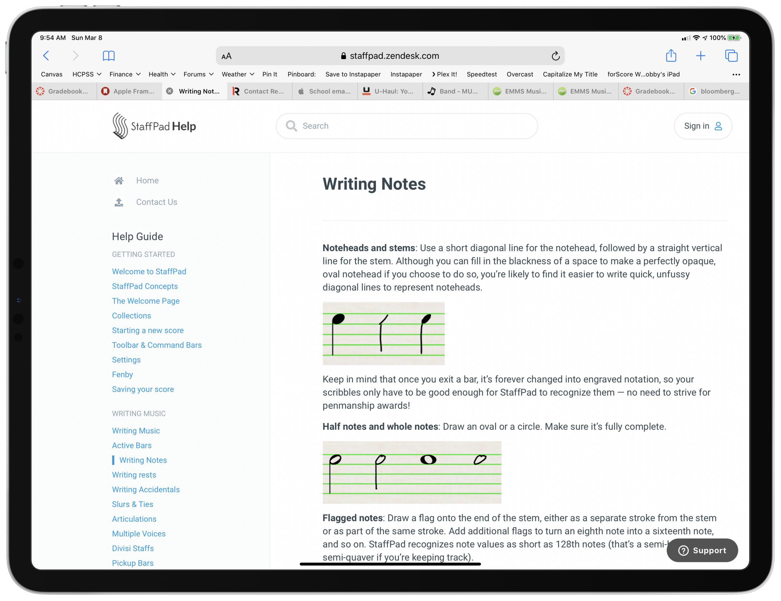
StaffPad’s help documentation (again, excellent) makes it look really easy. The examples of handwriting are really loose. As a percussionist who detests how other score programs handle drum set notation, I would love to be able to write drum parts as easily as the support documentation illustrates. No matter how hard I try to imitate it, I am getting inconsistent results enough so that I am reluctant to try these features again in the future.
While I am reflecting on note input, I need to acknowledge that StaffPad has, by far, the best implementation of erasing that I have ever seen for the Apple Pencil. There is no double-tap, or need to tap a button on screen to turn on the eraser. You simple press harder! It takes a little getting used to, and it is easy to press too hard when attempting to compose and erasing by mistake. But overall, I wish all apps would adopt this style. It is truly a dream.
Most of my testing for StaffPad included preparing for my recent band concerts. My Concert Band has 10 percussionists and some of my music had only three or four parts. I also have some flutes in my Jazz Band this year, and planned some repertoire that does not have original flute parts. Arranging these additional parts took place while I was on leave for the birth of my first child and was awaiting a return to school, where I would have only two weeks to prepare this concert before the performance date.
Headaches aside, the lightness and simplicity of StaffPad’s design, mixed with its direct note input, made this an indispensable tool for me in the past month. Projects that would have had more overhead using a heftier score editor like Dorico were a breeze using StaffPad and iOS. The iPad’s portability made it easy to sneak little additions to my work into busy days of carrying, holding, and feeding a newborn in one arm while sitting on the couch in my living room rather than at a desk.
Between pencil input and the tool bars mentioned above, there are a handful of features that are hidden beneath contextual menus that are achieved by long pressing on various places in the score. Long pressing in a measure allowed you to change the time or key signature. Long pressing on bar lines allows you to change their style or add measures to the music, add lyrics, text, or chords. These menus are very tastefully done, and as I have already mentioned, they have just enough features that they are confusing to dig through, but just enough that I was never wondering where something was. The lyrics and chords options are not as in depth as other score applications, but they were just right for my needs.
iOS-ness
There are features available to third party apps that I believe should be in every app. I was disappointed that StaffPad did not follow a few of these conventions.
Specifically, I wish StaffPad supported Split View. iPad apps can now share half the screen with another app. StaffPad only works in full screen.
This was frustrating for me, particularly in my arranging project mentioned earlier. I wanted to be able to open forScore on one half of the screen for a reference of the full score, and then compose in StaffPad on the other half of the screen. StaffPad customer support informs me that they experienced weird multi-touch results when StaffPad was on half of the screen and that it doesn’t work. But I would still like to see it happen.
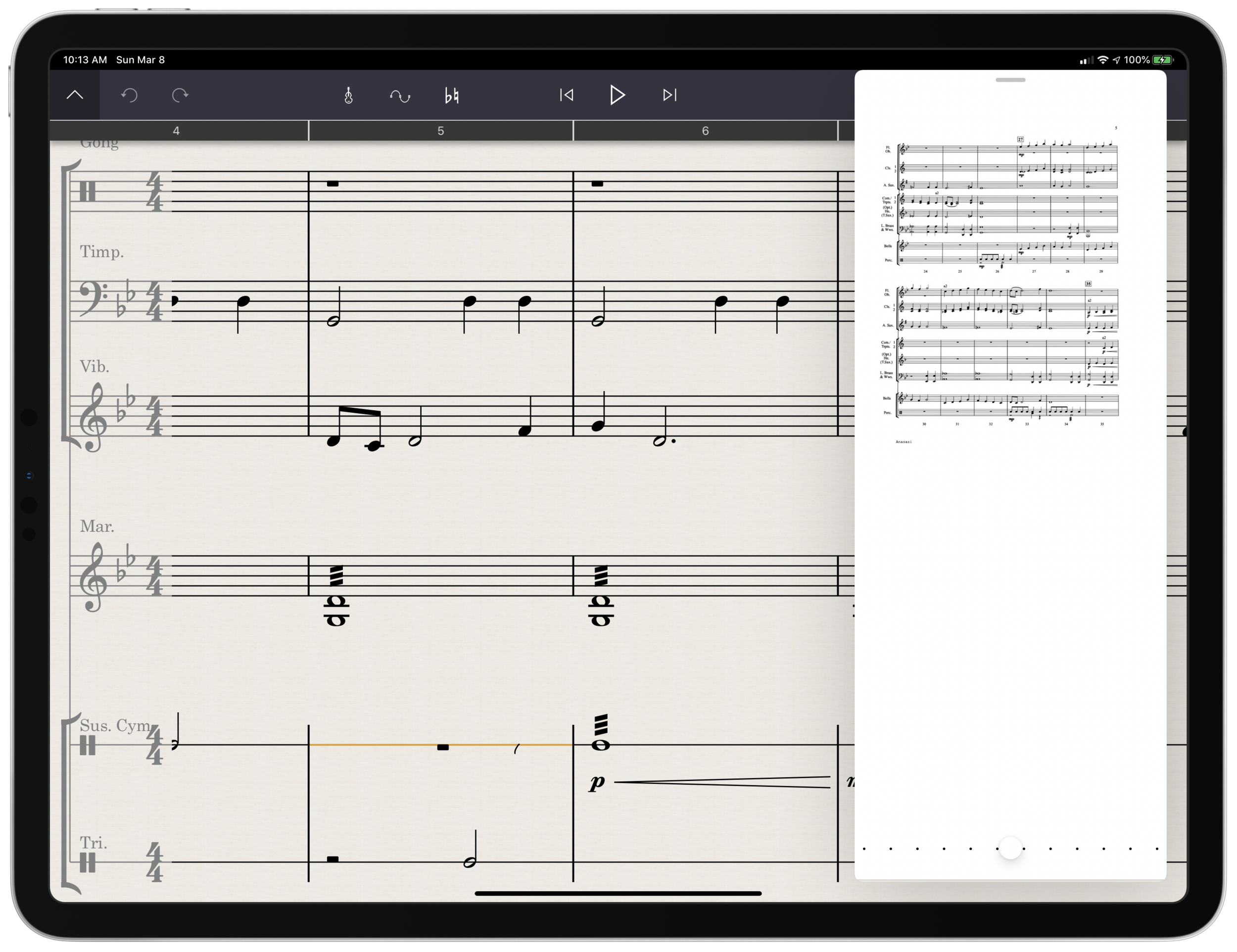
You can use other apps in slide over view, which is where you drag an iPhone-sized version of an app over top a full screen app for quick reference. You can see if the screenshot below that this is really too small to be tenable for score reference.
Referencing a score is awkward because StaffPad doesn’t support the iPad’s splitview feature.
Playback
Spitfire and cinesamples audio libraries, amongst others, are available as inn-app purchases. They sound fantastic! Given how seamlessly they work with StaffPad, it is astounding how easy it is to get good sounding playback. If only using advanced audio plugins with score apps was this easy on macOS and Windows.
That said, I am extremely hesitant about buying these plugins. These samples, once purchased, only work with StaffPad on iOS and cannot be used with any other program like they can be if you purchase the PC versions of these plugins directly from the companies that engineer them.
Conclusion
StaffPad is a unique composing application that leverages everything unique about the iPad to provide what I anticipate will be an indispensable tool for my work as a music educator. While the handwriting recognition doesn’t always work as I expect, it gets better with each update and also as I practice it.
StaffPad is elegantly designed and makes trade-offs that position it as perhaps the most natural score editor I have ever worked with. I am so glad that this app exists both as a tool for my professional work, and as a statement about what the iPad can be. I would recommend it to anyone who is looking for a score app that balances power and ease as long as they acknowledge that there is a learning curve and a price.
Want other opinions? Check out these reviews:
Scoring Notes: StaffPad wows with long-awaited iPad release and new free StaffPad Reader
Technology in Music Ed | Chris Russell: Working with StaffPad
🔗 Noteflight as a DAW | The Ethan Hein Blog
Noteflight as a DAW | The Ethan Hein Blog:
Notation software was not originally intended to be a composition tool. The idea was that you’d do your composing on paper, and then transcribe your handwritten scores into the computer afterwards. All of the affordances of Finale, Sibelius and the like are informed by that assumption. For example, you have to enter the notes in each measure in order from left to right. If you’re copying from an existing score, that makes sense. If you’re composing, however, it’s a serious obstacle. I can’t speak for all composers, but I’m most likely to start at the end of the bar and work backwards. If I want to put a note on the last sixteenth note of the bar in the MIDI piano roll, I just click the mouse on that beat and I’m done. Notation software requires me to first calculate the combination of rests that’s fifteen sixteenth notes long. I’m told that Dorico has finally addressed this, and lets you place your notes wherever you want. Noteflight, however, follows the model of Finale and Sibelius.
This is a super fascinating explanation of the way modern students are learning to create music on a screen. And I can vouch for Dorico that yes, it deals with note input in a non-linear way, much the same way a MIDI editor functions.

