native app

Making Tunable, with Seth Sandler (Music Ed Tech Talk Ep. 40)

Seth Sandler, maker of the poplar mobile tuner app Tunable, joins the show to talk about the process of making a tuning app, developing for iOS/Mac, and more!

Subscribe to Music Ed Tech Talk:

Subscribe to the Blog

Subscribe to the Podcast in... Apple Podcasts | Overcast | Castro | Spotify | RSS

Show Notes:

App of the Week: BusyCal

Album of the Week: Chris Thile - Laysongs Acapella Musicals on Spotify

Where to Find Us: Robby - Twitter | Blog | Book
Seth - Twitter

Please don't forget to rate the show and share it with others!

forScore for the Mac: Review

forScore has long been my most essential iPad app, and one of the few apps I consider iPad-first. This is to say that it is an app that takes specific advantage of the iPad’s strengths (form factor, pencil support, paper-like display, direct touch input) and leverages them in a way that makes the iPad feel essential.

For the same reasons it is essential on iPad, it has seemed slightly less essential on the iPhone (small screen size is impractical) and Mac (similarly, the design is not easy for direct manipulation, annotation, portability, or sticking on a music stand).

Still, an app this useful screams to be used cross-platform! The more I moved my sheet music library from PDFs on my hard drive to forScore, the more I found I needed to be able to work with the same library structure on my other devices. An iPhone is small, but there are those moments when it is the only device on you and you want to reference something really quickly. In a moment that my iPad battery once failed, I did conduct a percussion ensemble rehearsal from forScore on the iPhone.

In the same way that the iPhone is sometimes useful for being always the one in your pocket, the Mac is also useful sometimes. For example, file management is way easier on a Mac. No matter how many Mac features the iPad adds (drag and drop, Files app, etc.), it is simply not as easy as the Mac. Yes, the iPad can technically do the same things as the Mac in this regard, but it’s slower and more cumbersome. Furthermore, most users know how to use the Finder on Mac but don’t know how to work with the Files app on iPad, even though it is mostly the same these days.

It is actually possible to open forScore and the Files app side by side on the iPad. From there, you can drag and drop multiple files at once from one app to another.

It is actually possible to open forScore and the Files app side by side on the iPad. From there, you can drag and drop multiple files at once from one app to another.

I’d like to note that a year of teaching (mostly) online has sent me “back to the Mac,” so to speak. The Mac’s efficiency in multitasking, as well as its ability to run streaming apps like OBS and Loopback, has positioned it as my primary work device. Streaming forScore to my iPad’s screen to my Mac using OBS and AirServer is great, but it’s fiddly, indirect, and kills my iPad battery. It has become so much more direct to have forScore running right on the Mac, in the same place my other work is already happening.

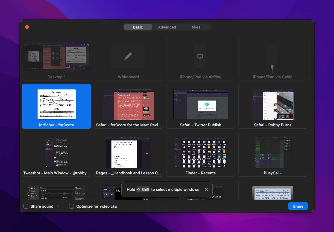
In video conferencing apps like Zoom, I can now share music on the screen with my students directly, thanks to forScore running on my Mac.

In video conferencing apps like Zoom, I can now share music on the screen with my students directly, thanks to forScore running on my Mac.

The wait is over. Actually, it has been over since the fall. With the launch of macOS 11 Big Sur, forScore has released a universal version of their app on the Mac App Store. This means that it will be a free download for those who have purchased the app on iPad.

Note: I wrote most of this review fairly soon after release. Its scope is therefore more like what I would call “First Impressions.” I have been using it all school year long by the time I am actually posting this and think it is now more accurate to call it a review even though I will not be covering every detail comprehensively in the words below.

The goal of this review is to cover what’s unique about the Mac experience. If you want to learn more about forScore’s features, check out this excellent review by David MacDonald

For more on this subject (and speaking of David MacDonald), listen to my podcast review of forScore for Mac, where he was the guest.

Subscribe to the Blog... RSS | Email Newsletter

Subscribe to the Podcast in... Apple Podcasts | Overcast | Castro | Spotify | RSS


Overall Experience

Having forScore on the Mac is a huge deal for me. I have been using it aggressively since the fall. It is on a shared screen during every band class and private percussion lesson I teach. Using it right on the Mac is just as easy as I expected.

All of the buttons, knobs, bells, whistles and user interface elements are exactly where you would expect them to be because it looks and feels like the iPad app. I will get into the implications of that in a moment.

Adding music to my library is now a breeze. Until this point, I have been storing all of my scores in a folder in iCloud Drive and then creating duplicate copies in the iPad version of my forScore library. This means that to share music on my Mac’s screen (without doing the AirPlay method above), I have to open the files in PDF Expert. They don’t have any of my indexes, metadata, or attached recordings. I cannot annotate them as I can in forScore, or use music stamps, and I cannot see them in the context of my organized setlist. It is in some ways like maintaining two separate libraries of the same stuff.

To make matters worse, iCloud Drive periodically decides to put some of my scores back in the cloud when I am low on space. When this happens, and I try to open a score from the Spotlight, even a score I used the day before, I will have to wait an extra-long time for my Mac to download the file before actually opening it.

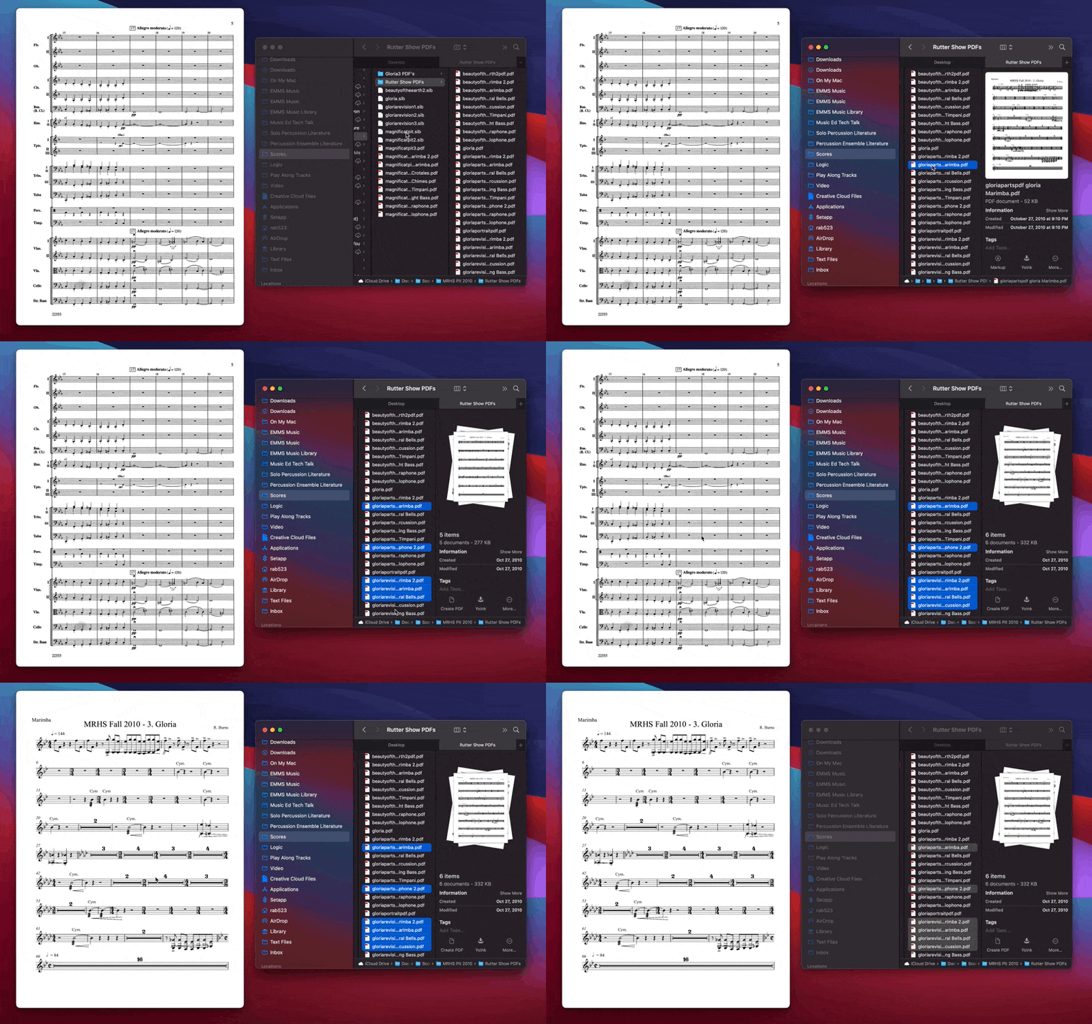
I am happy to report that forScore on the Mac resolves these frustrations. Not only is it lightning-fast for me to get all of the scores that were not in my forScore database inside of it, but scores can also now sync across devices over iCloud. Using keyboard shortcuts like Command+Clicking, Command+Tabbing, and the precision of the keyboard and mouse, allowed me to easily drag and drop most of my remaining digital sheet music library straight into forScore from the Finder. I never pushed forScore too hard in this regard, but at one point, I dragged about 40 scores into forScore from the Finder at once and it handled them with a breeze. This is something the iPad would occasionally crash while trying to do.

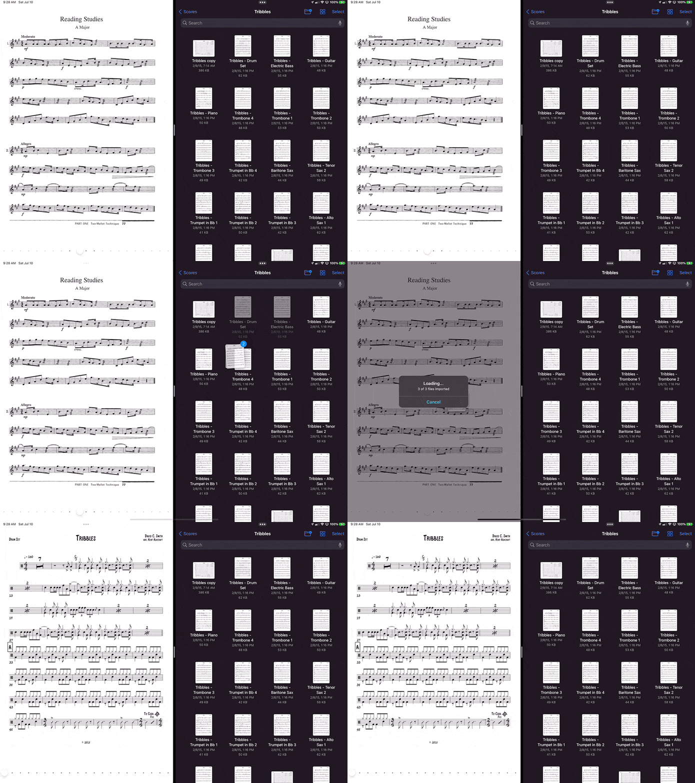
The file import process I showed on the iPad above is far faster and more precise on macOS.

The file import process I showed on the iPad above is far faster and more precise on macOS.

Because of this ease, finding duplicated, and deleting them was also easy. So was adding metadata. The Mac is now my preferred tool for doing this kind of logistic work in bulk.

Catalyst

forScore uses Apple’s Catalyst technology which means that Mac apps can share code with iPad apps. Apple introduced this at WWDC in 2019 and in the year that followed, relatively few apps made this transition. A notably good app using this technology is GoodNotes 5. They ditched their native Mac app in version 5 and decided to bring the iPad version over. GoodNotes is a good comparison to forScore, because its strength is, similarly, that it is a touch-first app that feels best when conceptualized as a digital “piece of paper.”

Catalyst apps can be automatically provided to the Mac by the developer with one press of a button, but they won’t be good experiences. Developers can do more work to have the app feel more like it belongs on the Mac, using things like the Touch Bar, custom Tool Bar elements, keyboard shortcuts, etc. The results have been lackluster. Still, having a Mac version of GoodNotes is better than not having one. And because it is an app I usually use on iPad, the need for the Mac version was more for reference.

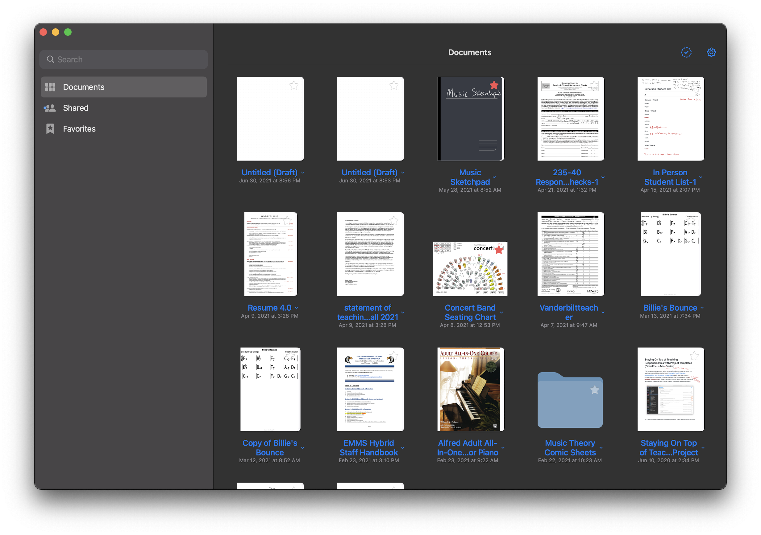
GoodNotes 5 on the Mac. It looks good. But I am constantly forgetting whether to double or single tap on things because it behaves like an iPad app, but I have the conventions of a Mac hardwired into my brain when I am sitting in front of one.

GoodNotes 5 on the Mac. It looks good. But I am constantly forgetting whether to double or single tap on things because it behaves like an iPad app, but I have the conventions of a Mac hardwired into my brain when I am sitting in front of one.

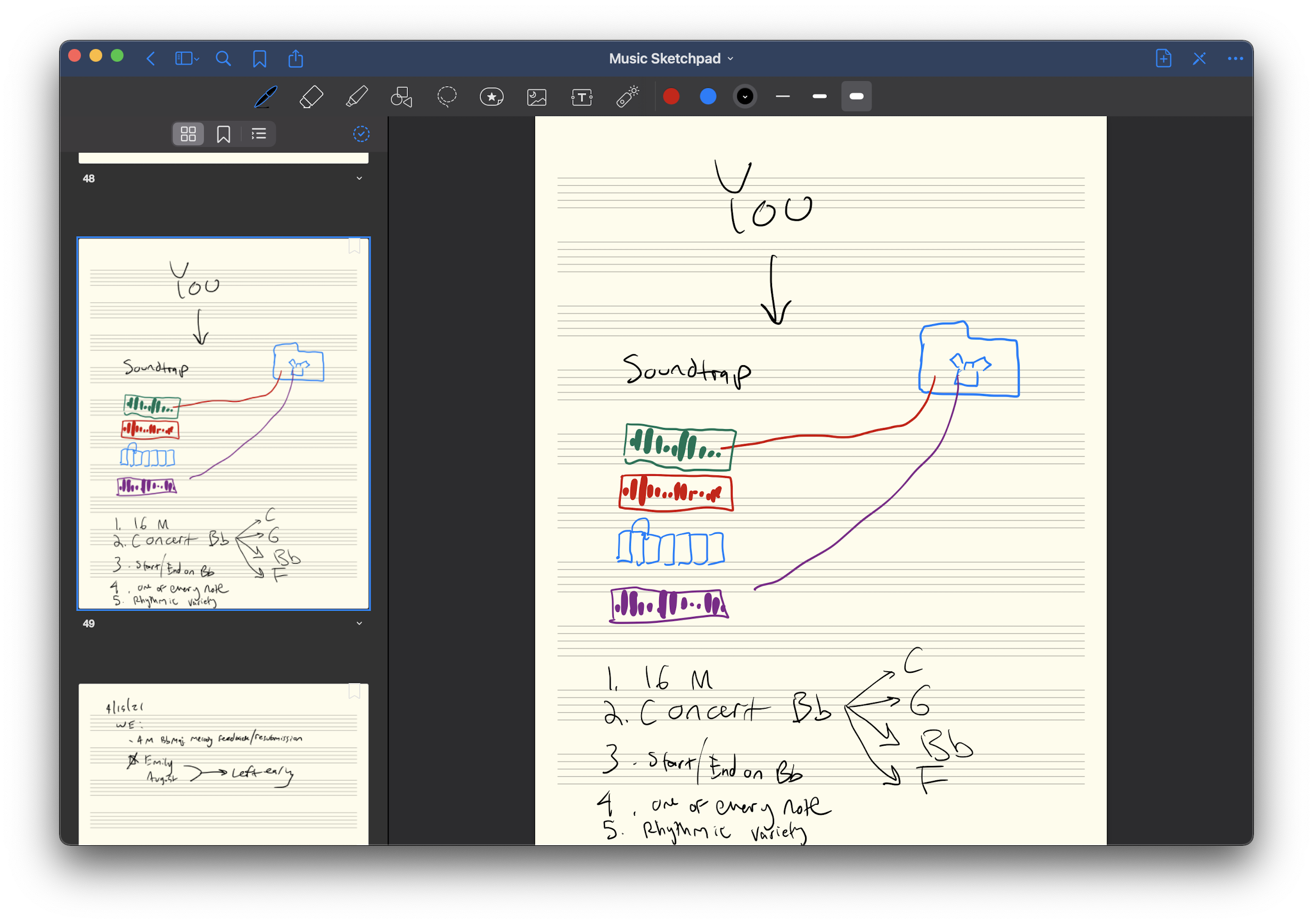
This is an even weirder example of an iPad toolbar on Mac, but it brings GoodNotes to my Mac, and for that I am grateful.

This is an even weirder example of an iPad toolbar on Mac, but it brings GoodNotes to my Mac, and for that I am grateful.

At WWDC in 2020, Apple announced that more developer tools would be coming to Catalyst, so that it is easier to bring even more of the things that make Mac apps feel like Mac apps to your iPad version. They also announced that new Macs would be coming out (they shipped on November 17th) with new processors built by Apple. These new machines would be able to run native iOS apps without developers doing anything at all.

Steven Troughton Smith highlights these three methods on Twitter.

I imagine forScore went with the last of those three options for the Mac. Even though it feels like a mostly native experience, some things get weird.

Details and Weirdnesses

There are things about forScore on Mac that “look” like the iPad and things that “behave” like the iPad. The things that look like iPad are more forgivable.

For example, the toolbar of an iPad app looks distinct from that of the Mac. Apple is attempting to blur this distinction by redesigning their stock apps to have buttons that are made of thin-lined graphics, rather than appearing as press-able buttons.

The old macOS toolbar used to look like this.

The old macOS toolbar used to look like this.

By contrast, iOS apps that are brought to the Mac with Catalyst have a toolbar that looks like this.

By contrast, iOS apps that are brought to the Mac with Catalyst have a toolbar that looks like this.

The new macOS toolbar seeks to blur this distinction by bringing its own toolbar design closer to that of iPad apps.

The new macOS toolbar seeks to blur this distinction by bringing its own toolbar design closer to that of iPad apps.

iOS apps also have different pop-over style elements that feature a Cancel button in the upper left and a Done button in the upper right. These don’t feel Mac-like but they get the job done. You can, for example, still press Escape to dismiss them like you can on a Mac, though the difference in user interface might suggest otherwise.

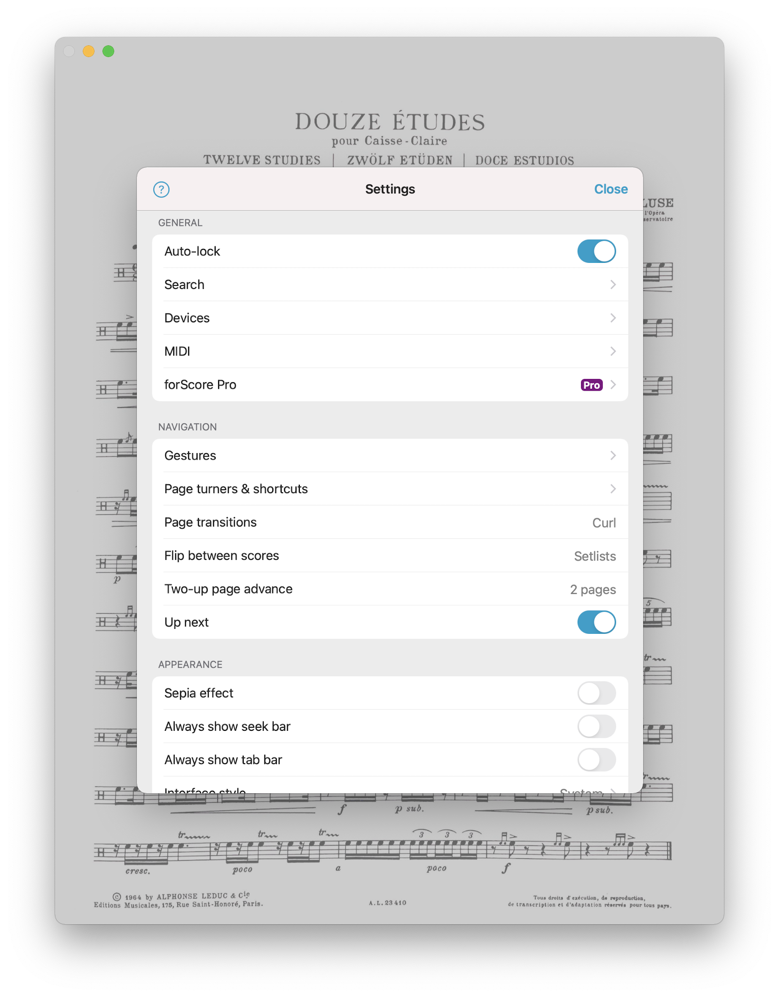
Alerts and settings screens trip me up with Catalyst apps because they really make me feel like I am using an iPad.

Alerts and settings screens trip me up with Catalyst apps because they really make me feel like I am using an iPad.

By contrast, here is the user interface of the OmniFocus settings screen, which follows native Mac app conventions.

By contrast, here is the user interface of the OmniFocus settings screen, which follows native Mac app conventions.

Here are some other details and quirks that highlight the varying degrees of success that forScore has at being Mac-like…

Window resizing

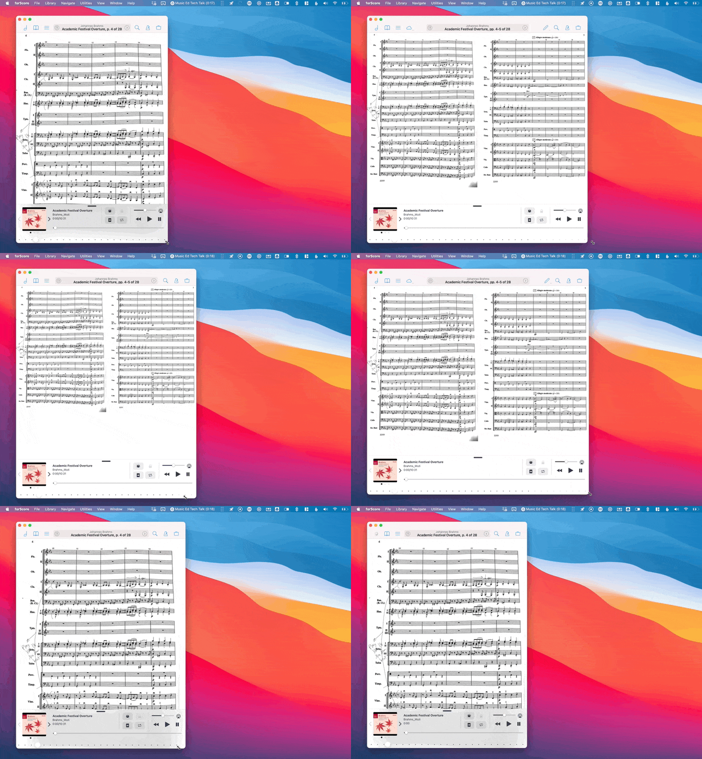
Windows can be resized on Mac. This is implemented pretty well in forScore. When the window is dragged to certain dimensions, the score will automatically decide if it is better to fit one or two pages of the score on the screen. As with an iPad, you can click the book-looking button to the left of the file’s title to force it to keep two pages on screen, regardless of window size. Tools in the toolbar also automatically disappear at smaller window sizes and reappear at larger ones.

forScore can do things on Mac it can’t do on iPad, like window resizing!

forScore can do things on Mac it can’t do on iPad, like window resizing!

Menu bar

The Mac has the menu bar which exposes (in well-made software) all of the available actions in the app. This helps with discoverability and customization. Users can always find what they want from the menu bar and can set menu bar items as keyboard shortcuts in the System Preferences app. It is nice to see many of forScore’s options in the menu bar, but I am not certain that all of them are there. Fortunately, forScore for Mac has an area in settings that allows you to customize keyboard shortcuts for many of the app’s features.

You can set up custom keyboard shortcuts in forScore.

You can set up custom keyboard shortcuts in forScore.

Page navigation

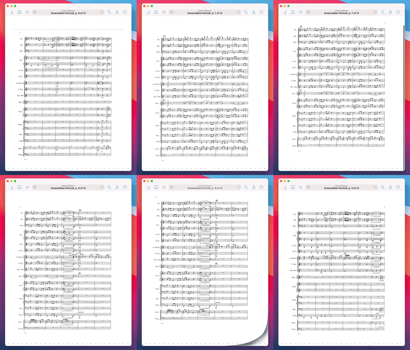
It’s really weird. Simply put, page navigation conventions that work on iPad do not always translate to the Mac. For example, touching and dragging the screen to turn pages is natural when you use your hand to turn the pages, but less so with a keyboard and mouse. Common Mac conventions like two-finger scrolling to swipe pages are implemented in forScore. But other things are weird. Two-finger scrolling feels more natural in other document-based apps like, for example, Preview. In forScore, you can pinch to zoom, but pages that are zoomed in larger than the window size take extra page-turning gestures to navigate. This if because forScore’s default behavior when you swipe is to show you whatever of the page is not on the display. This makes sense because in a performance you might want to zoom in closer to the music. When doing this, it makes sense that a one-touch gesture reveals the next part of the music (regardless of what page it is on), but in practice, this is not Mac-like. Any other app that deals with PDFs would show me the next page when I do the page turn gesture. This quirk is particularly weird if your score is just a few pixels taller than the window size you have set. Turning the page takes two swipes instead of one. The first swipe awkwardly jolts the screen down just enough to see the few missing pixels at the bottom of the screen, and the next swipe actually turns the page.

When my window is just too short, I have to turn the page twice, to turn it once. These kinds of quirks aren’t terrible, but when you encounter them, it’s easy to perceive the app as broken or untrustworthy.

When my window is just too short, I have to turn the page twice, to turn it once. These kinds of quirks aren’t terrible, but when you encounter them, it’s easy to perceive the app as broken or untrustworthy.

Zooming in and out

The above-mentioned quirk is even weirder when you have zoomed in a lot. I do this often to focus my students on a particular excerpt of music. When scrolled in, there is (to my knowledge) no way to keep scrolling from the trackpad. You have to zoom out, turn the page, and then zoom in again. Contrast this with Preview, a native Mac app, which will just let me scroll freely through the document, no matter how far I have zoomed in.

Spotlight!

I am pleased to say that searching for score files in Spotlight (Command+Spacebar) results in all my scores showing up, even chapter titles in an index of a larger score.

Sidebar

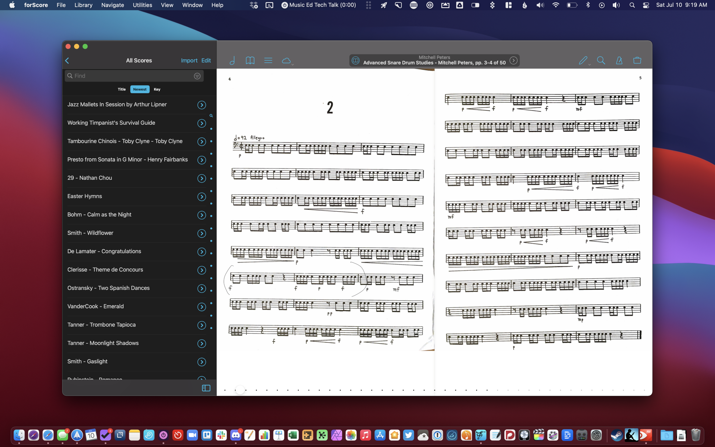
Mac apps tend to have sidebars that reveal list views and top-levels of organization hierarchy in an app. These can often be toggled on and off though I usually leave them on so I can get to things more quickly. forScore on the Mac supports the option to keep the sidebar permanently visible, so you can always see your library alongside whatever score is selected. Cool.

I like that the Mac version of forScore supports a permanently-visible left sidebar. I wouldn’t mind this feature on my 12.9 inch iPad Pro.

I like that the Mac version of forScore supports a permanently-visible left sidebar. I wouldn’t mind this feature on my 12.9 inch iPad Pro.

Conclusion

There are of course more Mac-like things to celebrate and more iPad-like things to question, but the bottom line is this: forScore is an app loved by musicians all over, and it is completely stellar that the developers dedicated time to bringing this application over. It is unknown if it would ever have happened without Apple’s Catalyst technology, but because of it, we get to have a pretty ok Mac app, where we otherwise would not. And having a pretty ok Mac version of an indispensable iPad app is… actually great! So thank you forScore team!

There are certainly more Mac apps that I would love to see on iOS than there are iOS apps I would like to see on the Mac, but the list is getting smaller.


Want more forScore? The second most popular post on this website for a long time was my tutorial for adding an index to large scores in forScore for iPad. Watch the video above.

Apple Silicon, Macs in Education, and App-Centric Learning

Apple Silicon Macs are likely going to be announced at their upcoming event this Tuesday, November 10th.

Bradley Chambers is incredibly knowledgeable about Apple's relationship with education and he makes some great points in the post below about how this transition could influence the Mac in education.

Making the Grade: What will Apple Silicon mean for Apple's education strategy? - 9to5Mac:

I believe that Apple will have untold flexibility in what kind of laptops they can produce for schools now. Is it possible to build an 11″ MacBook based on Apple Silicon that is $799 when purchased in bulk but still runs extremely fast? I believe so. It might not be in the first year or two of Apple Silicon’s lifespan that we see it, but in a few years, it’s certainly possible that Apple will have reduced the cost on the A14 to put it in a K–12 focused laptop in the future.

I could be way off base on my predictions. Still, I believe that Apple Silicon will unlock a lot of potential in K–12 to produce lower-cost laptops that will run circles around much higher priced laptops running Intel chips. I’d love to see an 11″ Apple Silicon laptop aimed directly at students that could be used for many years.

I really do hope that Apple tries to be creative with the Mac in education again. Still, I fear that anything they do is too little, too late. Apple has has not been aggressive in education. They tend to make huge leaps in certain areas of their business and then let them settle for a long time, sometimes years. This approach works for developing consumer software like note-taking apps, but it is not aggressive enough to compete with Chromebooks and cloud-based education software. I think back to Apple’s education event a few years back where they positioned the iPad as their future in schools and released a bunch of APIs that iOS app developers could use to link into their Classroom app. Years later, what has come of any of that? If you are using iPads in education, and you use Apple Classroom in combination with third party apps, I would love to hear from you!

Chromebooks and web apps have taken off. And a lot of these web apps can talk to each other. For example, third parties like Flipgrid and Noteflight can integrate with LMS software like Blackboard and Canvas. But these connections are often full of frustrating bugs. On top of this, the quality of a lot of this software in ed tech is already so poor. I wouldn't exactly call it a race to the bottom, because most developers are doing their best with the resources they have, but I like to dream about an alternate reality where Apple's vision for an "app-centric" model were the norm instead of the "web-centric" model we have now.

Of course, web software is cheaper and cross-platform. So it makes sense that it has caught on for being most equitable. But in a world where Apple had kept their prices more competitive, maybe school districts would have been more willing to buy students 1:1 Apple products, especially when schools jumped online in March.