ipad os

🔗 Omni Apps are Adopting Apple’s Standard iOS Document Browser this Fall

Adopting Apple’s Standard iOS Document Browser - The Omni Group

In 2019, we think it’s time to retire our custom document browser in favor of using Apple’s built-in document browser—and with our iOS 13 updates this fall we’ll be doing just that. Instead of seeing our custom file browser, you’ll be presented with the standard iOS document browser—just like in Apple’s own iWork apps. Using Apple’s browser, you’ll be able to store and sync your documents using Apple’s built-in iCloud Drive, or third-party commercial options like Box—or even in cloud- or self-hosted collaborative git repositories using Working Copy.

As a user of OmniFocus, OmniGraffle, and OmniOutliner, I am grateful that the OmniGroup is making this change. The Files app on iPad works very similarly to the Finder on Mac these days. So when I open or save a document on an iPad, I want to see that same interface. It's exactly the same as if I were on a Mac. I would never go to the File-->Open menu and expect to see anything other than the traditional Save/Open dialogue box that I see for every other app. This is standard on Mac. (Mostly. Some apps like Microsoft Office still refuse to use it.) So it is only fitting that in iOS, document based apps display the system provided interface for interacting with files.

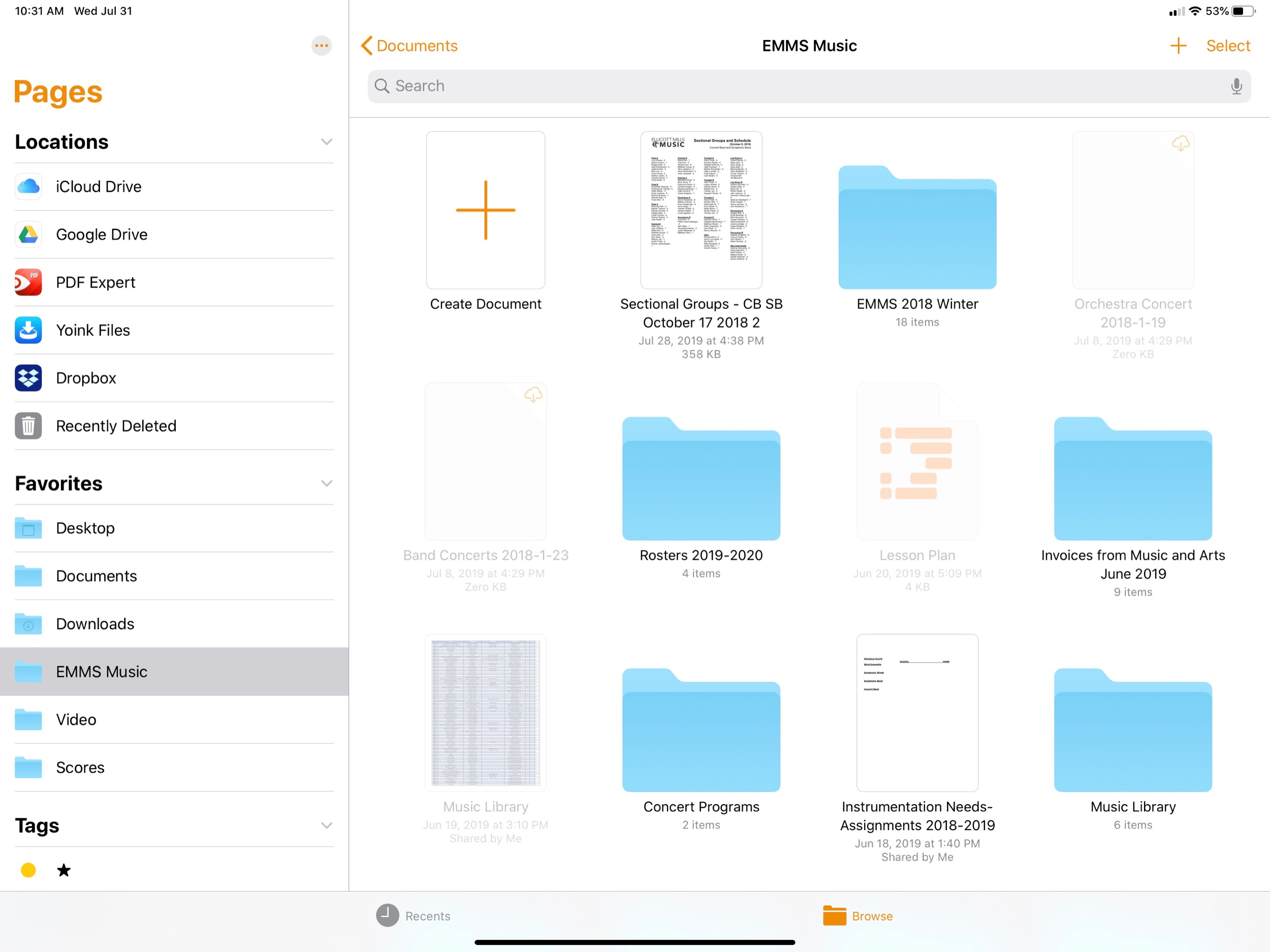
In apps like Pages, for example, opening a new document displays an interface that looks and behaves like the Files app.

In apps like Pages, for example, opening a new document displays an interface that looks and behaves like the Files app.

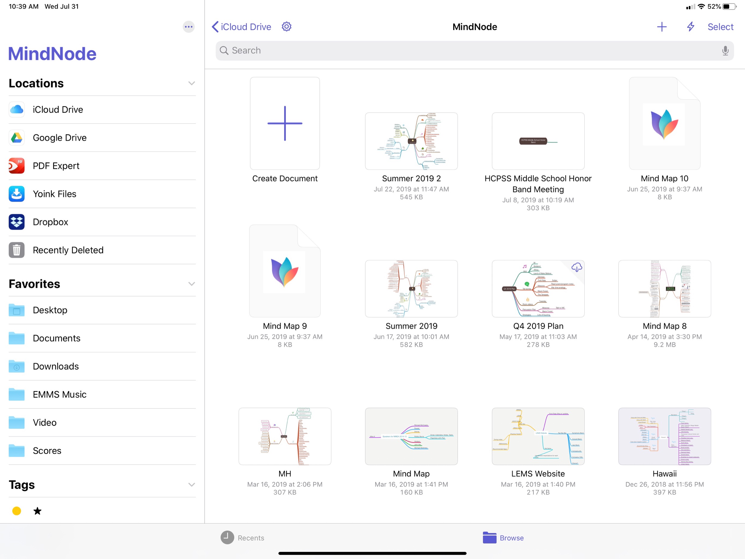
MindNode is an example of a third party app that uses the same Files interface as Apple’s own apps.

MindNode is an example of a third party app that uses the same Files interface as Apple’s own apps.

Apps like OmniOutliner show a custom interface. Fortunately, OmniGroup is changing this behavior in the fall.

Apps like OmniOutliner show a custom interface. Fortunately, OmniGroup is changing this behavior in the fall.

PDF Expert is another example of an app that does not use the native file picker. Hopefully they will get the message and adopt it soon.

PDF Expert is another example of an app that does not use the native file picker. Hopefully they will get the message and adopt it soon.
Integrating Luna Display Into the Classroom

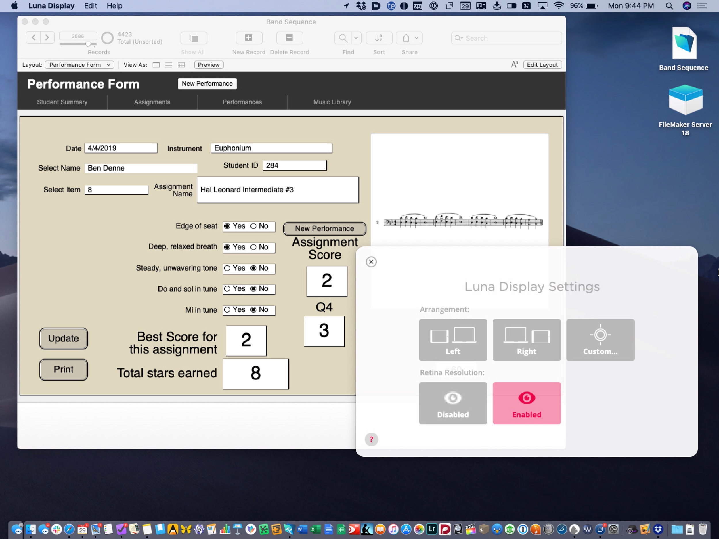
My wife gave me a Luna Display for my birthday and I have been really impressed with it so far. Luna is a USB-C dongle that plugs into a Mac. Using the companion app on iPad, you can access the entirety of macOS, wirelessly. 

public.jpeg

I cannot wait to use this device this coming school year. I teach in about five different classrooms which makes transporting my Mac cumbersome. It is heavy, always running out of battery, and is missing some of my iOS music apps like forScore and Tonal Energy. The light form factor of my iPad Pro is perfect for toting around the building in one hand.

There are a few problems with this. I am still faster on macOS for one. And more importantly, there is software on the Mac that I cannot take full advantage of on the iPad. I depend heavily on FileMaker for a tracking student data, assessments, and assignments. I have discussed that workflow on two episodes of The Class Nerd podcast. This episode on tracking student data and this episode, which is a bit miscellaneous. For whatever reason, keyboard input on certain parts of the user interface is slow on FileMaker Go, the iOS version of the app. Even though I can do 90 percent of the things I need to with my database on iOS, the typing speed slows me down.

Luna Display puts macOS right on the screen of my iPad.

Luna Display puts macOS right on the screen of my iPad.

It is for reasons like this that I am thrilled to use Luna Display in school next year. The experience of using the app is so smooth that at times I forget I am not using my Mac. Are there issues? Tons. But I stop to wonder every now and then why it is again that macOS can’t work with touch.

I also use a score editing app called Dorico on my Mac. Not as often as FileMaker, but enough that it is sorely missed on iOS. I have not tried to operate this application on the Luna Display but in full screen mode I suspect it isn’t so bad. Once I give it a shot I will report back.

Spending Time with iPadOS 13

I have been running the beta of iPadOS 13 for almost a month now. iPadOS 13 ships this fall and is the first version of iOS that Apple is branding iPadOS because of its focus on features unique to the iPad. At first you might think this to mean that Apple is adding ‘desktop’ features to the iPad, but the more I think about it, the more I realize that the iPad is in many respects growing into a platform with its own unique set of strengths. Here are my favorite features so far.

New Home Sceen!

The first thing I really love is the new home screen. You can fit way more apps on it now, and they stay oriented the same way in both landscape and portrait because it is a 6x5 grid in either orientation. This wastes way less space on the screen and allows you to cram a lot more apps into a smaller space for extra productivity!

public.jpeg

Also useful is that you can pin your widgets to the left of your apps. I can now see my OmniFocus tasks, upcoming calendar events, recently accessed Files, and notes, every time I return to the home screen. For OmniFocus, I have it showing my Priority perspective, which shows all due items, soon to be due items, and flagged items that are tagged ‘Today.’ This is one more tool to help make sure I don’t let stuff slip through the cracks. The same could be said of the Calendar widget. Having the Files app display recently opened files on the home screen sure does feel a lot like being able to treat the home screen the same way I do my Desktop on the Mac.

desktop safari

The thing that is surprising me the most is how much the new Safari update transforms the way I use my iPad. Safari now runs like the desktop version. This means that websites operate as you would expect them to on the Mac. No more taking out your MacBook for those few websites that just never quite worked right on iOS. For me this is going to change the way I use a lot of my school district’s mandated learning management software, which would often not work correctly, or as reliably, on my iPad.

public.jpeg

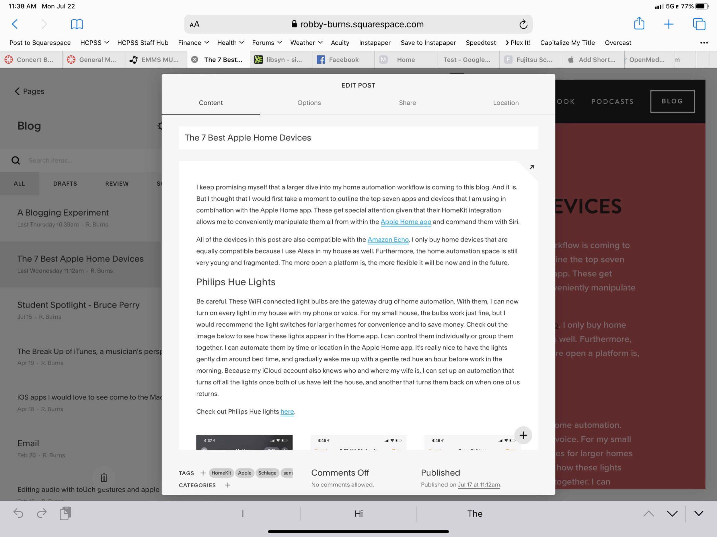
But what is really great is that I can now access the full versions of Google Docs and Squarespace from my iPad. Google’s apps on the App Store are still a little nicer, but they have never had the full feature set of the web apps, and now this is nearly a non-issue. Apple and Google need to find out some way to better let users choose if a document opens in Safari or Google Docs/Sheets/Slides, but I expect that to be eventually ironed out.

Even more exciting is that I can finally use the full toolset of Squarespace to update my website on the iPad (just one of the few things that would keep me taking my Mac out of my bag). So far, Apple has already done a nice job with these features, and they are not even ready for public release yet. There are some issues and unexpected behaviors, but not nearly as much as I expected. Desktop Safari has turned out to be the biggest productivity boost of all the new features. And did I mention there is now a download manager!?

multitasking and pencilkit

public.jpeg

There are also some improvements to multitasking. Notice above that I am using two apps open side by side with another one floating in what Apple calls Slide Over view. iOS 13 now adds the ability to manage multiple different apps in Slide Over at once. The implementation is great. It works like multitasking on an iPhone X or higher. You can swipe the little handle on the bottom of the app left and right to page through recent apps, and you can swipe it up and to the right to see all recently opened Slide Over apps. This makes it much easier for me to manage the few apps I am using often in this mode: apps like Tonal Energy Tuner, Messages, and Twitter.

public.jpeg

I now also appreciate that you can have more than one instance of the same app open at the same time. Notice above that I am viewing two notes side by side. When I mentioned that iPadOS is growing into its own specific identity, the pencil tools on the right side of the screen are what I was thinking about. They have been brilliantly updated. And Apple is releasing them for use by third party developers in an API called PencilKit. Here’s to hoping that it is widely implemented so that using the Apple Pencil feels more consistent across apps.

See below also. Swiping from the lower left of the screen with the Apple Pencil allows your to quickly mark up whatever you are looking at. And if you are in Safari, you can now clip an entire website, not just what fits into the screenshot. You can highlight, annotate right from this screen and then send it somewhere like Apple Notes where you can search the article by text.

public.jpeg

For me it is becoming clear that PencilKit is a feature that is going to widely shape and define the iPad as a particular tool for certain jobs that a Mac or an iPhone is not as useful for. Apple is bridging the gap a little by introducing a feature for the Mac called Sidecar, where you will be able to send windows of Mac apps to the iPad to be able to take advantage of the same pencil precision editing tools.

Conclusion

Overall, iPad OS is shaping up to be an awesome release. I didn’t even mention half the features here. And even some of the ones I am most excited about will not reach their fullest potential until third party apps take advantage of them (like PencilKit) or until more people are on iOS 13 (like iCloud shared folders). If you are an iPad user you have a lot to look forward to this fall. If you want to try the beta, you can go here. It is pretty risky though, and I am admittedly very unwise for doing it.

The 7 Best Apple Homekit Devices

Learn about my smart speaker setup on this episode of my podcast:

Subscribe to the Podcast in... Apple Podcasts | Overcast | Castro | Spotify | RSS

I keep promising myself that a larger dive into my home automation workflow is coming to this blog. And it is. But I thought that I would first take a moment to outline the top seven apps and devices that I am using in combination with the Apple Home app. These get special attention given that their HomeKit integration allows me to conveniently manipulate them all from within the Apple Home app and command them with Siri. 

All of the devices in this post are also compatible with the Amazon Echo. I only buy home devices that are equally compatible because I use Alexa in my house as well. Furthermore, the home automation space is still very young and fragmented. The more open a platform is, the more flexible it will be now and in the future. 

Philips Hue Lights

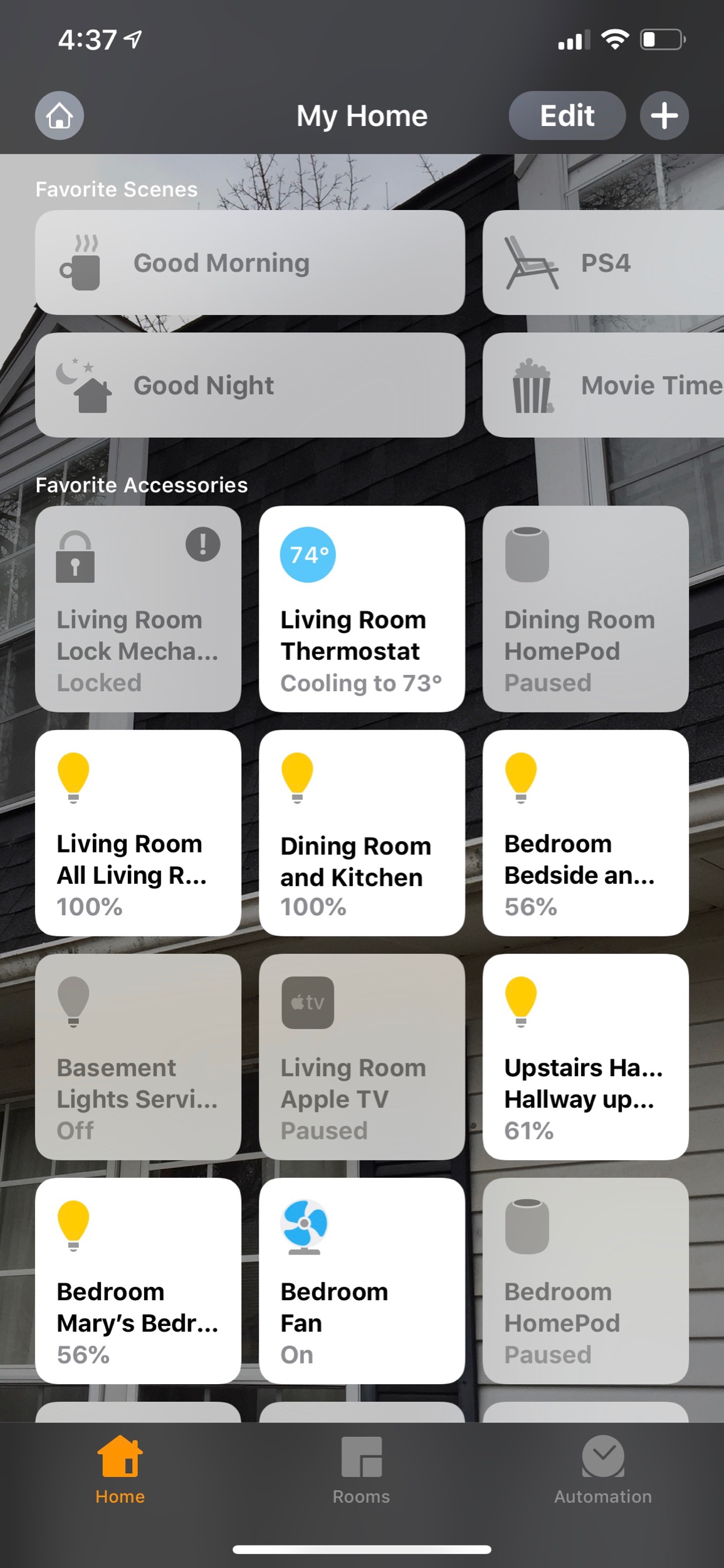
Be careful. These WiFi connected light bulbs are the gateway drug of home automation. With them, I can now turn on every light in my house with my phone or voice. For my small house, the bulbs work just fine, but I would recommend the light switches for larger homes for convenience and to save money. Check out the image below to see how these lights appear in the Home app. I can control them individually or group them together. I can automate them by time or location in the Apple Home app. It's really nice to have the lights gently dim around bed time, and gradually wake me up with a gentle red hue an hour before work in the morning. Because my iCloud account also knows who and where my wife is, I can set up an automation that turns off all the lights once both of us have left the house, and another that turns them back on when one of us returns. 

Check out Philips Hue lights here

The Home app aggregates all of my various different home automation devices.

The Home app aggregates all of my various different home automation devices.

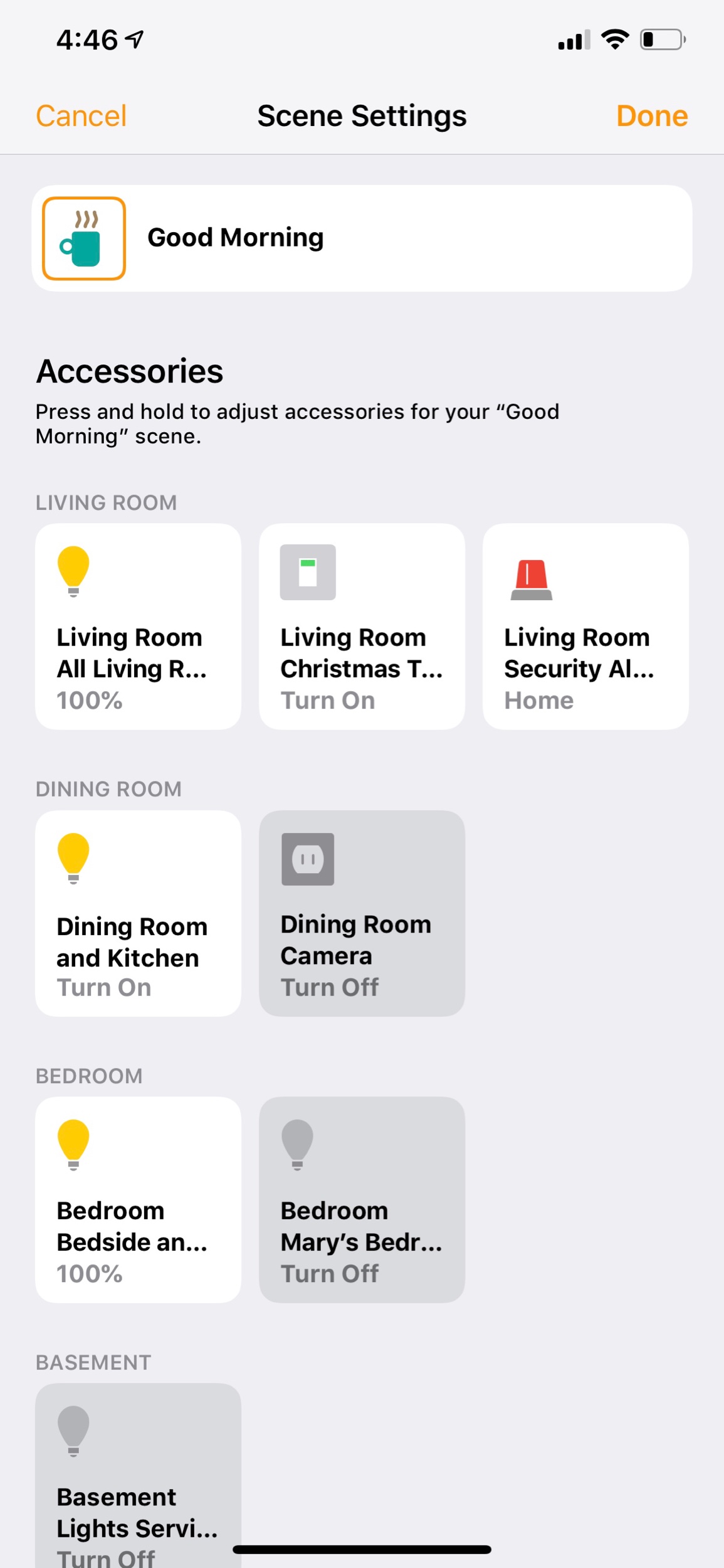
The Good Morning scene is automatically set to run at 6:30 am on weekdays and at 9:30 am on weekends.

The Good Morning scene is automatically set to run at 6:30 am on weekdays and at 9:30 am on weekends.

This is the set up screen for my Good Morning scene.

This is the set up screen for my Good Morning scene.

Ecobee Thermostat 

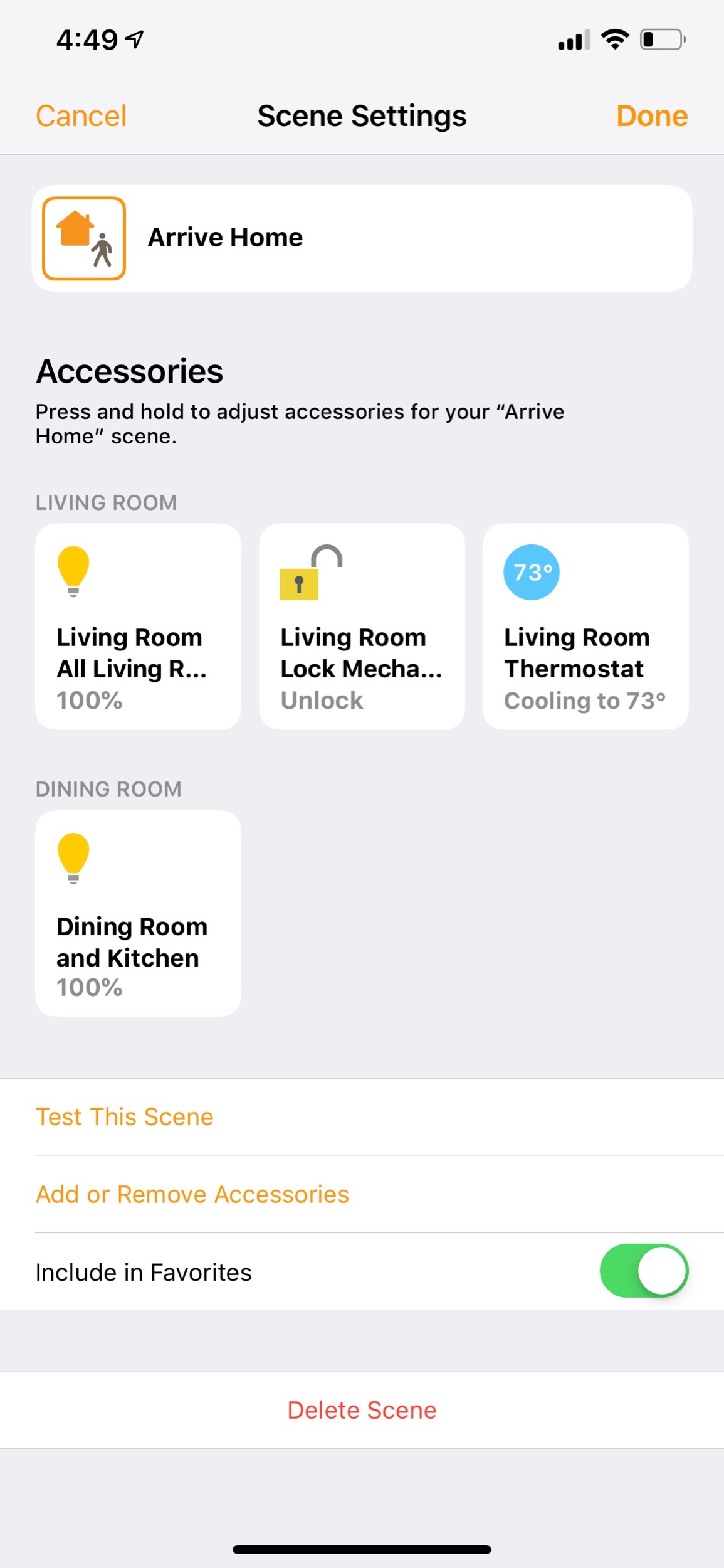
The Nest thermostat was the first home automation device I ever bought. It doesn't work with Apple HomeKit though. So when it unexpectedly died last year, I jumped at the opportunity to try something new. Ecobee thermostats are the best around. Speaking into the thin air "Hey Siri, I'm cold" to turn up the heat is a modern day dream. Of course, I can automate temperature in all of the same ways I can do lights. And I can even group these devices into "scenes" in the Apple home app to streamline frequent actions. For example, the "Arriving Home" scene turns on the air and the lights. This scene is not only triggered by button or voice, but automatically runs when my phone is within close proximity to my house. 

This is what you see when you open the ecobee app.

This is what you see when you open the ecobee app.

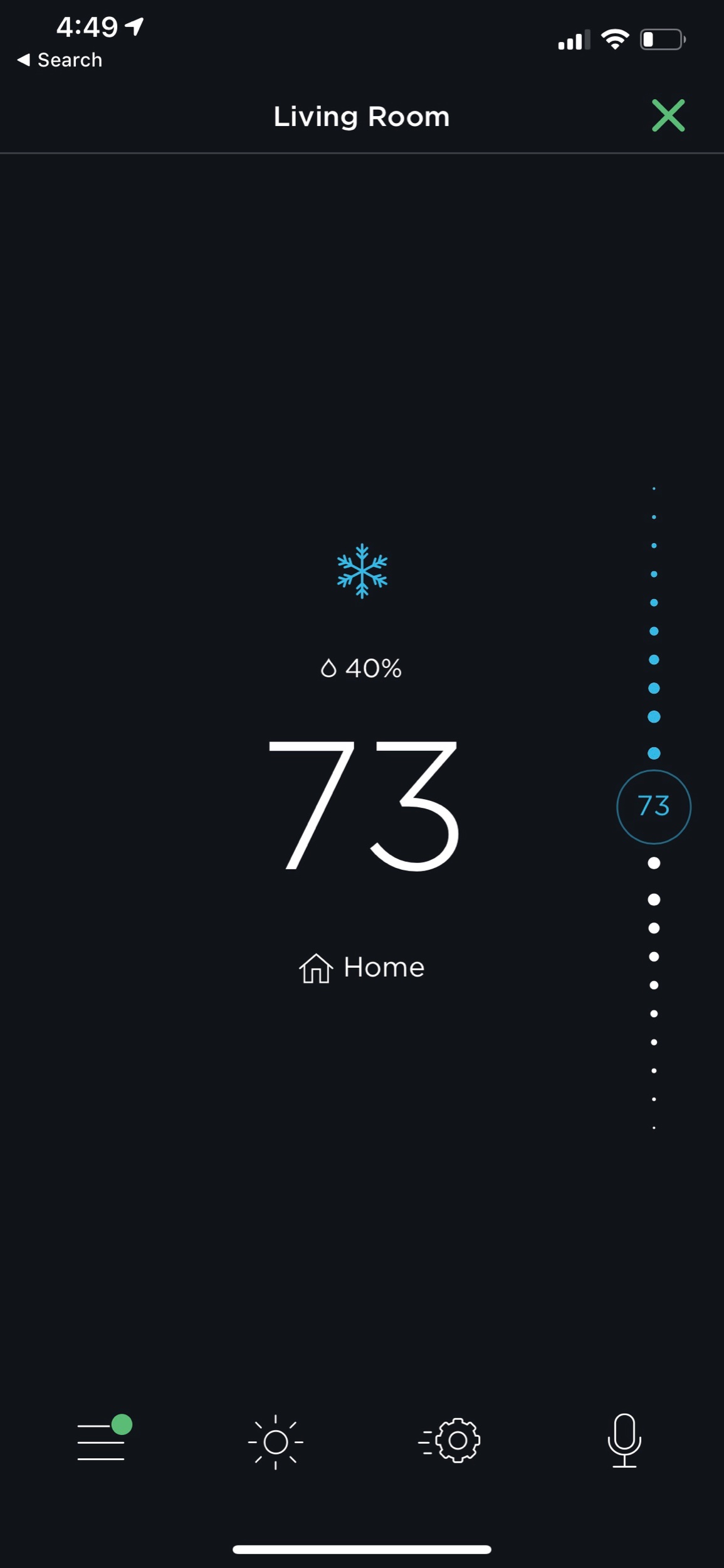
Once you tap on a thermostat, you get more detailed controls.

Once you tap on a thermostat, you get more detailed controls.

This is my Arrive Home scene. The door unlocks for me, the thermostat turns on a good temperature, and the lights on the main level of the house turn on.

This is my Arrive Home scene. The door unlocks for me, the thermostat turns on a good temperature, and the lights on the main level of the house turn on.

Schlage Sense Door Lock

My Schlage Sense allows me to unlock my door with the tap of a button. My teaching studio is in the basement of my house and the door is upstairs. It is disruptive to a lesson to constantly be answering my door, so now I just tell my Apple Watch "Hey Siri, unlock the door." It authenticates through contact with my wrist and completes the task. Of course my Arriving Home and Leave Home scenes also unlock and lock the door, in addition to all of the other actions I mentioned above. Having my front door unlock for me when I arrive home makes me feel like I am living in the future. Having it automatically lock when I leave gives me peace of mind that my house is safe. 

Logitech Circle Camera

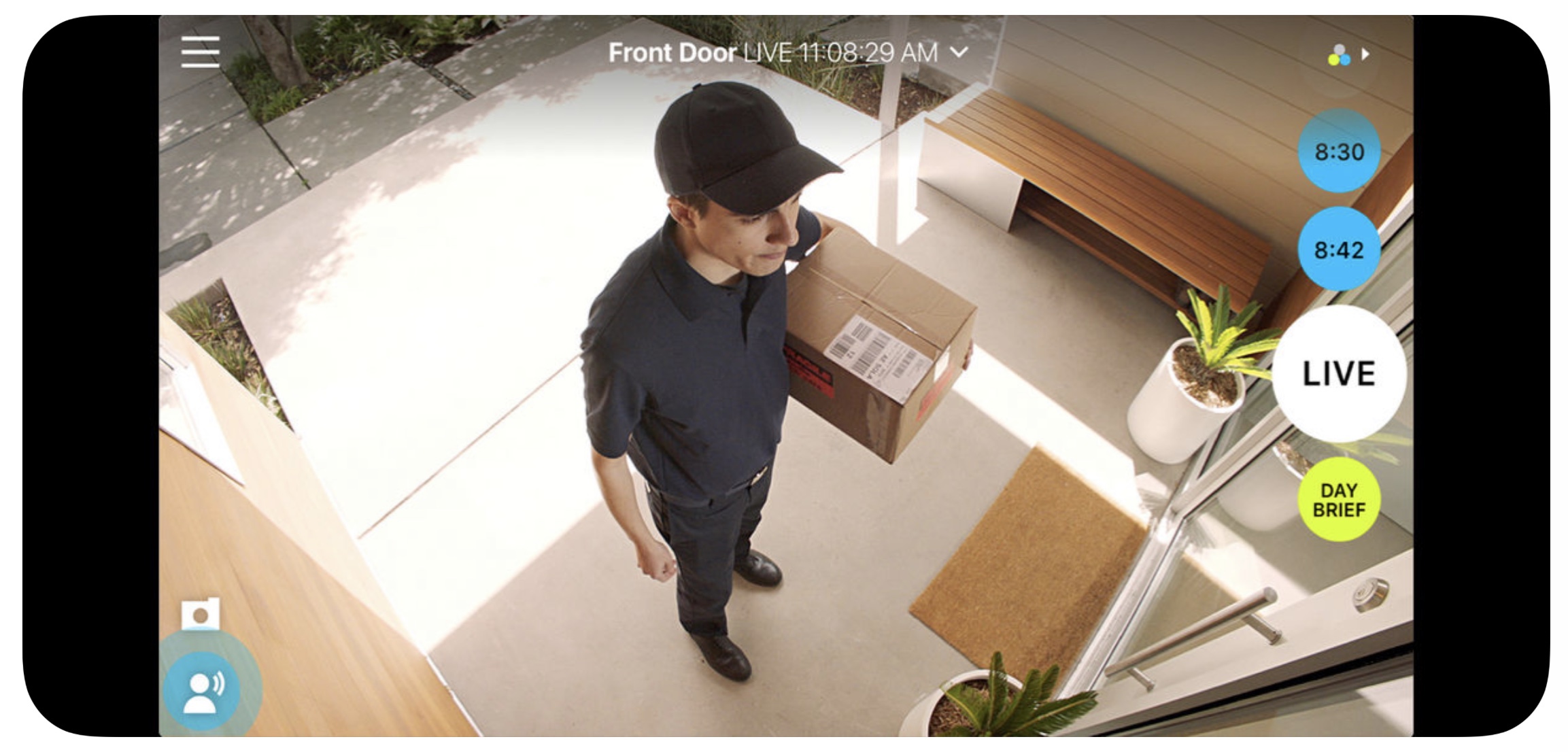
Of all the HomeKit devices out there, cameras are the hardest to shop for. I have found the Logitech Circle to be the best out there. Nest makes some great cameras but their lack of HomeKit support has driven me away. I have the Logitech set up in our dining room, facing down the primary hallway in my home. It is plugged into an iHome smart plug which is also HomeKit enabled so that I can turn it off and on remotely. This plug is automated in the Home app to turn on when neither my wife and I are home and turn off when one of us arrives home, therefore working like a security camera. When it detects motion it turns on our dining room and kitchen lights. It has a two way microphone so you can chat with someone in your home if you need to. And what I love about it most is that the camera feed shows up right in line with my other smart home controls in the Apple Home app. 

The interface for the Logi Circle 2 app.

The interface for the Logi Circle 2 app.

Eve Sensors

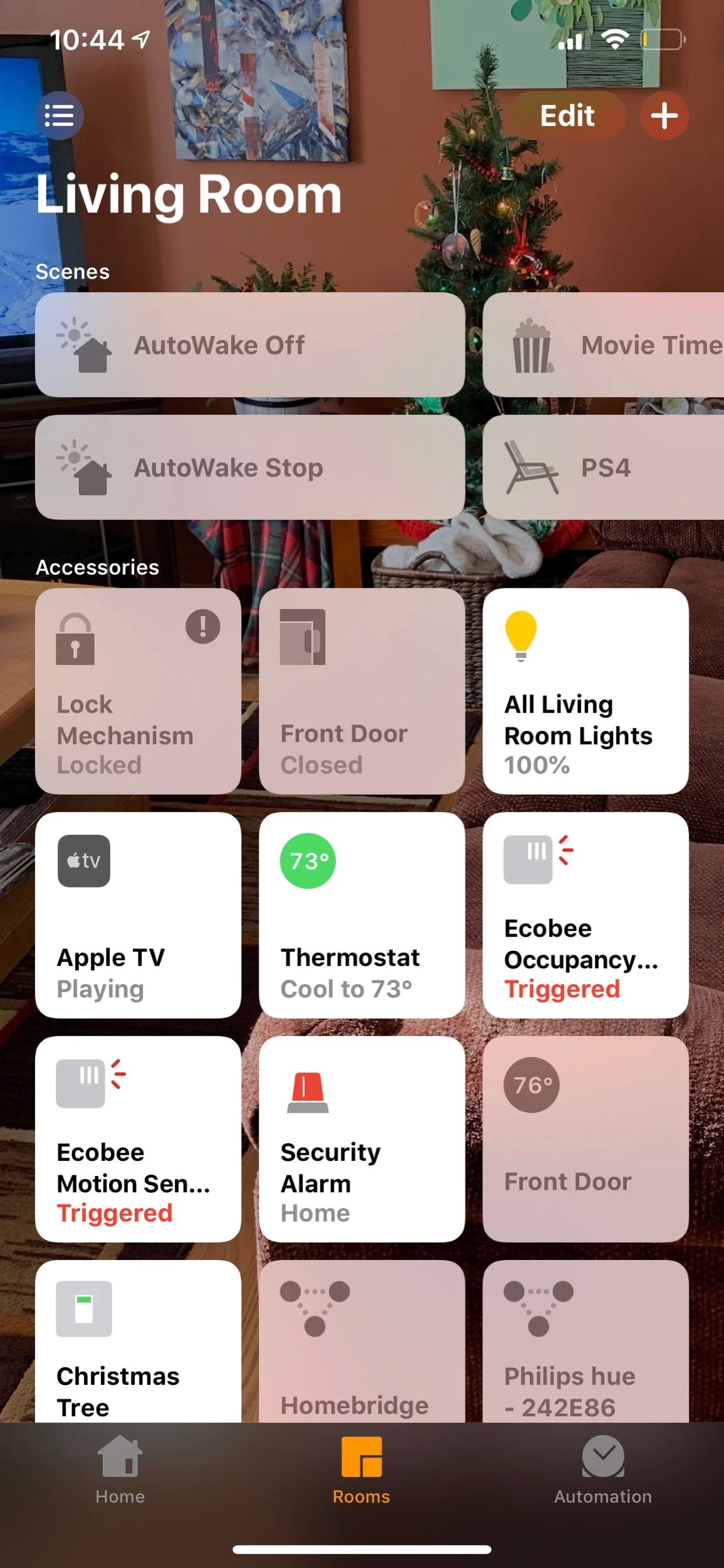
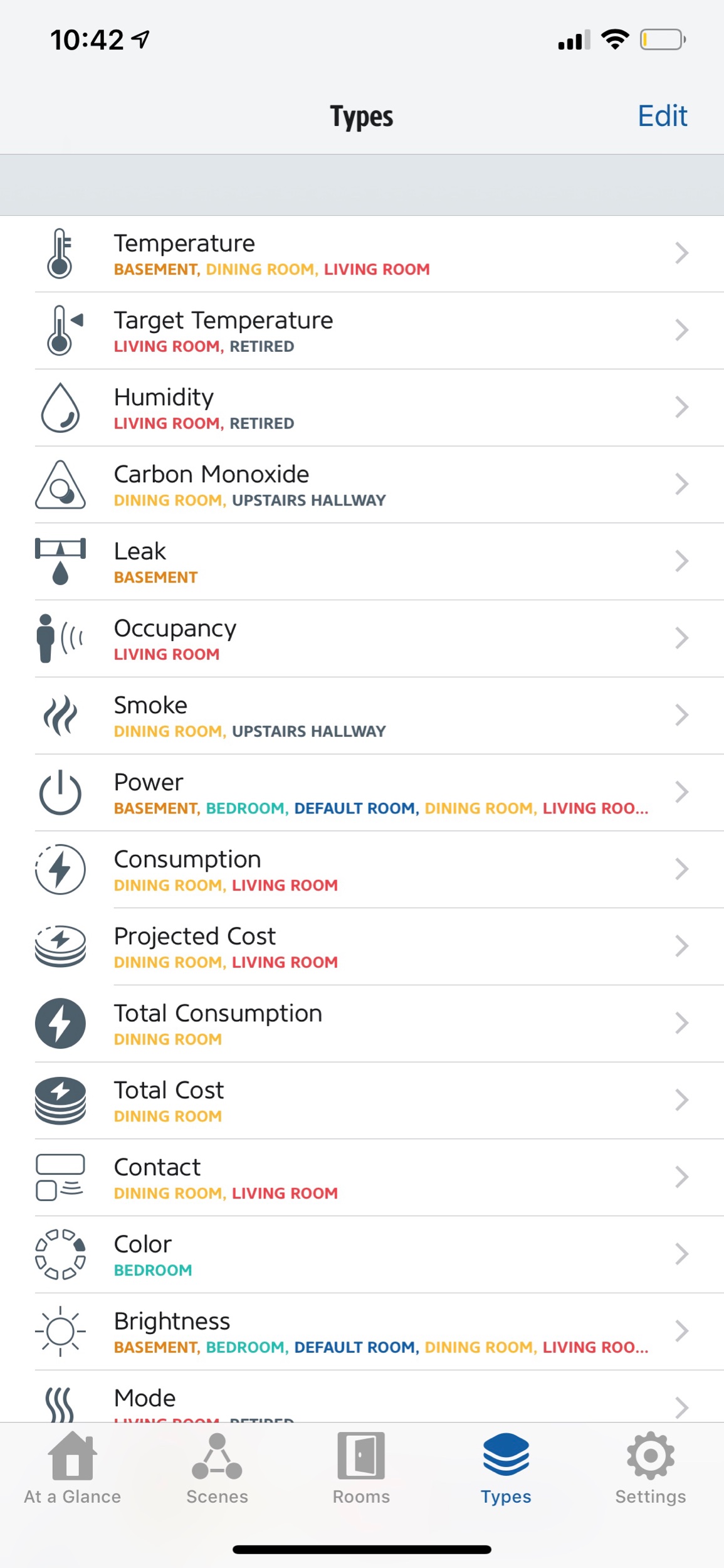
Sensors need no introduction. These things can trigger any other home device to act when they detect motion. Most of mine are set to turn on the lights in a given room when I walk into them. But they can also trigger thermostats and smart plugs. My favorite sensors on the market are made by eve. They are easy to set up and work reliably. Eve also makes a number of other interesting HomeKit products. 

Sensors appear as ‘Triggered’ in the Apple Home app when they have detected motion.

Sensors appear as ‘Triggered’ in the Apple Home app when they have detected motion.

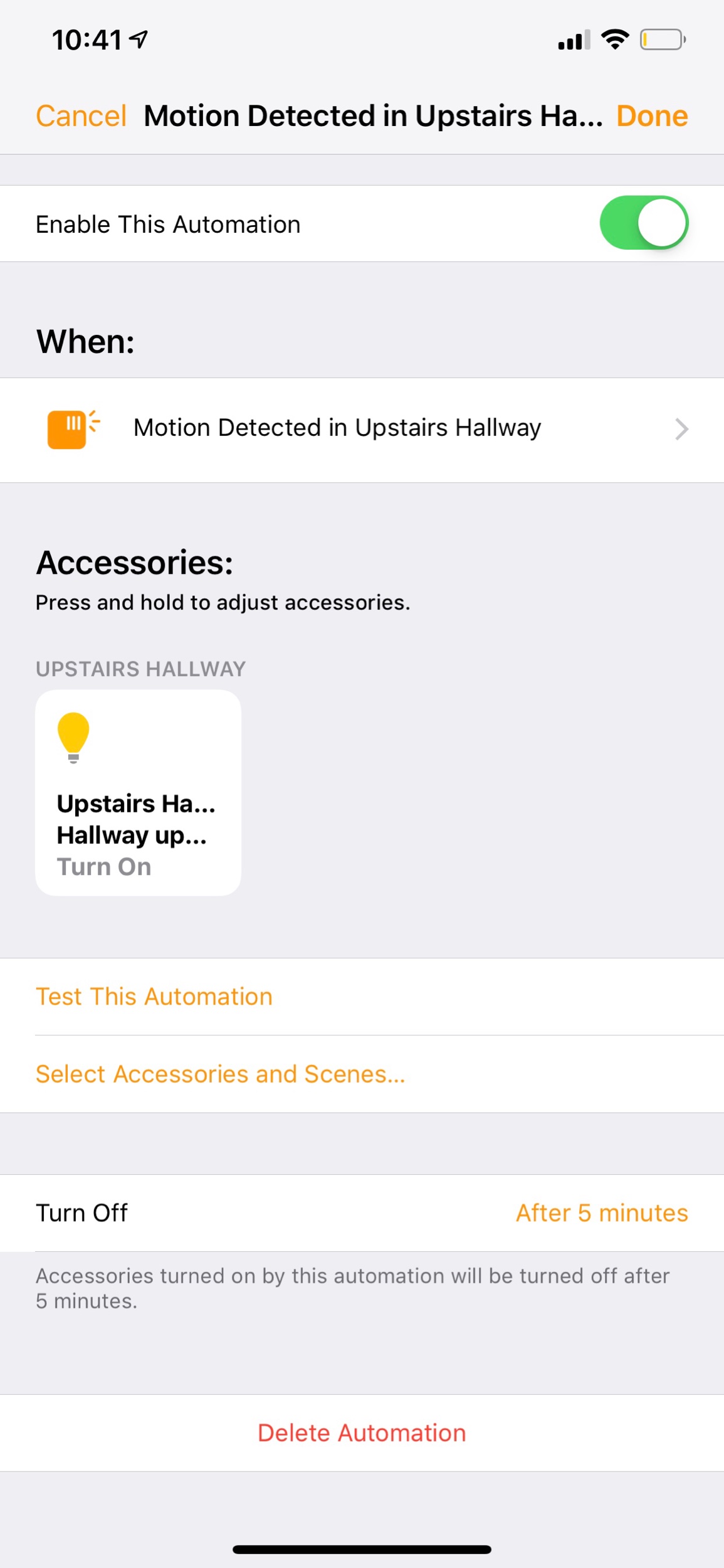
In Apple Home, I can make an automation that turns on the upstairs light whenever my eve sensor is triggered upstairs.

In Apple Home, I can make an automation that turns on the upstairs light whenever my eve sensor is triggered upstairs.

The eve app makes a great alternative to the Apple Home app for controlling all your devices.

The eve app makes a great alternative to the Apple Home app for controlling all your devices.

iHome Smart Plugs

I like using smart plugs as an all purpose way of turning on and off the things in my house that are otherwise not “smart.” In addition to the camera workflow I mentioned above, I also have these plugged into other devices throughout the house. For example, my bedroom fan is plugged into one. I can now turn it on and off in the middle of the night without getting up. “Hey Siri, turn on the fan.” A lot of brands make smart plugs but the iHome is the easiest to set up and use in my experience. 

Apple HomePod

I was hesitant about the HomePod at first given that it shipped with incomplete software and relies entirely on Siri for voice commands. Still, the device offered some compelling features. When iOS 11.4 brought the features that were missing from release (AirPlay 2 and multi room audio), I scooped one up while Best Buy was running a 100 dollar off deal on them, refurbished. 

The HomePod fulfills a lot of the same purposes as the Amazon Echo. It is distinguished by linking into the Apple ecosystem, allowing me to command Apple Music, Apple Podcasts, and all of the home automation devices mentioned above. 

Control of the HomePod exists inside the Apple Home app where it appears as a speaker device. The recent addition of AirPlay 2 allows my two Sonos One speakers to show up in the Apple Home app as well. 

The HomePod is first and foremost a good speaker. But it can also command your other speakers in the house and even the audio output of your Apple TVs. Simply command “Hey Siri, move this music to the living room,” and listen as your music is magically transported from one speaker to the next. You can output your Apple TV audio through to this handy speaker and speak playback commands to your tv and movies with statements like “pause,” “stop,” and “skip ahead 50 seconds.”

The HomePod is the core of the Apple Home experience. Of course, you could just as easily control every device in this post from an Echo. However, as an Apple Music subscriber, and frequent listener to podcasts in the kitchen, having a HomePod makes sense for me to own.

It looks like the investment is going to pay off. This fall, iOS 13 will be adding even more features to the HomePod and Home app. For example, the HomePod will be able to distinguish between my voice and my wife’s. This way, when she asks it what is going on today, it will read from her calendar instead of mine. iOS 13 is also introducing speaker automations for scenes. So my Good Morning scene in the Home app will now play my favorite breakfast playlist in addition to turning on select lights and changing the temperature.

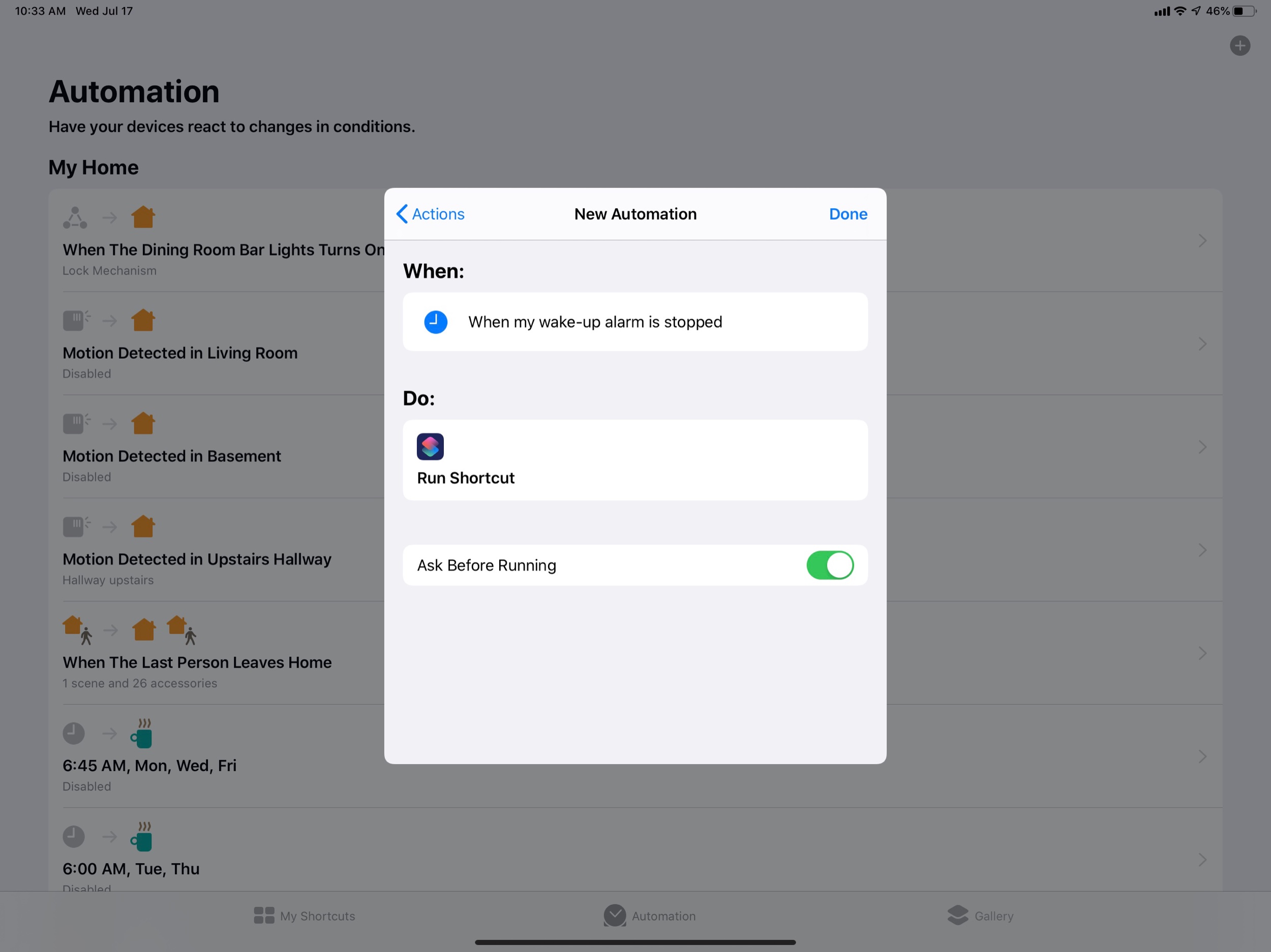
And finally, HomeKit automations and Siri Shortcut automations are going to be better tied together, and will be able to be triggered automatically. For example, doing something like stopping my wake-up alarm will both run the Good Morning scene and automatically run this Siri Shortcut that tells me how I slept, delivers a weather report, and opens a meditation in the Headspace app.

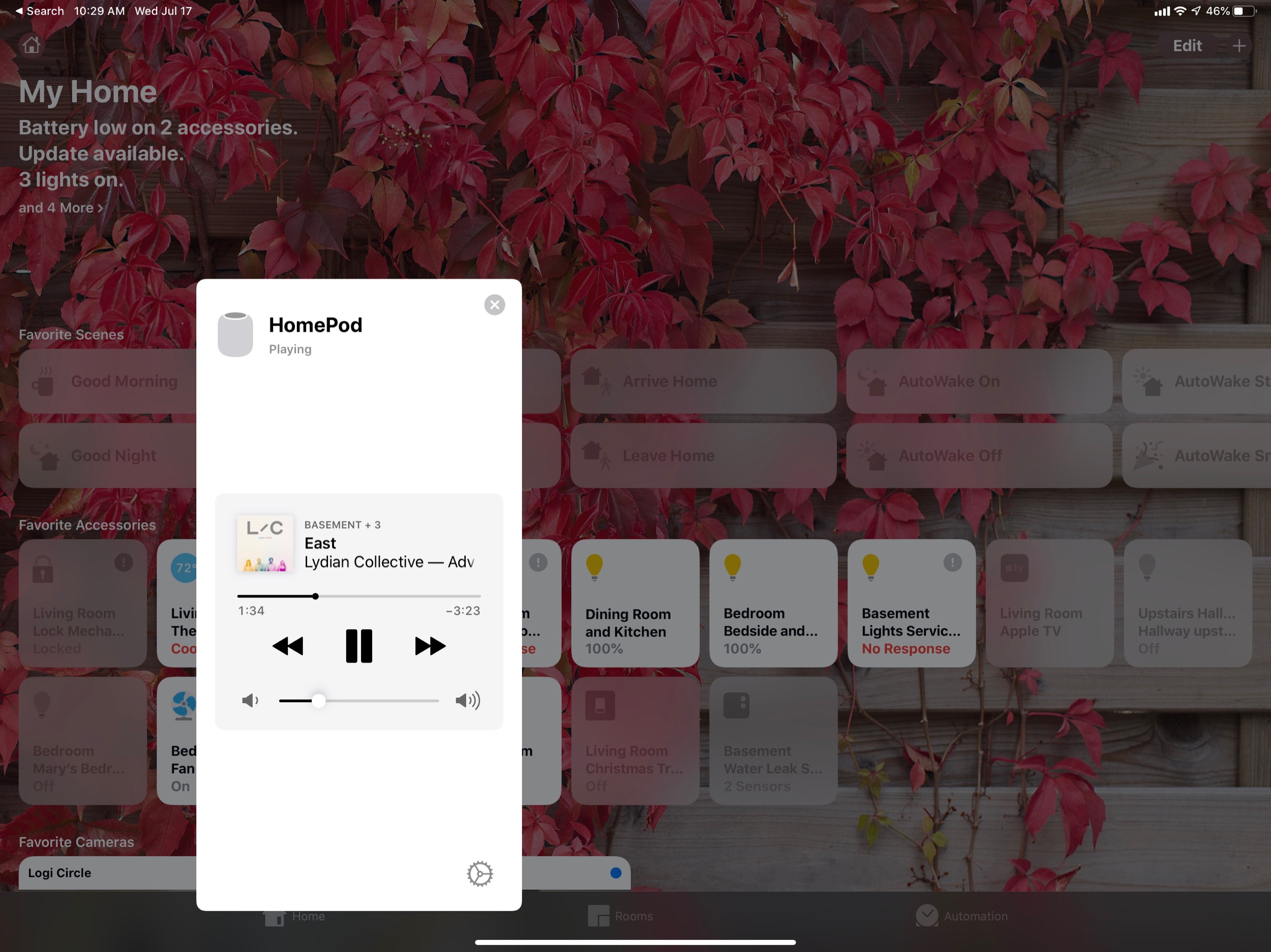
In iOS 13, HomePod play controls show up right in the Home app.

In iOS 13, HomePod play controls show up right in the Home app.

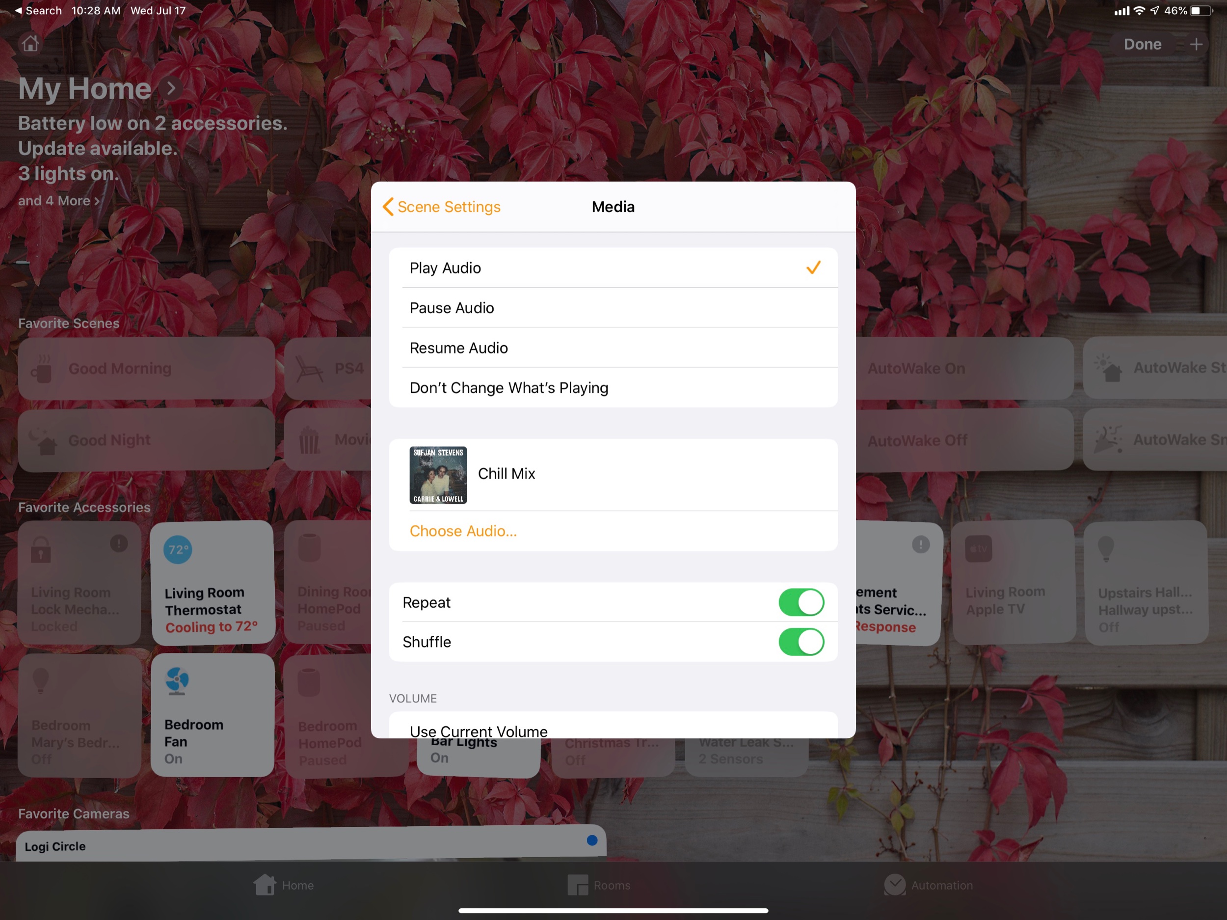
In iOS 13, music playback can become part of your scenes.

In iOS 13, music playback can become part of your scenes.

The new Siri Shortcuts app on iOS 13 integrates home automations and personal automations. It also allows them to be automatically triggered by time, location, opening a particular app, and more! In this example, stopping my wake-up alarm triggers m…

The new Siri Shortcuts app on iOS 13 integrates home automations and personal automations. It also allows them to be automatically triggered by time, location, opening a particular app, and more! In this example, stopping my wake-up alarm triggers my I’m Awake Siri Shortcut, which sets the Good Morning scene, reads me the weather, tells me how I slept, and starts a meditation.