iOS 14, iPadOS 14, watchOS 7, and tvOS 14 came out a few weeks ago. I have a lot to say about these updates, but today I wanted to write about widgets for a moment.
Widgets are catching on as a significant feature amongst the masses. As someone who plays around with the way apps are organized on the home screen at least twice a week, I can tell that widgets are going to add a lot of excitement (and anxiety) into my life. I have been toying with them since July when this software entered the public beta, and I am far from resolved.
Here is where I have landed for now…
Page one (middle image) contains my most tapped app icons. This will be a hard habit to break, but I find lots of value in having upcoming calendar tasks and weather permanently on my most visited screen. Weather Line and Fantastical have the best small-sized widgets, in my opinion. Even this smallest widget size takes up four app icons, so they need to be beautiful and information-dense for it to be worth me sacrificing four apps.
I didn’t think I would want weather on this first screen, but now that it is always visible to me, I don’t see how I could live without it. The Weather Line widget is awesome because its user interface depicts the weather on a line, almost like a chart. It even manages to fit an hourly rain graph into its small space when it is raining out. Not even my second favorite weather widget, Carrot Weather, does that.
The Today View (left image) is where I keep Siri Shortcuts and the older, legacy style widgets from iOS 13. As much as I like the newer widgets’ look, the older style widgets are interactive. I keep OmniFocus, Timery (for time tracking), Streaks (for tracking daily habits), and Waterminder (for quickly logging water) all on this screen because I can tap right on the buttons to act on these apps without the widget needing to launch into the app.
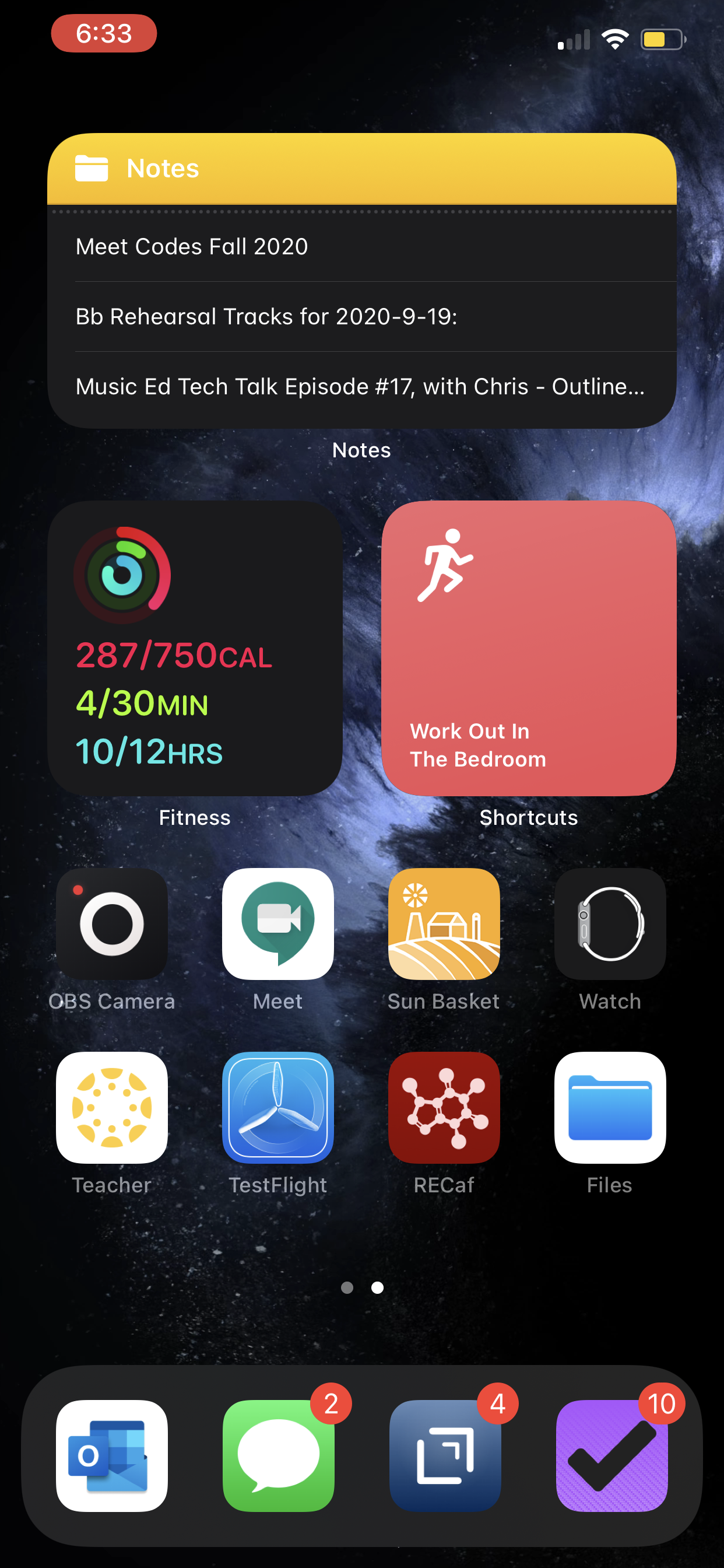
I am continually playing with page 2 (right picture). I like it to be mostly another grid of tappable apps, but I am experimenting with various widgets here. I think what I have settled on is to have the Maps and Notes app widgets stacked on top of each other at the top, and then to use the Siri Suggestion widget, which shows me two rows of apps that swap in and out throughout the day based on my phone’s predictions of which apps I want to use in which contexts. The image above shows some other widgets I am experimenting with, but I think I prefer having more app icons there.
On the iPad, I keep: calendar, weather, notes, Apollo (a Reddit app I use to keep up on the latest news about my interests), Siri Shortcuts, and the Files app for launching into recently modified files.
On both my phone and iPad, I am waiting for an OmniFocus widget to track my tasks. Even though I like the one in the Today view where you can mark the tasks as done right from the widget, I think I might want to have my next few upcoming tasks permanently visible on page one.
9to5Mac.com and MacStories.net have been two great websites to follow if you want to stay up on which apps offer widgets.


