Using Drafts and TextExpander to Organize Lesson Notes

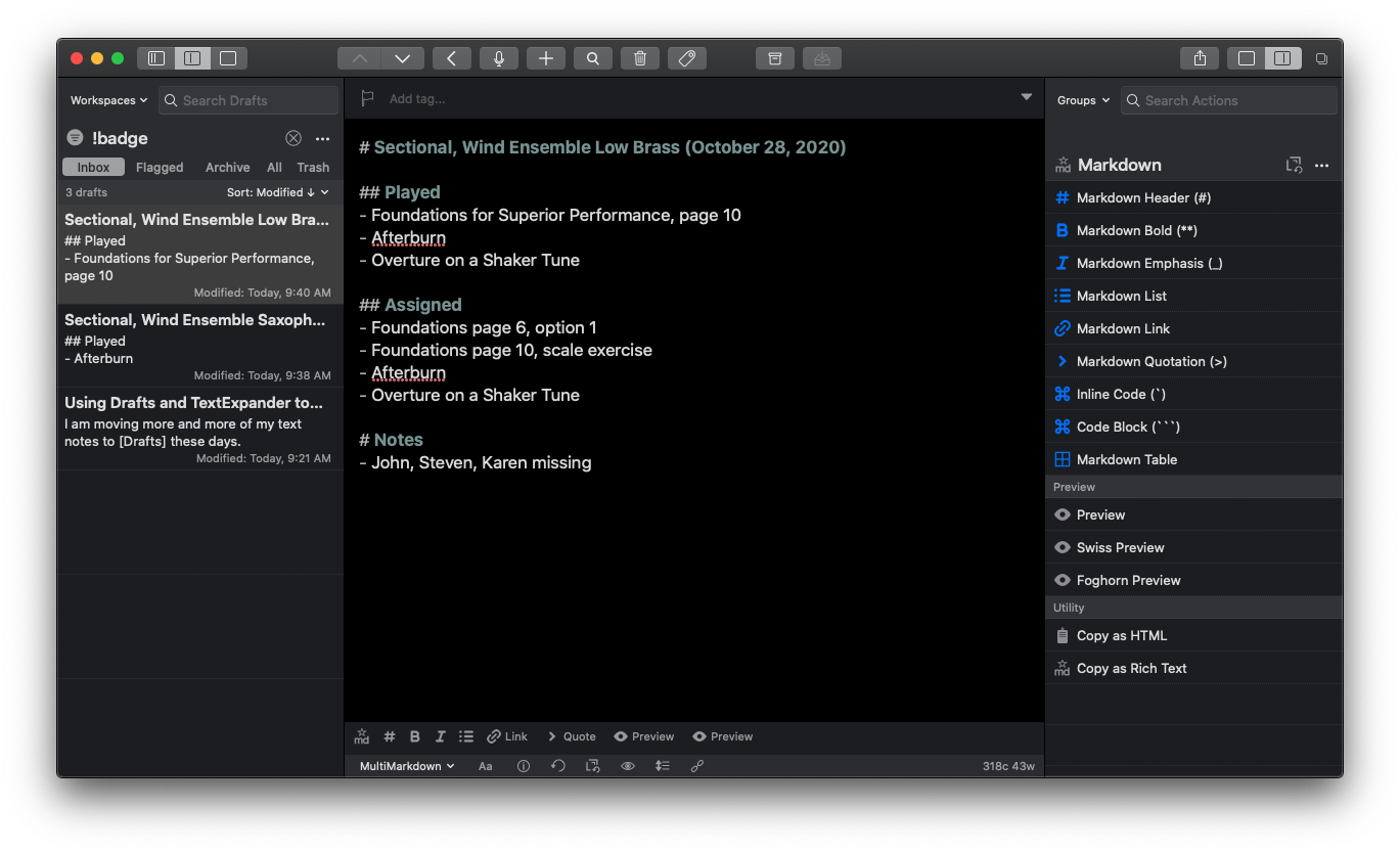
Taking notes on sectionals in the Drafts app.

I am moving more of my text notes to Drafts these days. You can read about how I use Drafts here. Drafts is a note-taking app where most of my text typing starts. When I am ready to act upon my text, the actions on the right side of the screen allow me to send it off to messages, emails, tasks, notes, social media, and more.

Generally, I use Drafts as a text-inbox, where I eventually process all of my text ideas and send them to other apps that are better suited for them. But lately, I wonder why I need to take the extra step of sending a draft to another app when Drafts is perfectly suited for organizing and searching text.

Let's take Lesson Notes, for example. When I teach a sectional, large ensemble, or private lesson, I like to take notes on what we played and what I assigned. Usually, I would type these in Drafts and then send the finished text to Apple Notes. But lately, I am just keeping it in Drafts and archiving it so that it doesn't clutter up the inbox area. Everything is in plaintext so searching my entire 7,000 draft library is way faster than searching Apple Notes. Plus, it reduces the amount of time I ever even need to open Apple Notes by 90 percent.
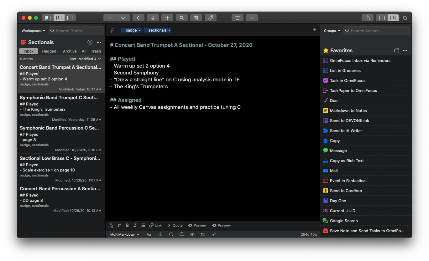
My "Sectionals" Workspace.

I add the tag "sectionals" to a draft where I have taken sectional notes, and I have a custom workspace that allows me to see just the drafts with that tag.
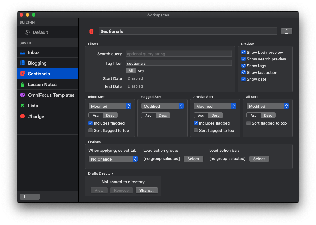
Here is how I have set up my Sectionals Workspace to include drafts with the "sectionals" tag.

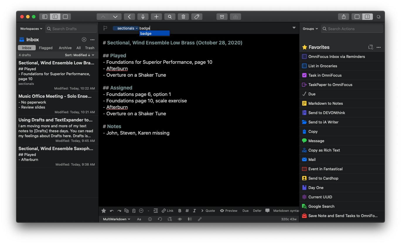
Adding tags is as simple as typing them into the tag area.

Additionally, tagging them "badge" makes it so that the draft doesn't contribute to the number on the red badge of the Drafts icon. I use the badge only to inform me of drafts that need to be processed to another app.

I write most of my drafts in Markdown, which means I use "#" symbols to note levels of the heading, "**" to indicate things I want bold, etc... If you want to read more about how I use Markdown, read this post. Drafts and common web editing tools like WordPress (and even Canvas) can turn this Markdown into HTML. I only use Markdown for my sectional notes to show bullet-pointed lists and first/second-level headings. Drafts does some light formatting to help me better see this information by, for example, highlighting the headings green.

It gets tedious to retype this template for every class, so I have TextExpander snippets to do it for me. Read about how I am using TextExpander here.

In the case of the snippet below, I type "sectionalnotes" into the body of the draft and then TextExpander prompts me for the ensemble and sectional name and then automatically fills in that data, with my fill-ins and the current date.
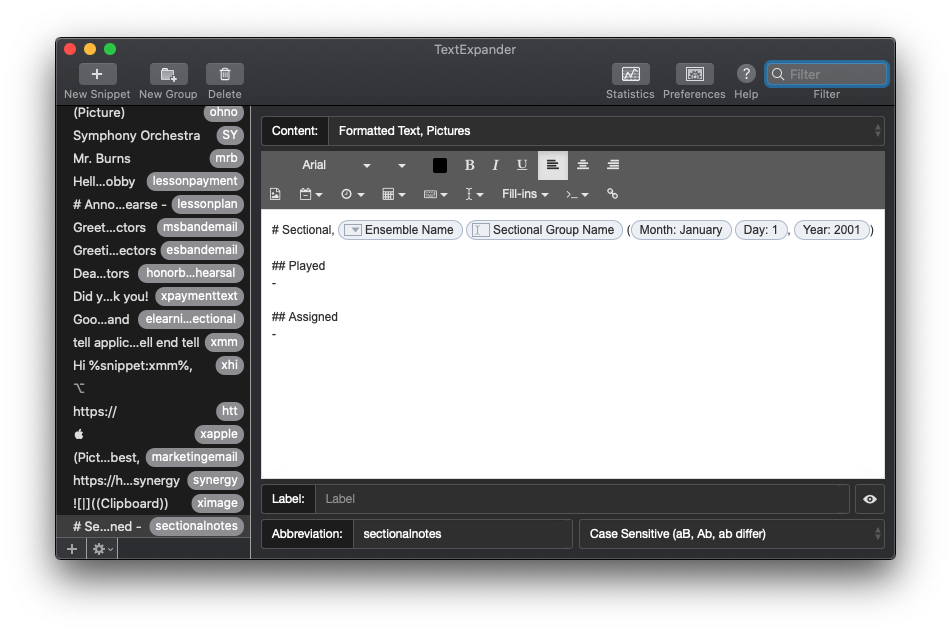
My TextExpander snippet for Sectional Notes.

Using an action called Current UUID, I can copy a link to a draft to my clipboard and paste it in to the calendar event for whatever class, lesson, or sectional it is related to. That way, I can easily refer to it by date, using the visually friendly interface of a calendar app.

'Music Quiz' iPod Game Brought Back to Life Through Siri Shortcuts

This is from a while ago but I think many will appreciate it…

Apple revives classic ‘Music Quiz’ iPod game through the Shortcuts app on iOS 14 - 9to5Mac:

On the iPod, Music Quiz plays a number of songs in shuffle mode and it provides five different options for you to choose which song is playing. The shortcut version of this mini game on iOS 14 is quite similar, as it also plays random songs with five different answer options.

Music Quiz on iOS 14 is part of the “Starter Shortcuts” folder, which offers four different shortcuts that demonstrate what users can do with the app. In order to find and play Music Quiz on your iPhone or iPad running iOS 14 or iPadOS 14, just follow the steps below:

If you have not tried Siri Shortcuts on your phone yet, this is a fun way to test them out. It’s baked right in to your phone if you are running iOS 14.

This shortcut makes it really easy to dissect how one of these is built and play around with the logic a bit to better understand how you might build your own automations using similar building blocks.

Sponsor Music Ed Talk Talk!

Do you have a product, app, or service that you would like to promote?

I am now offering sponsorships for the blog and podcast! A sponsorship includes…

  • An ad pinned to the sidebar of this blog (my thanks to this month’s sponsor, Flat for Education!)

  • A blog post about your product in my feed. You can provide the copy. If you wish, I can test your product and add some of my own experiences to the post.

  • An ad read on one episode of my podcast. Again, you provide the copy, but it is read conversationally in the middle of my show, not like a commercial. I speak to my own experiences if I have them.

I am open to all kinds of sponsorships. The audience of the blog and podcast are musicians and educators, often active music teachers, who are generally tech-savvy. Many of them use multiple computing devices, aren’t afraid to try new tech, and are looking for practical ways to engage their students musically.

Naturally, software that enhances the creative and productive lives of musicians and teachers is a good fit but I am open to sponsorships of a much wider variety than just that. Music stores, colleges, fundraisers, books, you name it!

If you want to be a sponsor, or if you want more details, choose Contact in the navigation bar of this site and leave me a message!

And if you don’t have a reason to sponsor the site in this way, but you want to support my continued hosting costs and motivation to keep producing content, check out my Buy Me a Coffee page. I appreciate any and all support!

Take Advantage of IFTTT Discounted Price Until October 31

In an upcoming episode of my podcast, Frank Buck and I talk a bit about automation. In that episode we reference a great service called If This Than That. I have been using it for years and though the service is free, they recently announced a Pro Version with a “choose your own price” subscription model.

You can choose a price as low as $1.99 a month until October 31. Since the podcast episode isn’t dropping until later in the week, I thought I would get this news out there now.

This is an extremely useful service that has been a part of my productivity workflow for years. IFTTT allows you to string together different apps and services to create automations, or, “Applets.” Some examples might include:

  • If I save a YouTube video to watch later, add a task to remind me to watch it

  • If I like a Tweet, save the attached article to a read it later list

  • If I am tagged in an Instagram photo, save it to my Dropbox

  • If I do an item on my to do list, log it in a row of a Google Sheet

  • If I pin something on Pinterest, share it to Facebook

The possibilities are limitless. The pro version adds a ton of features, for example:

  • Multi-step Applets

  • Queries and conditional logic

  • Multiple actions

  • Faster Applet execution

    ... and beyond.

IFTTT is a great tool and I strongly recommend you check our the new pro features before the end of this month!

Adobe Illustrator Comes to the iPad

From MacStories…

Adobe MAX Kicks Off with Illustrator for iPad, Photoshop, Lightroom, and Fresco Updates for iPad, Plus the Addition of Fresco for iPhone - MacStories

This year the announcements at MAX are no different. I’ve tried all of the apps discussed below that Adobe is releasing or updating for the iPad and iPhone this year to one degree or another, including spending the past few weeks using the beta version of Adobe’s latest pro iPad app, Illustrator. My artistic skills don’t do Illustrator justice, but from what I’ve seen from my testing the past few weeks and demos by Adobe, Illustrator is a remarkably powerful vector drawing app that takes a truly innovative approach to the app that should still be familiar to desktop users, but is designed first and foremost around touch interactions. Adobe has also released Fresco for the iPhone and some substantial new features to both Photoshop and Lightroom.

One more “pro” app from the creative industry finally comes to the iPad. I am enthusiastic about this though I have not used Illustrator in years. I am tempted to say that Adobe’s efforts on iPad (Photoshop came out last year) are too little too late, but the reality is, these apps are just not for people like me in most cases. If you are a professional using this software to get your work done, it is worth Adobe’s subscription. If you work for a large company doing design, I imagine the cost is even covered for you.

Unless you are really comfortable with Illustrator, I don’t feel like I can recommend this app for designing things. I started learning Affinity Designer this past summer which is an amazing competitor to both the Mac and iOS versions of Illustrator. It is easier to use and more “Apple-like” in many ways. If you need the power of an app like this, I recommend checking out Affinity Designer. It is very frequently on sale for prices as low as 30 dollars.

Another program I use for a lot of my design is OmniGraffle which is by the OmniGroup, the same people who create OmniFocus. It feels as close to using one of the iWork apps as I have seen for a vector-based design app. Its simplicity has vastly sped up my work making graphics for my website/podcast, school music program, seating charts, and more.

New iPad Air and iPhone

A number of teachers have asked me about the new iPad Air that Apple announced last month. It has been updated to look and function a lot more like the iPad Pro line and many are wondering if they need to go Pro or if the Air will satisfy their needs.

iPad Air and iPhone 12 (announced last week) reviews are out, and I have been reading through them this morning. Here are a few that stood out to me:

2020 iPad Air review: Almost Pro | Sixcolors.com

iPad Air Review: Forward-Looking | MacStories.net 

The iPhone 12 and iPhone 12 Pro | Daring Fireball

iPhone 12 and iPhone 12 Pro Review: The Best iPhones-but Note for the 5G

Based on everything I have learned so far, there has never been a better time to buy Apple's entry level products. The regular iPhone 12 and iPad Air are spectacular products, and I am guessing that a very large majority of users, even tech nerds, and professionals, are going to feel totally satisfied with them.

I have not tested pro apps like StaffPad, Ferrite, or LumaFusion on the iPad Air because I am still using the 2018 model iPad Pro. My educated guess is that you would not feel limited by the iPad Air, even if you use these apps. You would especially not feel limited using music apps like Tonal Energy and forScore.

When it comes to the iPhone, I am more compelled by the new Mini size and the Pro Max size (which comes with a much better camera system than the regular 12 Pro). Reviews for these are not out yet.

I will probably upgrade my phone, and it will probably be the Pro Max, just because I have a 9-month-old and want to take the best pictures possible of him. That said, I really miss the iPhone 5 days of the tiny phone and might consider a Mini in a future year if I read good things about it later this season.

I am going to keep my iPad Pro around for a bit, but if the Mac were ever to come equipped with a touch screen and Apple Pencil support, I would have to re-evaluate needing the larger-sized iPad Pro and whether or not I need an iPad altogether. I do miss the comfort of the smaller iPad size, particularly for reading, and my gut says that this iPad Air might satisfy my needs down the road.

Conclusion - You probably won't regret not going Pro on Apple's fall lineup of products, but the differences are definitely in the details so make sure you read up on them first.

METT Episode #18 - Productivity Boot Camp (Part I): Notes and Tasks, with Dr. Frank Buck

Thanks to my sponsors this month, Flat for Education.

Dr. Frank Buck returns to the show for the kick-off of my mini-series, Productivity Boot Camp! Dr. Frank Buck is a productivity master with a background in band directing and administration. I share my knowledge of Apple products and native third-party apps, and he shares his experience with web-based, cross-platform apps. We bounce back and forth about good digital task and note management and share our favorite apps!

Show Notes:

App of the Week:
Robby - Sticky Widgets
Frank Buck - Feedly

Album of the Week:
Robby - The Lost Art of Longing | BT
Frank Buck - Handel Flute Sonata V - Recording of Dr. Frank Buck Performing

Where to Find Us:
Robby - Twitter | Blog | Book
Frank Buck - Twitter | Website

Please don't forget to rate the show and share it with others!

Subscribe to Music Ed Tech Talk:

Subscribe to the Blog

Subscribe to the Podcast in... Apple Podcasts | Overcast | Castro | Spotify | RSS

Thanks to this week's sponsor, Flat for Education:

Flat for Education offers music educators and their students the most affordable cloud-based music notation software on the market. Empowering teachers to create playful and engaging music activities, creations, assessments on any device at any time.

The platform integrates with every well-known learning management system available: Google Classroom, Microsoft 365, Canvas, Schoology, and MusicFirst to name a few. Everything will be synchronized with your existing setup to avoid any time loss.

Flat for Education offers an advanced system of assignments allowing you to create playful and stunning music activities with your students.

Create a template for all your students to start working from, or simplify the toolbar to have them only working with eighth and quarter notes. The only limit is your imagination.

Save a lot of time by generating worksheets and quizzes in just a few clicks for your students to practice music theory.

Finally, Bands directors and choirs conductors can have their students directly recording their performance from home for review.

Whether you are teaching remotely or in-person, Flat for Education will support you in creating playful and engaging music activities in no time. Try it free for 90 days on flat.io/edu

Syncing Peloton Bike Workouts to the Apple Watch Activity Rings

My wife and I started using the 12 dollar a month Peloton service, without the bike, early this year. It is full of engaging, thorough, and motivating classes that span everything from yoga to strength training. I recommend it. Even if you don't have an interest in the bike, it is still a viable service for staying physically active at home. That said, we did become interested in the bike through this service and have been owners since around February.

Go to the Apple Health settings of the Peloton app to begin setup.

Go to the Apple Health settings of the Peloton app to begin setup.

After my bike workout, I go to this screen of the Peloton app to review my workout.

After my bike workout, I go to this screen of the Peloton app to review my workout.

One of my favorite features of the bike is that it syncs my activity to Apple's health ecosystem, where I also track sleep, water, and numerous other fitness metrics.

The newer and fancier Peloton bike uses Apple’s GymKit technology to sync metrics only the bike knows (like distance) with metrics only the Apple Watch knows (like heart rate) and then immediately track it as an Apple Watch workout. 

I admit I am slightly jealous I don’t have this version but you can get the same results if you have a third-party heart rate monitor. All I do is wear this third party heart rate monitor on my arm when I do a bike ride, and then open up the Peloton app on my phone when I am done. The Peloton app syncs my ride metrics to the Apple Health app, which then syncs the fitness data to the Fitness app on the iPhone and Apple Watch, ensuring that I fill my rings. 

Post workout, I review my workout in the Peloton app and then open Apple Health to see the data tracked in that workout alongside other thigns I am tracking like diet, water, meditation minutes, and blood oxygen.

Post workout, I review my workout in the Peloton app and then open Apple Health to see the data tracked in that workout alongside other thigns I am tracking like diet, water, meditation minutes, and blood oxygen.

Next, I open the Apple Fitness app. Sometimes it takes a few minutes for the rings to show up here, and then later on the watch, but they always do.

Next, I open the Apple Fitness app. Sometimes it takes a few minutes for the rings to show up here, and then later on the watch, but they always do.

The best part is that I can charge my watch while I ride, which means I can wear it to track sleep throughout the night using AutoSleep.

Peloton also has an Apple TV and Amazon Fire Stick app now. Great for doing yoga in the living room. I track these workouts normally on my Apple Watch by running the appropriate workout type before I start.

Stay healthy out there.

Flat for Education (Sponsor)

I am thrilled that Flat for Education is sponsoring Music Ed Tech Talk this month. Their product is a breath of fresh air in a landscape of frustrating education software. More on that in a moment, but first, their own words:

Flat for Education offers music educators and their students the most affordable cloud-based music notation software on the market. Empowering teachers to create playful and engaging music activities, creations, assessments on any device at any time.

The platform integrates with every well-known learning management system available: Google Classroom, Microsoft 365, Canvas, Schoology, and MusicFirst to name a few. Everything will be synchronized with your existing setup to avoid any time loss.

Flat for Education offers an advanced system of assignments allowing you to create playful and stunning music activities with your students.

Create a template for all your students to start working from, or simplify the toolbar to have them only working with eighth and quarter notes. The only limit is your imagination.

Save a lot of time by generating worksheets and quizzes in just a few clicks for your students to practice music theory.

Finally, band directors and choirs conductors can have their students directly recording their performance from home for review.

Whether you are teaching remotely or in-person, Flat for Education will support you in creating playful and engaging music activities in no time. Try it free for 90 days on flat.io/edu.

Since my school district moved to online teaching in March, I have had the opportunity to test a greater variety of web-based music teaching software. Much of this I have been able to use practically, with kids using the tools on the other end, and in combination with our district's learning management software.

The user interface of Flat for Education is really simple and clean. It is immediately easy for a teacher or student to find the features they are looking for and every click feels responsive and fast!

The user interface of Flat for Education is really simple and clean. It is immediately easy for a teacher or student to find the features they are looking for and every click feels responsive and fast!

I will put this simply: a lot of education technology is buggy, unintuitive, and difficult to decipher. Music technology is no exception. One thing I really appreciate about Flat for Education is the design. It is simple, beautiful, and straightforward. 

I am not just referring to the graphical design of Flat for Education. I am referring to the experience of using it. The onboarding could not be more straightforward or direct. Menus in the score editor are simply laid out, buttons respond quickly, note heads drag smoothly, and nothing takes too many clicks to accomplish. I did a lot of testing before writing this post and found that every feature I tried was easy and reliable. Even something niche like batch uploading numerous XML files from Dorico into my Flat for Education library was quick and rock-solid.

Another example of how clean and easy to understand the Flat for Education experience is. Batch uploading numerous files I created in Dorico into my Flat Score Library happened in a flash before my eyes!

Another example of how clean and easy to understand the Flat for Education experience is. Batch uploading numerous files I created in Dorico into my Flat Score Library happened in a flash before my eyes!

As frustrating as education tech often is for the teacher, we know that it is infinitely harder for our students. If you are teaching in person, online, or hybrid, technology can engage and empower students or frustrate them so much they want to give up. But when the technology is as easy as Flat for Education, the software gets out of the way, and the learning content comes to the center.

I think it is important also to highlight that these scores are collaborative and cross-platform. You might be thinking this is obvious considering it runs in a web browser, but I point it out here because so much of the growth in web-first teaching tools is happening at the expense of our students who are depending on mobile devices like cell phones and tablets. Flat is built not only to run on any browser, but any computing platform. Students can easily work on the same documents together if they are running Chrome on a Chromebook, iOS, or whatever platform is available to them. And it’s easy too!

It is so impressive to me that Flat for Education has prioritized the user experience to this level of detail on top of building an excellent score editor and learning environment. Be sure to check out the 90-day free trial if you are looking for a teaching platform built on top of a great score editor, or simply for a tool that empowers your students to interact with musical notation in a freeing way. Again, my thanks to Flat for Education for sponsoring this month of Music Ed Tech Talk.

How Is Apple’s Keynote Stacking Up in the Age of Online Learning?

CleanShot 2020-10-14 at 13.55.50.png

In the age of online learning, the teaching world is embracing Google Docs even more than ever. Google Slides are all the rage, especially in combination with the great ecosystem of Chrome Extensions like Flat for Docs and Peardeck.

I love the extensibility of web-based software, but I feel more at home using native apps like Microsoft Office and Apple's iWork. These apps feel like they belong on the operating system, they function reliably offline, have great keyboard shortcuts, more professional features, and great designs. 

I am spending less time creating documents for my classes this year as things have moved to online Canvas content, Noteflight scores, and Soundtrap templates. There is a lesser need for my usual rosters, seating charts, posters, and other data that I create in native software. Presenting information online is still as relevant as ever though, and for that, I am finding that Apple's Keynote is still the tool for the job. 

No, I can't add a Peardeck to my Keynote presentations, but I can access them from a web browser and share them with my colleagues, where we can both be editing the same presentation at the same time, just like a Google Slides presentation.

I am using Google Slides for some things (notably, the extensions above), but Keynote is still my go-to app. It gives me more speed, more control, better templates, and fine integration across Apple’s ecosystem. If I edit a slide on my Mac, for example, that presentation even becomes quickly launchable from the Files widget on my iPadOS home screen for further editing.

Widgets on the left side of my iPad homescreen allow me to see recent data across all my apps including timers, calendars, tasks, recent notes, and recently opened documents across all my devices! It’s fair for me to mention that while this works mo…

Widgets on the left side of my iPad homescreen allow me to see recent data across all my apps including timers, calendars, tasks, recent notes, and recently opened documents across all my devices! It’s fair for me to mention that while this works more reliably with documents stored in iCloud, I have been noticing my Google Docs starting to show up in this Files widget. Horray!

Keynote recently received two updates that make it even better for teaching online. 

Running a Presentation in a Two Monitor Setup Without Overtaking Both Screens

I run two monitors for my online classes. The one on the left is used in combination with Open Broadcasting Software to quickly share my screen without fiddling with options inside of Google Meet or Zoom. Until recently, running a Keynote presentation would overtake both monitors, rendering it useless for my secondary screen, where I watch over the Google Meet, and interact with other software. 

Now through using an option in the Menubar called Play Slideshow in Window, Keynote can run in a standalone window, which can be put into full-screen mode and only take up one monitor. You can also right-click the Toolbar and permanently add an option to present this way. See these options in the gifs below.

Now, I can run this on the monitor I share with students and have them enter my class to a rotation of slides, while I do unrelated tasks on my other display.

Embed YouTube Videos Into Slides

One of the last standing reasons I loved using Google Slides was because you could embed videos from websites like YouTube and Vimeo right into the slides and have them play with an internet connection. If you show a lot of YouTube to your class, this is way faster than downloading YouTube videos to your hard drive and then embedding those into Keynote or Powerpoint (although, the Downie app makes this process very easy).

Now that Keynote can embed YouTube videos right into a slide, I can save a lot of time, and space! I have the entire Breathing Gym video series in one of my slide shows, and the storage really adds up!

I play a “Friday Video Feature” for my students every Friday, usually pertaining to some kind of educational goal, but sometimes just a short, fun, video. I used to save these on my hard drive, and at one point, I archived them in Evernote, but now I think I am just going to leave a year’s worth of my favorites embedded YouTube videos right into the same presentation I run for the class each day so that I can pull them up on command.

Overall I am pleased with the results I get in Keynote, particularly how good the final presentations look. Some of these recent updates, particularly the YouTube support, seem related to Apple’s understanding that their education users are probably depending on the web more. If that’s the case, I am curious to see what else they have in the pipeline for iWork.