Back on September 3rd I posted My annual resume… and the things I learned from it. This post was 3,000ish words which honestly feels too long to expect anyone to digest. So I have broken down its meatier portions into a few blog posts which I will be posting here in the coming days. Of course, I do recommend you read a little bit of the original post for some context.
In that post, I discuss a lot of the ways I manage my time. I broke that down into cooking, exercise, and technology tools. Today, I am reposting the “Tech Tools” section of the post where I detail two of my favorite time saving productivity apps for the Mac.
BusyCal
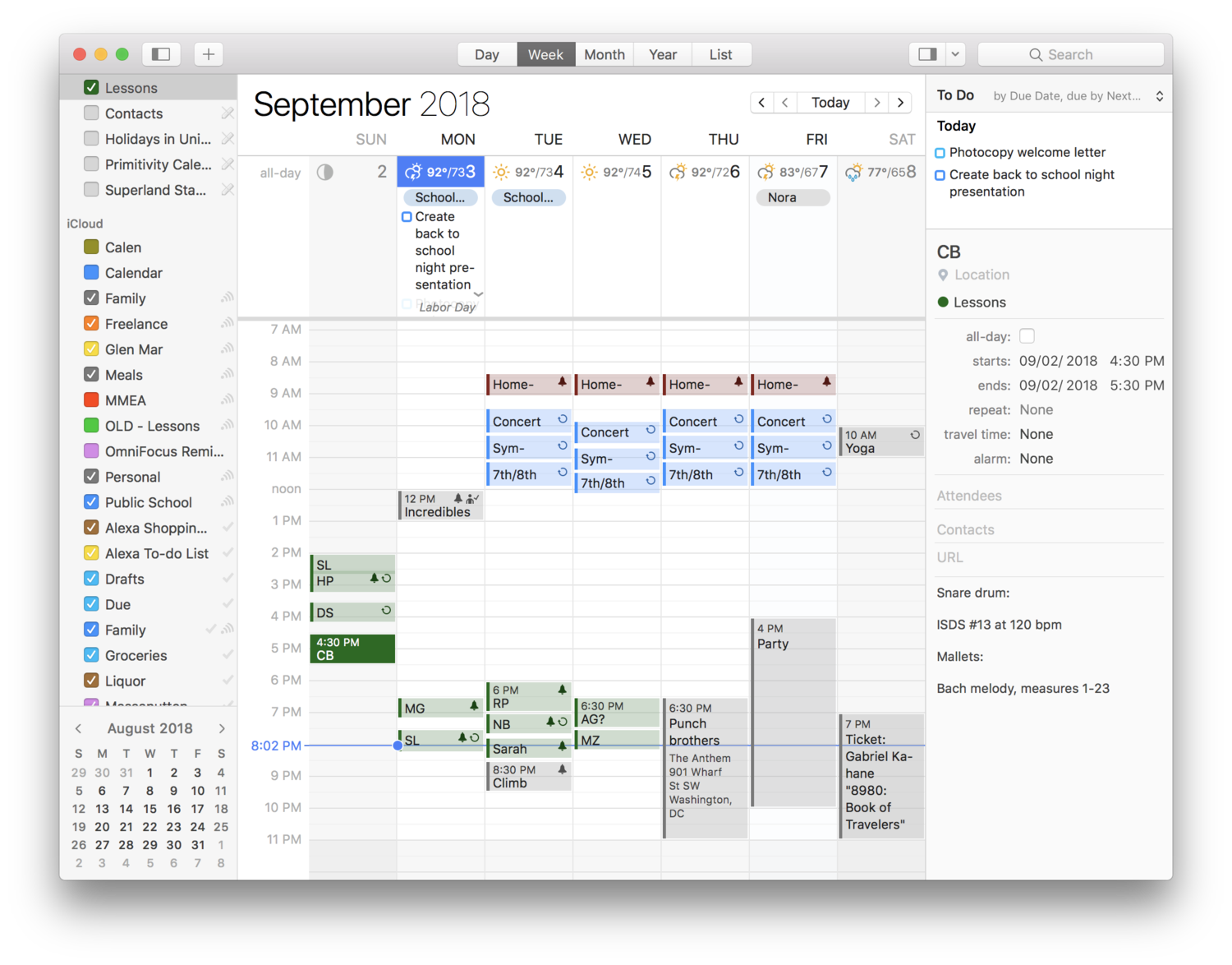
Now on to time and energy management. Tools that help me manage the many events in my day and the tasks I squeeze in the cracks. BusyCal is my go to on the Mac. It looks and feels like the macOS Calendar app in nearly every way with a ton of great power features on top. It has weather integration, the ability to tag events with people, and more. My favorite is a persistently open “Info” panel on the right side of the screen. Instead of double clicking events to see the notes and location I have assigned them, I click once. And instead of a floating modal box, I can always see the contents of my events. This feature alone is worth the 50 dollars for me. Especially because I use the notes field to track what my private students are working on and I hate clicking so many times in the standard Calendar app to get this info to show up in those modular pop-over windows.
Each lesson, I type student’s assignment into the “notes” field of their block. My “Lessons” calendar is in Google Calendar, and I have published it to a password protected part of my website for private students only. This way, they can log in to see when their next lesson is, and also what I assigned them recently. Now there is no excuse for them to say they forgot what I assigned. And it cuts down tremendously on unneeded parent communication.
Check out the right side of the user interface of BusyCal. Reminders and an edit window can be persistently visible on the screen.
OmniFocus
OmniFocus has been my “todo” app for years. OmniFocus has a great feature called Review where you set your task lists to be reviewed every “x” days, weeks, or months. Every day, it rolls up projects that need to be reviewed. If I wake up up early, this is what I do the moment I sit down at my desk. But it is also possible to do in little spurts throughout the day. This ensures that things don’t slip through the cracks.
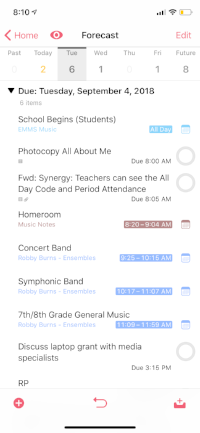
OmniFocus just released their version 3.0 for iOS. This introduces some killer new features. First of all, the Forecast view now shows your tasks inline with your calendar so that you have better context for when you should be working on them.
Next, OmniFocus 3 supports a tag that will show something in the Forecast even if it is not due. While Reviewing, for example, I simply swipe left on the tasks that I want to be thinking about for the day, and it adds them to the list.
Forecast view shows me my todos in context with my calendar events.
OmniFocus now allows you to assign multiple tags to the same task, so I have began including tags for energy level. “Low,” “Medium,” and “High” help me to filter items based on my current state. If I have five minutes, and haven’t eaten in a while, I can look at all the “Low” energy tags and get one or two done.


